I look at dozens of brochures each year. A handful are brave enough to submit themselves for review (it’s only ever done on request) and most that do ask will get published, if at all possible, but there have been one or two occasions when I have to say to the company that it’s probably best if I keep my big mouth shut. Thankfully, that’s a rare occurrence and one that I doubt could ever apply to the Pavestone brochure which has evolved into one of my favourites, one of the select few that has me salivating with expectation long before it lands on the doormat.
So, when the 2020 oeuvre arrived, I was initially confused – surely that’s the 2019 brochure, isn’t it? Or is this déjà vu all over again?
A quick double-check showed it to be, indeed, a new brochure for 2020, but the similarity in look, style, size, colouring and layout to what was presented to us last year is startling! Is it possible to take the old adage of “if it ain’t broke…” that one step too far?
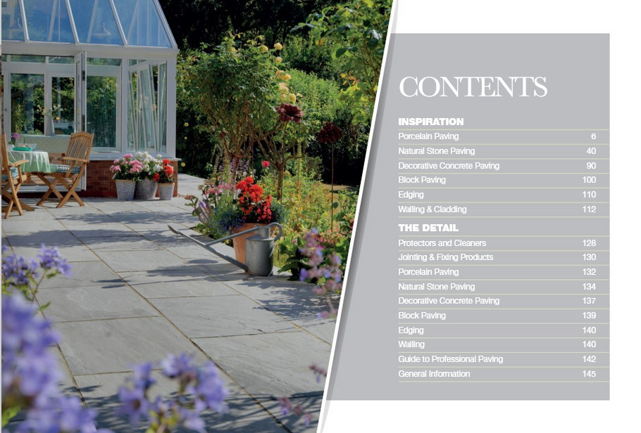
While the covers are practically indistinguishable, and overall layout is pretty much as it was last year, there are subtle changes, new additions, and, inevitably, a few departures. The initial flick-through the race card contents page reveals the short-odds favourite, porcelain, has maintained its place in the lead, which should surprise no-one with any understanding of the paving and hard-landscaping trade, while imported stone is following closely on its hooves, but notably showing nothing that is new. Concrete paving is holding on, but the dark horse coming up surprisingly quickly on the outside is the porcelain wall cladding, which, I have to admit, really isn’t something I particularly like.
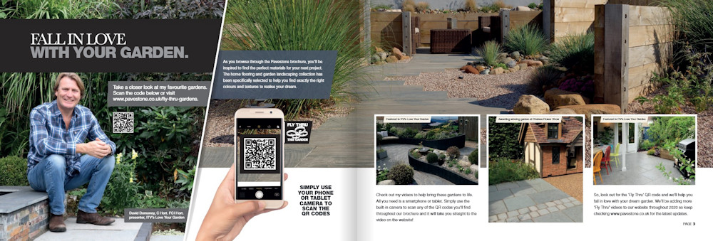
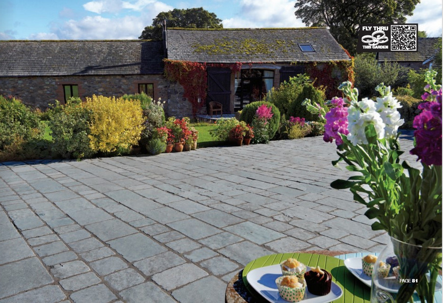
Once inside the brochure, the number of QR-initiated Drone Fly-Throughs has been massively expanded, as has the presence of a face-off-the-telly. The former is a truly wonderful and invaluable extension to the armoury, while the latter, I’m afraid, leaves me cold, mainly because I test positive for Celebrity Aversion Syndrome. As soon as I see a celeb-endorsement of any product, from shampoo to soup to setts, it makes me wonder what it is the product is lacking that they think a famous face will be able to distract me from noticing.
Anyway, I would urge you, if you haven’t already done so, try out these Fly Throughs (the spell-checker must have been set to Americanese because they erroneously spell it ‘Fly Thru’). Be warned: they are addictive, but they do give us the sort of views and perspectives that we could only dream of just a few years ago.
On to the newcomers: there aren’t many, but there are enough to keep the brochure fresh and interesting. However, everything that is new hails from a kiln, rather than a quarry or a mould - it’s all about porcelain as paving or wall cladding.
In yet another admission, I have to reveal a significant advantage over casual perusers – my copy of the brochure was personally customised with annotated sticky-labels indicating pages with new products. I genuinely appreciate the gesture, for it makes my task that much simpler, but I do worry that the aforesaid casual peruser has no such way of identifying what has been added since last year.
I know some manufacturers and distributors feel it is unnecessary to pick out each season’s debutantes, the theory being that most readers will only look at a paving brochure once every few years, when a new patio or driveway is being considered, so what does it matter if this flag is new or that sett has been in the range for a decade? For me, I feel that highlighting new products, even if they are just colour additions, new sizes, or minimal tweaks, is a worthwhile exercise because it costs nowt yet it shows the reader that innovation and product development are an important component of the company’s M.O. It also nudges those that simply must have the latest product…and it doesn’t half help contractors and installers when they are trying to upsell to a client!
So: the moral of this story is to mark out what’s new – it can’t do any harm!
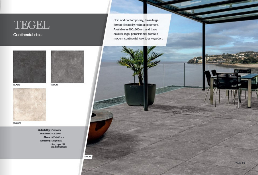
First of the newbies is Tegel, described as ‘chic’ which tells you nowt, but it’s a single size, 900x900mm tile in dark, medium and light/white mottled grey tones. We’re seeing more and more of these larger formats, and they are a wonderful thing but they require exceptionally careful installation. Such scale brings with it some limitations – these are practically impossible to lay to anything other than flat planes, so no twist or folding with diagonal cuts, which totally ruin the look. Think carefully about falls, levels and just how a paving unit the best part of 40kg a-piece will be handled safely and securely.
Dolomite, in geological-speak, is normally a limestone, but in the Pavestone range it’s a rectangular marble-effect unit in eight colours, now the all-new Hype Green has been introduced. Green-ish, would be a fairer description, subtle and soft rather than anything attempting to match the vegetation. 1000 x500mm for the outdoor range, but, oddly enough, 900x450mm for the 10mm indoor version.
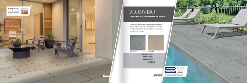
Monviso is the supremely bland porcelain option. Smooth, silken and no discernible features other than the colour, which is a simple either/or of Grey or Mint (moss-tinged tone). Just the one 900x600mm size available, so nothing too exciting but that’s what some folk genuinely like.
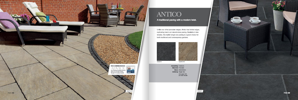
Antico is probably my personal favourite of the whole Pavestone Porcelain range. I’m a sucker for a fettled edge, even when I know it’s not real. Two colours: a very dark graphite-like Granite and shimmery gold-brown Quartzite, both in the one 800x400mm size. I keep switching – one minute I think the near-black presence of the Granite is the one I’d choose, and then my head gets turned by the gentle colour variation of the Quartzite. It’s not often I really take to a porcelain, but Antico has managed it!
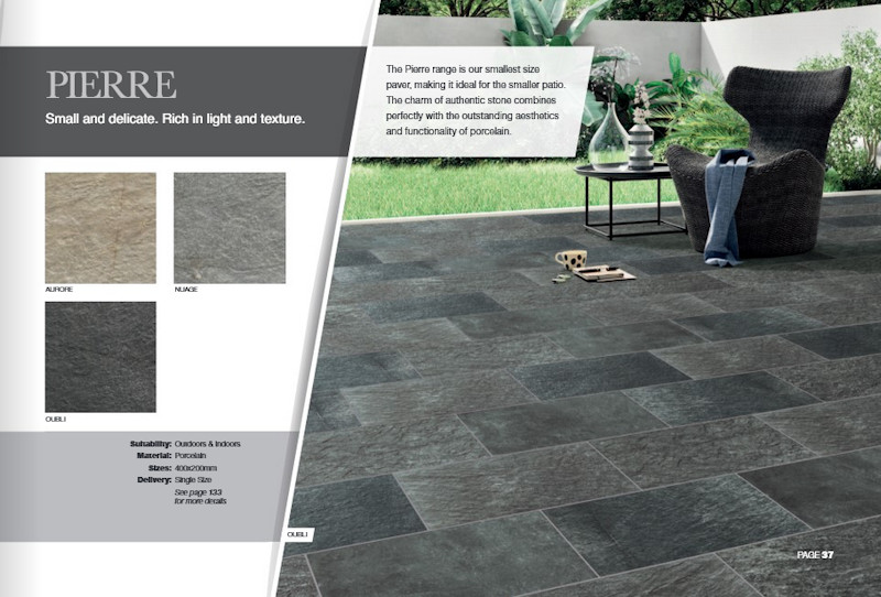
Pierre is the baby of the extended range, a delicate 400x200mm single size that’s only just too big to be considered a block or a sett. The accompanying blurb suggest it’s ideal for smaller patios, but I always find that small units emphasise the smallness of a tight spot, whereas larger units (not the giants, just large) trick the eye into thinking the space must be bigger than it seems.
Having said that, a 400x200mm unit in three colour options (Aurore, a light gold-brown: Nuage, a mid-grey: Oubli, the dark grey) with a fissile slate appearance makes it a very, very useful unit for contrast bands, edge courses or those areas where a little bit of twist in levels is required.
This all represents a significant expansion of the porcelain offer from Pavestone, a total of ten styles, up from last year’s offer of six. A two-thirds increase in a year? That definitely shows where they feel the market is heading.
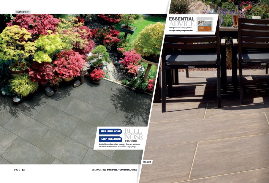
There’s a noticeable nudge regarding the bull-nosed options available for, it seems, all the porcelains with the exception of the Simply ‘value’ range. For those requiring steps, copings or any structure with an exposed edge, there’s the choice of full bull-nosed (rounded top and bottom face) or half bull-nosed (rounded on top face only). While such detailing may seem a minor addition, the fact that it has been made so widely available as an ‘Off The Shelf’ item indicates the position porcelain has now reached. It’s only taken five years or so to move from ‘we only supply squares’ to a position where items once considered bespoke are now a standard part of any decent range.
Skim through the pages….this is strange….I can’t recall the last time I reviewed a brochure from such a major brand that didn’t have a new stone product. Is that it for stone now? Has it truly peaked? Are we on the downward slope to irrelevance? I doubt it, but we do seem to have reached a position, as we did with concrete block paving about 20 years ago, where we’ve settled with a handful of tried and tested favourites and no longer look for anything new or exotic. Oh well!
There's still one of the best curated selections of natural stone paving - flags, setts, blocks, edgings and kerbs - anywhere in Britain, it's just that, for 2020, nothing new to report. And it's the same story with the concrete paving, the cast flagstones, the block pavers and the edgings - all lovely, all worthy of consideration, but nothing new.
The next newcomers are found in the expanded section for Cladding, and, of course, it’s all porcelain and mostly of the modular pretend-stone variety. I declared earlier that I’m not a fan of these ‘tiles’. I’m probably too old and too traditional in my tastes to appreciate tiles that probably look better in a bathroom or kitchen but find themselves stuck on external walls. They just scream “tiles” to me, no matter how careful the designers have been with the moulding and colouring. It’s just not a style I like.
However, what I like or dislike is totally irrelevant. They may not be appearing in my garden at any time soon, but they are increasingly showing-up in more and more projects the length and breadth of the country. They obviously appeal to some, and there’s enough of them to make it worthwhile for Pavestone to invest significantly in their offer.
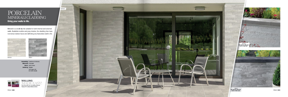
First up is Minerali, a small-scale tile in grey (Zinco) or off-white (Artico) with pieces replicating split stone mixed with sawn face styled pieces. I’m sure some will feel it looks great on their south-facing terrace or patio in Brighton or Bournemouth, but the thought of being confronted by that in a back yard in Bolton terrifies me!
Rock Stack is, as the name suggests, stacked slips of stylised stone, jutting out to varying degrees. Funnily enough, about 20 or 25 years ago, as Eastern Europe was finding its feet and, more importantly, finding the western European markets, no end of Polish, Baltic and East German manufacturers were trying to sell us the very same thing….but in real stone! It is/was a traditional look for house facades and the like in that part of the world, and one they were keen to export. It had some success – I recall a wonderful Polish company that had some lovely examples, stones that I found fascinating from a geological perspective, but they never sold in significant quantities.
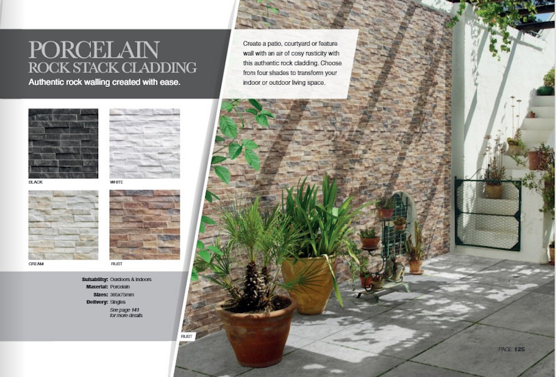
Will Rock Stack sell? Probably. The timing is right, and the audience is now far more receptive. The options of Black, White, Cream and the multi-hued Rust seems to cover all the bases, but, to my sceptical eye, it all still looks like repetitive tiles, lacking the variety and unpredictability of the earlier stone versions.
To finish off, the Maintenance and Aftercare range has been significantly beefed-up with a whole range of products brought in from a very reputable source and given clear and simple branding: Protect; Restore; Clean – could it be any clearer?
While I haven’t tried any of these particular products, I have used and recommended the source company’s products for many a year and they are generally sound. As with all the aftercare products, no matter where they hail from, if there is to be the occasional problem, it’s usually the application that lets them down, rather than the product itself. Read the instructions: follow them to the letter: don’t kid yourself that you know best!
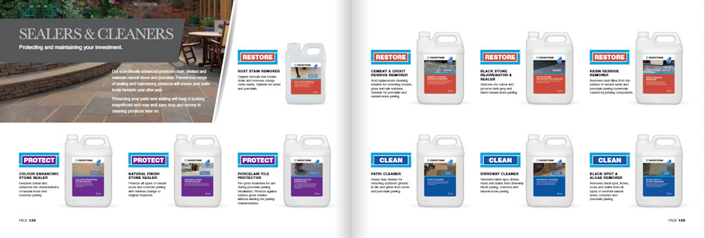
That’s about it, other than brief acknowledgement of the revamped fixing products, a cladding adhesive, a primer slurry and a porcelain grout. Again, I’ve not tried any of them, so there’s not much I can say.
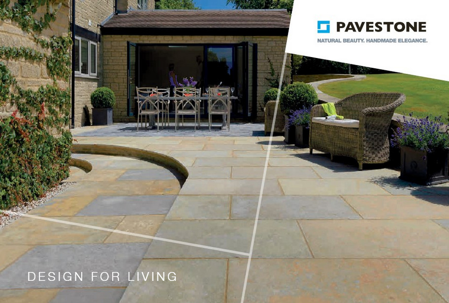
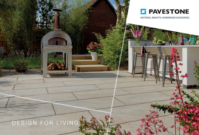
What about the brochure itself, then? As I said right back at the start, it’s a direct follow-on from 2019. Same size, same style, same layout. It remains heavily based on images, and, by-and-large, those images are of a very high standard. They are well selected and exceptionally well-staged, with more than a hint of southern European climes in some of the shots. The lighting is particularly well-managed with few, if any, issues with inconvenient or intrusive shadows.
Those ranges with a larger number of options are, rightly, given several pages to show their wares, but other than the caption, which usually gives only the colour name, it's easy to forget just which product one is admiring. That 'Heather Blend': is it Classic or is it Tudor Antique? Flip back a few pages to find the range title.....but it would have been so much easier to have a "reminder" on each page. How hard can it be to caption it as "Classic: Heather Blend"?
The landscape format of the brochure is used to its best advantage, enabling grand statement shots and smaller supporting images to be viewed with ease on a vista spread open on a coffee table. The descriptive text is basic but it works by not interrupting the flow or attempting to distract from the visual delights. Key information is provided on the page with supporting technical data tucked away at the back. All in all, it’s pretty close to the perfect brochure!
The old adage is that a picture is worth a thousand words, and never was that truer than in this gem from Pavestone. It’s a pleasure to browse, it’s a joy to behold, and it’s a brochure that both installers and customers will return to over and again through this strangest of years.
Further Information:

Pavestone's Customer line: 01386 848650


