Bradstone 2014
Rambling Introduction
It's that time of year again, and the brochures for this season's patio and driveway goodies have been trickling in for a few weeks now. Normally, I start these reviews just after Christmas but more and more manufacturers are semi-insisting on giving me a personal run-through of what they have on offer. I'm not good at hiding my feelings, so they can usually tell straight away whether I like summat or whether I'm going to be rude about it. Maybe the personal presentation allows them to get some sort of advance inkling of what to expect when I finally commit fingertips to keyboard.
I do appreciate the time and effort they put in, especially those who have the decency to travel to the big city of Warrington to save my meagre pocket money being wasted on petrol. Seeing products 'in the flesh' is always so much better than relying on marketing department descriptions and cleverly lit professional photies.
The downside of all this is that the brochure has often been out for a few weeks by the time I get to see it, so any review I might churn out is retrospective rather than giving contractors and potential clients a sneak preview. A part of me thinks it was more fun when I saw quite a few of the brochures before they hit the streets, even if it meant embargoing any comment until an agreed official publication date.
Anyway, the first candidate this year, purely because they got their visit in before anyone else, is the never-stationery carousel of personnel that is Bradstone, with a dash of Charcon thrown in to keep it interesting.
New Products
Last year, you will no doubt recall, Bradstone were responsible for an epidemic of dropped jaws as they launched their innovative PatioDeck system. Despite the naysayers, most of whom resided in rival camps, the PatioDeck proved to be much more than just a gimmick and actually sold in numbers that exceeded even Bradstone's own expectations. So, it should be a safe bet that we'll see some natty additions and extensions to the system, won't we?
Well, yes and no. Yes, there are additions but no; there isn't the brave, bold and confident developments that I, for one, had expected.
Predictably, the PatioDeck system is now capable of accepting *calibrated* natural stone flags, and there's even the capability of using a sort-of random layout of four sizes. I say 'sort of' because, when it's the same layout every time, it's not really fair to refer to it as 'random'. And "random pattern" is, as I keep pointing out, an oxymoron. It's either random, or it's a pattern: it can't be both!
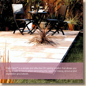
With the new 15.3m² kit, which involves three different 'frame' sizes in various quantities, there are more layout options, and with an expanded choice of 5 flagstone ranges to use with the system, the number of potential designs is massively increased. It is, as the modern terminology would have it, a no-brainer.
However, a couple of the ideas I had expected to see are not present and I had genuinely expected them to appear as the next logical step once the whole idea of PatioDeck was accepted by the patio-buying public. Maybe they are holding them back for next year?
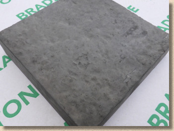
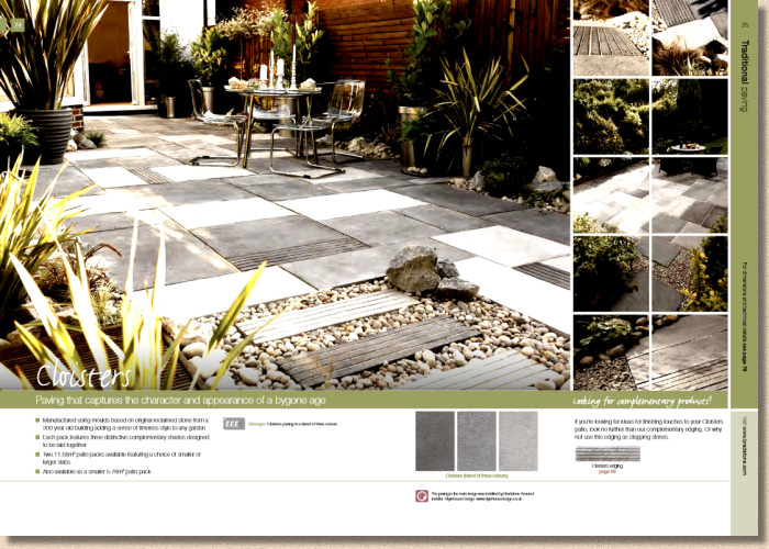
The Layered Slate Effect cast flagstones are, they say, all new, although I do recall an uncannily similar product from a sister-brand of Bradstone some years ago, albeit in a different colour scheme. The 2014 offering includes a dark-ish grey, a light-ish grey and a cream. The texture of the moulding is spot on, uncannily accurate in the detail, and there's is some very subtle and attractive shading, but is it enough to convince patio buyers to go with a concrete copy when the 'real thing' can be had for more or less the same price?
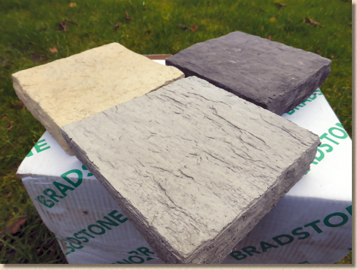
The colour palette is right for the current taste (grey, grey and more grey), but with a stingy 3 sizes available, plus 3 complementary edgings, there's limited choice and layout potential. I'm not convinced there is sufficient appetite for this low-key, understated type of concrete paving just at the moment. Lovely flags, lovely moulding, but limited potential, I fear.
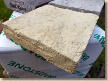
And if the undeniably attractive Layered Slate flagstones have limited appeal, then the one-size one-colour Aged Riven is possibly doomed before it starts. Unless this can be sold as a simple-to-handle budget flagstone for the weekend warrior patio installer, I can't see its market. It has virtually no appeal to a designer, it's too small and simplistic for contractors, so it's only hope is through the misguided souls who purchase on impulse via a garden centre. Sorry, Bradstoneers, but I just don't like this.
There are bits and pieces of other newbies or extended ranges in the patio range, but nothing that will energise the hibernating contractor and have them ready and eager for the new season. New cheesy stepping stones? Rope-top and sawtooth edgings? A circle kit? Nothing to see here....move along please.
The fact that the popular Old Town Walling blocks will now be single-sided is worthy of note (and done for quality management reasons, rather than public demand) but it won't make a massive difference to either the appeal or the design potential. If anything, I would suspect it might make wall-building a tad simpler, but not that much.
In the block paving range, which has never been Bradstone's strongest hand and is in dire need of a breath of fresh air, all that is offered is a stronger colour blend for the DriveFlair blocks and a vague promise to do summat about efflorescence. There is the scent of something sweet cooking up in the near future, however. The highly significant investment in the Bedfordshire plant making the Panache ranges will augment the potential for that product along with other blocks, and there is the hint of a suggestion of a possibility that when sister-brand Charcon completes its revamp come mid-summer, there will be knock-on effects for Bradstone blocks. More on that when it happens.
The one thing that really surprises me, however, is the sparse, blink-and-you'll-miss-it development of the natural stone range. I know Bradstone's heritage is concrete, and they are very, very good at it, but what sells in the paving market at the moment is stone. No matter where your heart may lie, if you want market share, if you want to be taken seriously as a key supplier to the patio and driveway market, you need a strong stone offering.
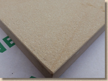
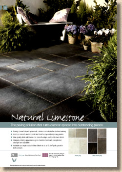
For 2014, there are only two developments, and one of them is more of a tinkering than a development. A new colour option for the fine-textured sandstone, Ferndale , a multi-brown with hints of barely red, is not going to have contractors salivating and rushing out to place orders. It looks attractive, and it certainly rounds out the colour palette for smooth sandstone, but it's nowt new.
However, the all-new Natural Porphyry flagstones might just have that effect. I've had a sense for a couple or three years now that Porphyry could well be the next 'in thing', but probably on a regional basis. The typical reddish tones of porphyry will probably limit its appeal in Lower Britain where pale, pastel hues and the monotone palette are all that seems to matter, but north of Milton Keynes, and especially in northern England and Southern Scotland with their tradition of red brick housing, there should be much more interest.
Bradstone are offering an Indian porphyry, which tend to have a reputation for being a bit muddy compared to the more expensive Argentinian and Italian stones. The brochure images definitely suggest reds, and the accompanying text promises exactly that, but the pieces I've seen are ochres, tans and rusty browns, but it's not wise to judge from a very small sample.
Looking beyond the colour, the texture is very interesting. Porphyry is a bloody hard stone and it's not easy to texture it.....unless you have deep pockets and very tough processing kit. Hence the propensity of riven texture porphyry – simply split but otherwise unmolested. Still, Bradstone are offering us two intriguing textures: a flamed finish which softens the heaviest ridges and crevices of split stone, and a truly gorgeous 'leather' finish which is an uncannily accurate description for the brushed but not quite polished feel.
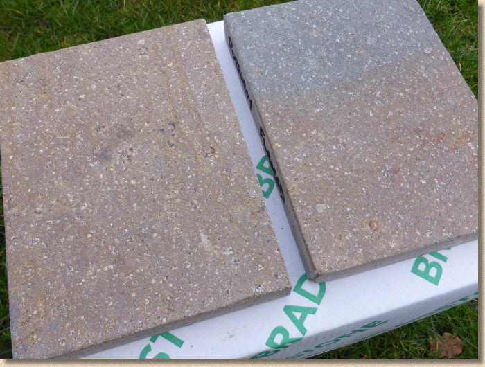
Indian porphyries, which may be lacking the strong colours of those from other countries, do seem more amenable to secondary processing, and given the lower extraction costs on the sub-continent, then such processing becomes just about economically viable. Given that top-of-the-market Italian riven stone can set you back 100-130 quid per square metre, the very attractive target price of 55-60 quid per m² (all plus yer VAT, of course) is bound to make many of the more adventurous designers and contractors sit up and take notice.
Brochure layout
So, even though I've used up almost 1,500 words so far, there's not much new to report. It hardly seems possible, does it? And so I'd better get on with looking at the new 2014 brochure before I run out of breath.
First impression is there not much different from last year. A discrete Bradstone logo tucked away in the top corner although the familiar incomplete triangle logo seems to have been excised, and a showstopper image taking up the whole cover featuring a pretty wide selection of the company's products: walling, edgings, stone flags, textured concrete, copings, decorative aggregates...and all very, very grey. Concrete grey.
With all the brands that supply a wide range of paving and hard-landscaping products, there's an eternal battle over how to present the manifold choices. Do you put all the stone products together, separating them from concrete and clay? Or do you mix it up and risk causing confusion? There is no right answer: it's a matter of finding what works best for the marketing department and how they want to sell the brand.
This year, Bradstone have identified three key fields for their range: What they call 'Contemporary', another grouping referred to as 'Traditional', and then good old block paving. There are smaller sections for those products that fit into all, or even none, of the above. Naturally, there will be some argument about what should be thought of as contemporary or traditional, but in yet another sweeping generalisation, traditional means riven stone and riven stone effect paving, while contemporary means smooth or specially textured.
As a way of arranging a brochure, it's as good, or as bad, as any other. For occasional browsers, it's probably helpful to have similar pavings grouped together, and for contractors, they really ought to familiarise themselves enough to know just where the smooth or riven version of a particular stone can be found.
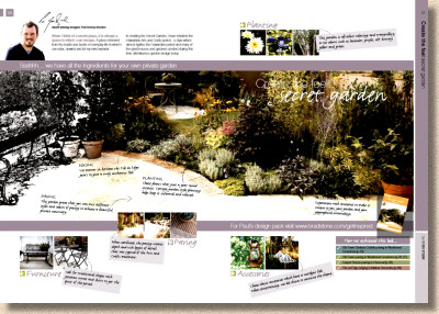
Interspersed between the appointed divisions are several pages suggesting how to create a certain look as presented by pet garden designer, Paul Hervey-Brookes. They are simple design ideas, but I really do like the presentation where they've graduated a design from photograph back through to computer-generated black-and-white pencil style. If you're familiar with PotatoShop, you know exactly how this effect is achieved, but it just seems to work so well in this setting.
I feel this is an area which should be more deeply explored in these brochures. Design suggestions or whatever you want to call them, are a great way of showing off paving and walling and other hard-landscaping in a realistic setting. Many of the staged photies are too obviously staged, but this idea of annotating images, of showing detail in close-up, and then explaining the thinking that went into the design is both effective as a sales tool and entertaining for the casual browser. But give all of these a double page spread. You can't really do justice on a single page.
The essential technical information is shoved to the back and restricts itself to size and pack information. Layouts have been exiled to the website, and I'm undecided whether that's a good thing or not. Layouts take up a lot of valuable real estate in a brochure, so I understand the reasoning, but then not making evident the versatility and potential of various product ranges while you have the reader's attention seems like a missed opportunity. How many will actually use the online paving planner? If choosing a potential layout means sitting at a screen and clicking, tapping, swiping and dragging bits and pieces in an unfamiliar app, when the alternative involves seconds simply scanning a few line drawing options, the drive to send everyone onto the web feels premature.
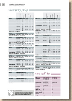
At just 84 pages, including covers, it feels parsimonious to skimp on layouts for the cost of a very few extra pages. We've seen bigger Bradstone brochures in previous years, and there is no wasted space in this edition. A decade ago we might have had to endure page after page of marketing waffle, which has, thankfully, been chopped, but 2014s brochure is right on the cusp. A few extra pages would have allowed for layouts and perhaps a bit more about the under-promoted Bradstone Assured Contractor scheme, which needs much more of a presence if it's to carry any authority.
Page styling
Throughout the brochure, the photies used are generally of a high standard without being overly twee. Most images are relatively closely cropped, focussing on the hardscape rather than the wider opulence of a site, and there is a real feel that this is paving for the ordinary family with just enough chic designer jobs to ensure we don't forget the versatility.
Swatches very in size throughout, from postage stamp sized inadequacies to lavishly generous, but there's no sense of being left under-informed. The swatches are largely used to show colour options rather than texture, and they back-up the main images so the reader has a good sense of what's available.
What text is provided alongside the imagery tends towards the factual rather than the aspirational, and is bullet-pointed which helps emphasise its brevity and helpfulness. The font used for naming each product is a faux handwritten script which gives each page a homely, organic feel. There is a footer containing various symbols intended to give a guide to, for example, price point, as well as crediting the contractor responsible for the installation, which is very welcome.
Overall, there's a real sense of professional style to the brochure and the over-riding impression is of a brochure of images rather than one overloaded with arty-farty white space and meaningless text. It's a browser's delight.
Summary and availability
Any serious paving contractor or garden designer will, by default, have their own copy of Bradstone 2014. It's one of the three or four essential 'annuals' without which you can't hope to be taken seriously. It's noticeable just how quickly you become familiar with what can be found where, so no incompetent-seeming faffing about in front of potential clients, and the whole look of the brochure is very professional.
For those clients, this will be an invaluable guide to what's possible when they are thinking about their patio or driveway, and it prompts a good number of important considerations which they might otherwise overlook. It's eminently readable, browsable and user-friendly. It's a great place to start the journey towards that new patio or driveway.
As you'd expect, copies of the brochure are readily available from all Bradstone stockists and due to the tardiness of this report they are already in wide circulation. If you don't know the whereabouts of your local stockist, call the Helpline number given below.
And as you'd also expect in this age of technological marvels, there is a downloadable PDF version which you can grab this very day, should you wish. However, the online PDF version, for some reason, appears very bleached, with washed out colours and huge areas of white-out on key images. Yes: I know it could be my antique monitor screen, but every other PDF I view on the same monitor looks fine, so I'm guessing it's a dodgy encoding by whatever bit of cheap PDF-erry software Agg Industries found on tucows.com.
Download, by all means, using the link below, but if you want the best views, get yourself an olde-worlde hard-copy. It's much more fun.
And then find a project where you can use that Porphyry!
Bradstone Helpline: 01335 372 222


