New website for SureSet
SureSet have recently celebrated the completion of their first decade in the Resin Bound Surfacing industry and since those first steps back in the days of Britpop and Blur (or was it Blair?) they've gone from strength to strength and are now widely acknowledged as leaders in the field, with an ever-expanding roster of approved installers and a seemingly endless array of aggregates to suit any imaginable project. And to launch themselves into their second decade, they've just unveiled their new look website.
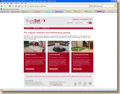
It's a slick and professional look, with the maroon Sureset logo prominently displayed and used as the source for the site's colour palette, which is essentially maroon, grey and white. The opening page loads more-or-less immediately: no messing about with a silly animated introductory splash page, just straight to a simple and immediately logical opening page that leads the visitor into the rest of the site.
Contact information is obvious: there's the phone number top right and the address at the bottom of the page. This gives visitors confidence because there's no sense of the company hiding away behind a screen of anonymity. The bulk of the page is split into three panels: News, Commercial Applications and “House and Home”, which again, immediately leads the visitor into the relevant section. For those wanting specific information, there's a useful Search facility next to the phone number top right and a text-based navigation bar running along the base of the page leading to such esoteric sections as Picture Library and Technical.
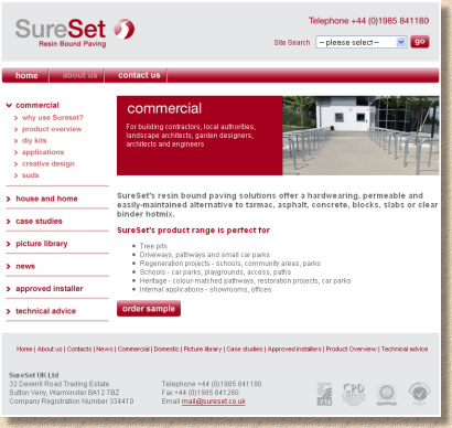
There's some recycling of information within the commercial and domestic sections. For example, the Product Overview info is the same in both sections, but then, where differentiation is warranted, it is provided, so the Commercial section provides more detail in the “Why Use SureSet” than is found under the same heading in the Domestic section. This is clever and efficient use of content, making sure it's correctly targeted with plenty of options to dig deeper or veer off to one side or t'other. An expandable navigation list is positioned to the left allowing quick and easy jumping from one item to another and between each of the main sections.
Overall, the navigation can't be faulted. You never lose your sense of place and you're never more than a click of two from the info you seek. But is the info of any real use, or is it just another example of corporate noodling? This is what happens when less adept web design companies simply fill white space with fatuous text with the intention of fooling web-inept upper management into believing they have just spent thousands on a wonderful website when all that's actually been provided is a pre-built, off-the-shelf package dressed in corporate colours and wallpapered with waffle over the course of a lazy afternoon.
If we think of content as a signal-to-noise ratio, that is, the proportion of valuable information to senseless psycho-babble, methane-powered trumpet-blowing and geek gimmickry, then the SureSet site has a very good score. The team responsible have successfully identified the sort of information that web visitors require, and they've provided it in manageable chunks. Five succinct case studies that will appeal to designers, engineers and specifiers, a well-organised picture library with products arranged by site type, application and product line give a reasonable impression of the range – as reasonable as is possible with a strictly visual medium, but backed-up by ready access to request samples for the full tactile experience. Technical advice is available as freely-downloadable PDFs, and there's even an online listing of approved installers, complete with mug-shots of the named contractors.
It's hard to find anything to moan about. Navigation is just about as good as it could be; the content is well-produced and relevant; the styling is clean, modern and uncluttered. In fact, the only thing that struck me as I wandered around was the need for a case study or two looking at purely residential applications, perhaps a private driveway and a DIY small patio. Other than that, the stunning similarity between Lauren Gardiner and Susan Newton in the About Us beauty parade is uncanny. They could be twins!
One item that seems to be missing from the News section is the new “Spectrum” product. It can be found in the PDF version of October's newsletter, but it really does deserve more of a splash on the site itself.
Sales Manager, Victoria Newton told me,
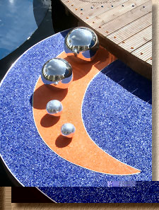
“We have developed a new way of coating clear recycled glass with a pigment that does not fade. Even after very heavy traffic where the colour is slightly worn off the surface it still shines brightly through the clear glass from underneath.
By adding the pigment to the resin the client can choose any colour from a RAL colour chart enabling us to exactly match logos or other designs and to provide an endless choice of colours. It also means that the consistency of colour is greatly improved compared to recycled colours.
I know what you are thinking: how much is this all going to cost? It will work out around £15 per m² more than a standard recycled glass finish, which is a lot cheaper than the previous red, yellow and orange colours which were a crazy £800/m²”
I've seen some very interesting images of projects done using the SureSet Spectrum product and I'm eagerly awaiting a project up here in the civilised part of the country that I can visit and see it for myself.