Brett Brochure 2018
The Brett 2018 brochure was one of the first to arrive at Borlochs Hall, and, apparently, it should have been here even sooner but for an admin error and an unnamed someone buggering off to sun themselves in Winter warmth. After an initial flick-through, it sat on the side of my desk for a week or so awaiting the full review treatment. Meanwhile, on a separate but equally untidy clutter of papers precariously perched atop the copier-printer, the Brett 2017 brochure was resting following a year of heavy use in preparing designs and layouts for discerning clients.
Far too late, due to minor inconveniences such as grandchildren’s birthday parties and spinal surgery, the time came to cast a more considered eye over the brochure and commit my ponderings and cogitations to paper…or screen, anyway.
Skipping gleefully past the introductory blurb I was on page 23 before I noticed summat amiss. New for 2017? Eh? Was this a typo? How had that slipped through?
I checked the front cover. Oh eck! This wasn’t the 2018 brochure at all, but the 2017 edition, yet so similar was it to the latest publication, near identical, actually, that it’s an understandable mistake to make.
They’re almost indistinguishable. Yes: the collage of photies is different, but it’s exactly the same arrangement in terms of size, shape and placement, and the barely noticeable date tucked away vertically on the extreme left-hand edge is, of course, different, but at first glance, it’s easy to understand how the edition on the tottering pile near the phone was overlooked in favour of the edition on the teetering pile on the printer.
And it’s not just the cover. The layout and format inside are more-or-less identical!
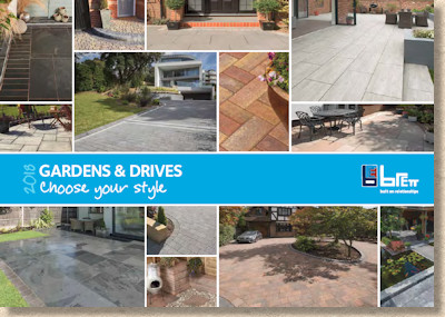
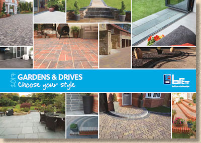
This is not, necessarily, a bad thing. If it’s not broke; don’t fix it, and all that, but this is now three years running with the same style, layout, format….everything, bar a small handful of new products.
And broke it most certainly isn’t. The landscape format is a winner and one of the best moves of recent years, while the internal organisation is just about as clear and simple as is possible with such an eclectic range. It’s friendly, approachable, visually appealing….why would you change any of that.
But, when it comes to brochures, there’s this nagging sense that there *should* be changes, there *should* be incremental improvements and annual developments. When a brochure looks the same, year-in and year-out, part of my brain starts to think that not a lot of effort has been expended, that the marketing team have just said, " We’ll jiggle the order and chuck in a few new photies, then sod off down the pub ", which doesn’t really convey the sense of excitement and eagerness that I want to smell oozing out from a new edition.
Or am I being unduly harsh?
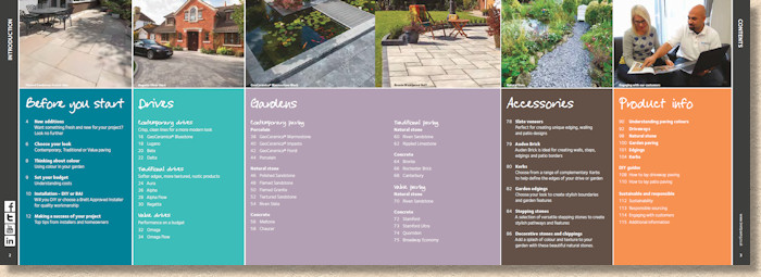
So: the order has indeed been jiggled. Driveways have been given pre-eminence this year, and, probably as an indication of the growing dominance of porcelain, the previous Natural Stone sub-division has been subsumed into Driveways and/or Gardens. And there are, as expected, quite a few new photies, but there is something more than that.
The New Products double page spread, which is still the best way I’ve seen of flagging-up (I know: I’ve used that pun before….dozens of times!) the season’s latest innovations, further emphasises the importance to the modern paving trade of porcelain, as witnessed by the exceptionally generous allocation of page real estate given over to GeoCeramica, the twist-on-a-theme porcelain on which Brett seem to have pinned much of their hope.
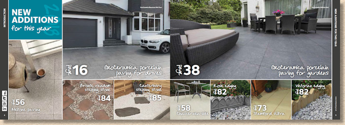
GeoCeramica isn’t really fully new. It was launched in 2017, but too late for last year’s brochure, so while it *is* new to the brochure, it’s been used, and very successfully used, up and down the country for about 9 months.
The "twist" is that these GeoCeramica porcelain tiles of flags have a base layer incorporated, which eliminates the need for a primer or bond bridge, along with the need for a mortar bed, and allows the flags to be laid directly onto a screeded sand bed over a sub-base. All this thinking was explained in more detail in the report on the BAI Awards for 2017.
In the months since its launch, I’m not sure I could say GeoCeramica has taken the world by storm. It has its fans, but probably just as many detractors. Judging from the feedback I get from contractors, it holds more appeal as a driveway product (the chunkier 60mm thick version) than as a patio paving (40mm thick) so perhaps that’s why Brett have chosen to lead with Driveways for 2018?
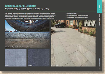
The GeoCeramica Bluestone is the sole offer, available in two shades of grey: steely mid grey, or Gris Claro as they call it, and the darkly sombre Noir Puro . Only one boring 600x600mm size though, which immediately limits its appeal for me, and leaves the range begging to be paired with something to give it a lift.
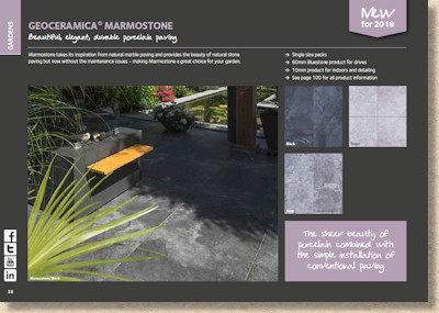
Leaping forward, the patio-friendly version of GeoCeramica comes in a much more expansive range, with three ‘flavours’, the three hues of marble-like Marmostone , the pair of basalt-like Impasto (the same as the driveway range, only thinner), and the three textured Fiordi flags.
The obvious exception of the timber-alike. This is the surprise big seller for ceramics, but it’s absence from GeoCeramica is, I can only assume, a temporary arrangement. The look is catered for in the standard Porcelain range, which as been somewhat scaled back now that most of the Brett eggs have been firmly placed in the GeoCeramica basket.
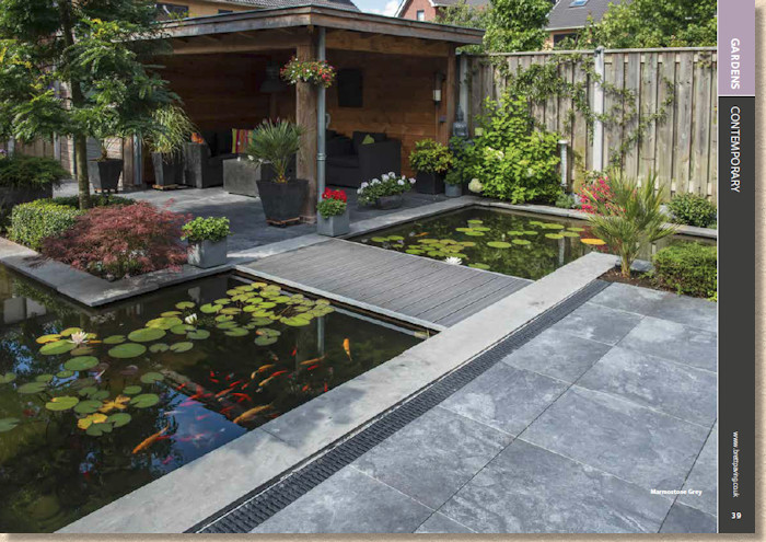
Marmostone grey
It will be interesting to follow GeoCeramica over the next couple of years. Porcelain has become the most competitive of markets for residential paving, so everyone is scrabbling about looking for an edge. Some are racing to the bottom looking for ever cheaper product from all sorts of godforsaken places, and others are relying on stylistic tinkerings to offer something unique to them, while some are being more adventurous with expanded sizes options and complementary products such as steps and circles.
There’s no doubt that porcelain is here to stay, but is GeoCeramica?
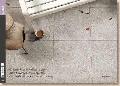
What else is new? Well, Meltone is a new shot-textured concrete flag with a black fleck intended to give it the look of granite. New to Brett it may be, but so many others have a similar product. How will it compete?
There’s only the one colour – the inevitable grey – and just two sizes, both of which are squares (450x450mm and 600x600mm), so obviously aimed at the narcoleptic stackbond layouts. Like GeoCeramica, it desperately needs a mate, a contrasting (and hopefully exciting!) partner with which it can combine and create something that will lift it.
The other shot-textured, fleckless flag from Brett is the Chaucer range, which comes in three colours (buff, natural and….err…grey) and, as of 2018, a new size, 600x300mm, a rectangle to enliven the existing squares and, hopefully, jazz-up the design opportunities.
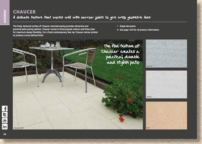
Shot-textured flags remain understandably popular, as they have for almost three decades. Customers like the reassurance of a rugged texture, and the simplicity of colour, not to mention the realistic pricing, so anything that boosts their versatility can only be a good thing.
And talking of realistic pricing, the budget-conscious Stamford range of riven-effect wet-cast flagstones is augmented by an interesting new texture. Stamford Ultra has a lightly-rippled surface that boosts its appeal for those wanting a bit of style despite their limited spend. Three colours – can you guess? – but just one DIY-friendly size, the inevitable 450x450mm square, but hey! We can’t have everything – not on this budget!
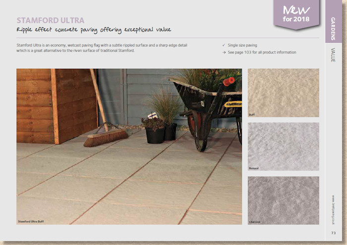
New Stamford Ultra Paving
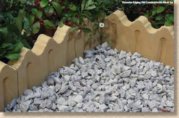
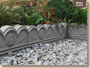
Two new wet-cast edgings. A heritage-inspired wave-top with indented panels, revelling in the unoriginal name of Victorian , and available in Old Cotswold (Buff) or Slate Grey (Grey) and the decorated wheel-style Rose with its embossed floral decoration, in the same two-colour options.
Both can trace their origins to the clay edging tiles of yesteryear, which now seem only to turn up in antique shops at stupid money proves for some reason, so you can understand why a manufacturer such as Brett would use their wet-cast expertise top offer a more economically affordable alternative that, with a couple of coats of good quality wet-look sealant, can be quite convincing for those looking to create a cottage garden style.
Finally, two new stepping stones. Stones upon which one can step. Stones for stepping upon. A way of patching bald bits in the lawn. They. Are. That. Exciting!
Canterbury and Bronte Random are the new irregular-shaped offerings, so they are, at least, an improvement on the unimaginative circular style, and, to be fair, the Bronte Random does come in a fairly impressive range of five colours, while Canterbury is restricted to a mere two.
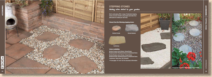
Stepping Stones have, for me, always been a thing for the DIYer. They are more bloody trouble than they are worth to lay well. Getting the spacing correct with extended lines is one problem, while having them properly seated so they don’t rock or slip sideways is another. It always seems easier to lay a standard path and be done with it, as far as I can see!
So, there we have it. Brett for 2018 in all its glory.
It remains an eclectic range, with something for everyone, without straying into anything outlandish. Solid, reliable, predictable and safe. These should not be interpreted are pejorative terms. The market is a little wobbly just at the moment and customers will be looking for safe and secure, and, most importantly, sensibly priced.
As for the brochure itself, as stated right at the outset, it’s a proven performer. It, too, is now safe and reliable. The avowed aim of this brochure format was always to appeal primarily to the customer rather than the contractor or designer, and there’s plenty here for the customer to appreciate.
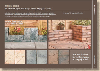
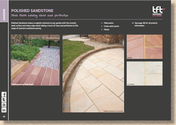
The landscape format is just so user-friendly I don’t understand why more manufacturers don’t use it. And the cover is bright, appealing on-trend with its collage styling, and so suited to the contemporary need to have coffee-table credentials. It’s a very attractive looking brochure.
And the organisation within is so well-considered. Everything is logically grouped, easy to find, colour-coded for added simplicity, and pages uncluttered with excessive technical information.
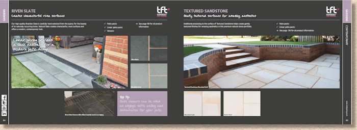
However, that dark background worries me. I know it’s no new, but while flicking through the 2018 edition, and doing the old compare and contrast with 2017, something kept niggling away at me. What was it about the ‘ambiance’ that was keeping my enthusiasm in check. And then it hit me – it’s that dark background. It mutes the tomes and colours of what are otherwise excellent photographs. It makes me feel wintery and subdued when I think I want to feel fresh and Spring-y.
I mutilated a couple of pages. I cut out the photies, carefully trimming the edges neatly, and then placed them on a white background. The difference it made! A previously muted photie suddenly had a new lease of life. It looked more exciting; it promised warm days and light nights to come. It came alive!
Maybe this is just me. I didn’t feel this way 12 months or so ago while reviewing 2017’s edition, so maybe it’s an after-effect of a cold and challenging winter season.
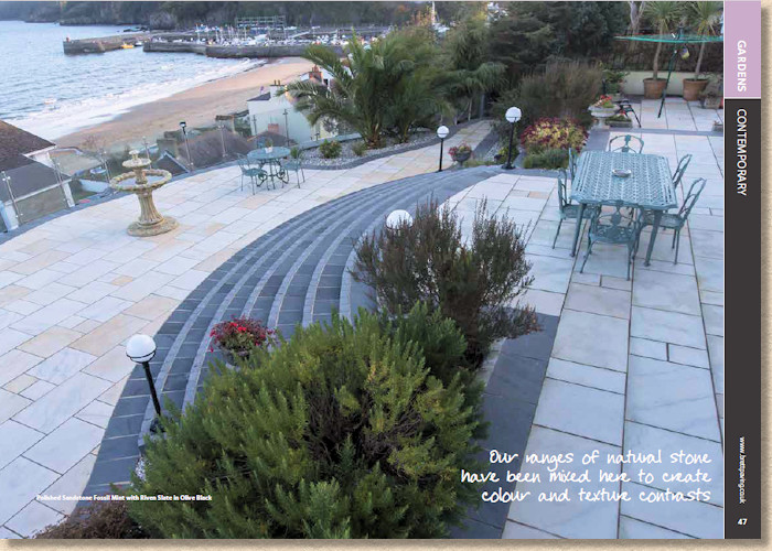
Whatever, it shouldn’t detract from what is, otherwise, an excellent overview of what’s important in the residential paving trade for 2018. It contains a taste of everything that the modern customer is looking for, and it does it with class and style and an economy of effort. There’s no sense of being sold to, just the pleasure of seeing what might be possible.
Brett Paving: 0845 60 80 577
Click here to download brochure

