Stonemarket 2014 Brochure
It's astonishing but possibly serendipitous to think that it's Star Wars Day (May the 4th be with you – apologies for cracking your ribs so soon into a review!) before I get to what is often the star of the brochure show each year, the Stonemarket oeuvre, which, this year, isn't a collection or portfolio or a compendium, just "Stonemarket" as it says on the cover, although it does admit to being a 'brochure' on the inside cover.
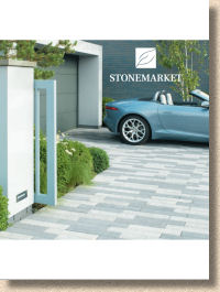
The very fact that it doesn't need this declaration its intentions on the front cover, that there's no mention of paving, gardens, patios driveways or landscaping, no definition, just a classy photie, the familiar leaf logo, and the name, Stonemarket , in simple white understated text, all of this points to just how iconic both the brand and the brochure have become over the years. But is this iconic status still justified?
The new products were unveiled 6 months ago, so I won't waste time regurgitating what was written then , only to re-affirm my belief that the Nordus Schwarz is a bloody stupid and pretentious name, but a drop-dead gorgeous stone for paving and, without doubt, the stand-out product for this season.
So, all this leaves me free to focus on the brochure itself and see if I can identify just what it is that Stonemarket do so well, what it is that makes their brochure top of the pile, year after year.
On the surface, there are very few changes from that winning formula. The familiar idiosyncratic sizing, 210x280mm, not quite A4 but still a comfortable portrait-orientation rectangular format, and the immediately recognisable clean white background, all remain, so the pedigree, which stretches all the way back to 2007, is continued. If it ain't broke….and all that!
In fact, this brochure could slide in seamlessly with almost any of those previous years, such is the consistency of design and layouts. It's only the products which change, while the brochure gradually, almost imperceptibly, evolves an maintains that aura of high quality and effortless chic.
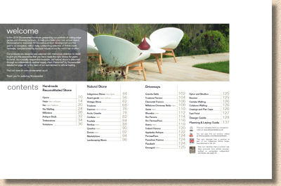
Following an immediate Contents page which splits the product range into three simple groupings (concrete, stone and driveways), and a very useful " here's what's new " page, there's the absolute minimum of trumpet-blowing waffle before getting to the meat, and that waffle largely concerns the newly launched Designer and Installer schemes which are intended to link the better-than-average Garden Designers and the above-par Installation Contractors with the more discerning clients. It's essentially another Approved List albeit with an upmarket twist.
And that upmarket twist is instantly evidenced by the insistence on referring to concrete as " handmade reconstituted stone ". Really? Handmade? I know for a fact the concrete is not mixed by hand, it's not dropped into the moulds by hand, it's not manually de-moulded when cured. Fair enough, it may well be touched by human hand at some point, maybe as the shrink-wrap is melted over the filled pallets, but claiming the flags are 'handmade' is stretching the truth to the limit of fragility.
There's absolutely nothing wrong with concrete. I've said it before and I'll say it again: it's a fantastic yet unfairly maligned product, but without it, we wouldn't have a construction industry. Trying to give the impression that these flagstones are a gourmet product, that they're lovingly crafted by leathern-handed, smock-clad artisans in thatched workshops powered by a moss-smothered water wheel tucked in a tranquil valley is just bollocks. But does it matter? Probably not. I doubt that customers buy a paving because it claims to be hand-crafted; they buy it because it looks good, and there's no doubt that Stonemarket paving looks good, and especially as portrayed in this brochure. Still, pretentious twaddle just irks me – style over substance. Yuk!
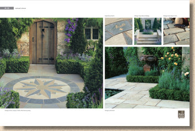
Just look at the quality of these images! They are stage sets, but they are incredibly detailed and deliberately crafted stage sets. The title page for the aforesaid 'handmade concrete' is selling a garden ideal. Less than a third of the double page spread is actually paving: the bulk is lifestyle. It's colour-themed summer planting, it's neutral coloured conservatory, it's stylish garden furniture with immaculate soft-furnishing, it's Pimms and strawberries. The paving isn't even identified! But it all sets the scene for what Stonemarket sells – a fantasy of a better life.
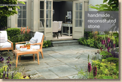
These images could be Chelsea gardens (coming up in just a few week's time). These are most definitely not back-to-back terraced houses, or even Barratt houses. These are luxury so-called 'Executive Homes'. This is selling paving in the same way as they sell kitchens and bathrooms, and it is done so devastatingly well.
OK, so most of us will never have a home like that or a garden like that, but what these images provide is inspiration. They plant the seed of an idea, the bones of a design, they prompt the imagination to think beyond a basic rectangular patio and create a patio or driveway as a key part of a wider landscape which takes in the planting and the furnishing and the lighting. Jeez! It's good!
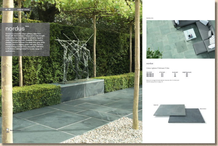
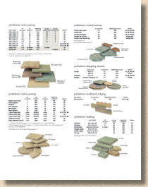
Look at how the barely-technical detail is provided. Minimalist, simple, clean, clear and classy. Unlined table format for sizing and pack quantity information, and stacked 3D swatches, which look great but actually show almost nothing other than basic colour contrast. You'd struggle to identify the texture, but the isometric swatch assembly looks so much better than the usual postage stamp, overhead shot table layout.
Look, too, at how the pages aren't over-stuffed. On those which aren't double-page wow shots, there's a simple blank header and footer, which although it takes up page real estate, actually makes the layout seem airy and spacious. In't it funny how the eye can trick the mind?
I could eulogise for another 500 words at least, but I think you get my drift. Stonemarket is still the dog's knees of brochures, and by quite some way, but then, it has a bigger budget than anyone else – it would be no surprise if it was somehow discovered that it had a bigger budget than all the others combined. So, it's dead easy to make a sumptuous brochure if you have enough money to throw around, innit?
No it's bloody well not! I've seen plenty of brochures from established suppliers where a budget has been doubled of trebled, often at the behest of a new marketing team, but it is never a guarantee of success. Money alone doesn't bring that sense of understated class; for that, you need impeccably staged sets to give you the uber-cool images, and a damned clever photography team to maintain that consistency of style and sassiness. You also need stylists to create that generous-feeling page layout, and not least, a word-smith capable of conveying the potential of the paving without ever descending into flowery nonsense.
Even if it was possible to distil everything it takes to make a great Stonemarket brochure, to encapsulate it all in a simple formula, no-one else could ever do it for the simple reason that they just don't have the impressively expansive range of quality Stonemarket products, and at the end of the day, no matter how good, clever, stylish, luscious or stunning a brochure might be, without the products, it's practically worthless.
No matter who you are, contractor or customer, designer or dreamer, competitor or cheerleader, if you've not already got a Stonemarket brochure, you had better bring a signed note from your mam. Other than a total absence of life, there is simply no excuse not to have this most essential of paving brochures, and especially not this late into the year.
Stonemarket Customer Line: 02476 518 700

