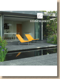
Stonemarket 2013
This is a bit strange. It's a bright day outside. It's mild, it's sunny, it's dry. The heating isn't on, and it's still light at 9pm. So how come I'm reviewing the Stonemarket 2013 brochure? Doesn't this usually happen just before Christmas, in the depths of darkness, whilst wearing a vest and an extra-thick pullover?
This year, events have conspired to mangle my schedule, and so instead of leafing through the lush tome that is the Stonemarket brochure and dreaming of the possibilities once the better weather arrives, the allegedly better weather is upon us, and I've already seen several of the new items being laid. It's more of a retrospective than a review.
Over the past few years, Stonemarket's annual eye-feast has become the benchmark for paving brochures, the one against which all others are judged. It's classic example of finding a formula that works and then sticking with it, making only minor incremental changes that don't impinge on the sense of style or touch of luxury. Mind you, most, if not all, of the other brochure publishers would sacrifice their first-born for the budget available to the Stonemarket brochure team. To paraphrase Dolly Parton, it takes a lot of money to look this expensive.

So, they've stuck with the unmistakeable not-quite A4, white background format, with the uncluttered, clean styling that has been the standard since 2008, and like last year's offering, the amount of white on the cover has been slightly scaled back from the minimalist days of yore, but without compromising that crisp, chic constitution. 140 heavyweight pages, just as last year, and, as we should probably expect in these days of Os-terity, significant chunks from previous years have been re-used. Hey! If it ain't broke….!
To be brutally honest, there's not a lot that's new in this year's effort. Just four new 'bits' are highlighted on the contents page, so we'll have a look at them in due course, but I wanted to mention the Foreword, which instead of being some meaningless guff from the MD or Sales Director about how the company is enduring a season-long orgasm such is their excitement with the new brochure, we're given a short but thoughtful piece about 'Garden Design Trends' by top gardening bod, Andrew Wilson.
Oh, I'm not daft enough to think that Stonemarket didn't " suggest " he mention certain types of materials which they just happen to sell, but in a little over 200 words he does give an elegant summation of how many garden designers currently envisage the hard-landscaping element. Can't agree on the wide-joints thing, but it is good to see an alternative perspective rather than marketing bluster.
After that, we're straight into the meat. No filler, no blurb, no bollockese, just a jaw-dropping double page image of the Opera Reconstituted flagstone in its new colour. This is what makes the Stonemarket brochure the pace-setter. Just look at the sheer quality of that image. If you want to be hyper-critical, you could point out that you can't make out much of the paving detail, but sense the mood that is created. The style and and atmosphere oozes from the pages and envelops you. It's almost as though you can feel that incredibly tactile surface beneath your bare feet.
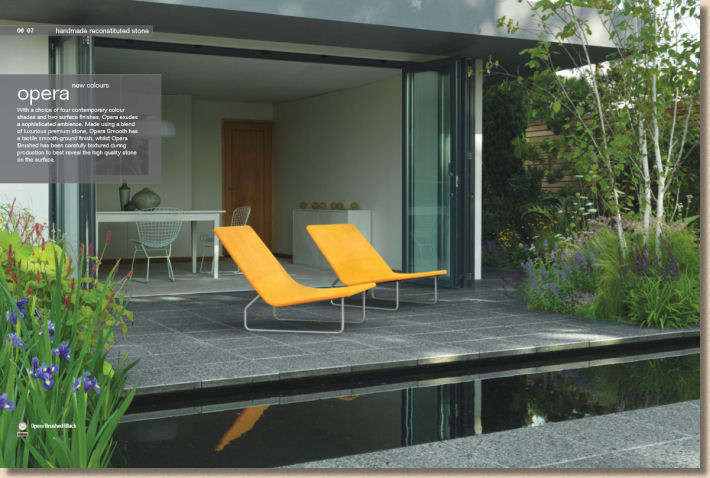
The addition of three new colours, Black (well, charcoal really), Marron (a porphyry-like palette of reddy-blacks and purples), and Buff (err, buff!) make this range far more versatile, but still just the one size which sort of screams to be laid as stackbond. It desperately needs a rectangle, possibly even one of the plank-like formats,. Say 800x200mm, which would still retain its modularity, but open up so many other design possibilities.
Those with memories as long as mine will recall that the Stonemarket brand was very much built on its expertise with concrete paving. For the last decade or so, that focus softened to encompass natural stone, so it's refreshing to see a renewed commitment to concrete, whose day will surely come once again. After all, you don't put a product on the cover of such an important brochure unless you are backing it to the hilt.
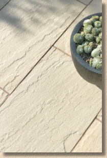
Similarly with Haus (how do you get an umlaut? Oh, here we go …. ü). Haüs is reconstituted (pronounced 'con-crete') too, but there the commonality with other cast or riven-effect concrete flags ends. Haüs is a modernist's take on concrete flagstones, with crisp arrisses, subtle surface variation, and homogenous colouring. It has the advantage of offering four different sizes, albeit in project pack format, and the innovation for 2013 is that the riven flavour is now available in the sandy Dune colour.
I'm not a massive fan of Haüs. It's neither one thing nor the other: it's not an authentic riven copy but it's not a clever new concrete 'feature paving' either, and for what it costs, you want it to do just a bit more than lie there looking gormless. It always strikes me as unassuming, almost bland paving. I've seen a couple of jobs where it has blended perfectly with the owners' style and the building architecture, but it was too insipid, too quiet and undemanding. It needed to push itself forward a little more, if that's possible for an inanimate lump of concrete!
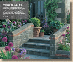
On we go, and many of the images we pass have been seen before, but as I've said before, these brochures are not targeted at obsessive such as me, but at the clients who will only invest in a new patio or driveway once a decade or so, and consequently they have no idea that the image of Millstone Walling and Steps has been knocking round for a few years. It was a great image when it was first used back in 2008 and it's still a great image. I wouldn't have a clue how that product group, the walling, coping and bull-nosed steps, could be better portrayed. It's more or less perfect.
Aha! Here we go with the current 'in thing': native stone. In fashion, there's an adage that, if you can recall the first time a particular look or style was popular, you're too old to wear it now, but the same can't be applied to native stone. It may have been edged out over recent years by upstart foreign imports, but it was only a matter of time before those with discerning taste and adequate pockets realised that nothing quite has the same impact as stone hewn from the rocks on which we stand.
I know the same applies in other lands. Porphyry, a stone I adore, looks even more sumptuous under Italian skies, and even Travertine actually doesn't look too bad in the eastern Med. I'm sure Padang granite looks fabulous in China. There's something about the way stone for construction always seems to work better in its home territory, and what more proof is required than our own yorkstone? It's just….well it's just 'right'.
Over the last two or three years, many of the more clued-up paving suppliers have latched on to the fact that there is genuine demand for native stone. OK: it's never going to sell in the sort of quantities we see for the god-awful Fossil Mint, but it was wrong for it to be overlooked for so long, and so we now have Stonemarket offering four of the better offerings from the British mainland. Two yorkstones (one from Lancashire and t'other from t'wrong side o t'Pennines), a Cumbrian limestone and Auldwick, a sandstone that is often erroneously referred to as a slate, hailing from North-east Scotland.
The yorkstones, Scout Moor and Cromwell, are well known and need no wordy encomia from me. Ingleston is probably the best native limestone for paving and it make my heart sing to see this distinctively different stone being given a wider audience. In its raw state, it's mildly interesting, but once a flame has been lashed across its surface, it is transformed into a paving that emanates character. Making it available in two gauge widths (200 and 400mm) with random lengths gives it just enough versatility. De-bloody-licious!
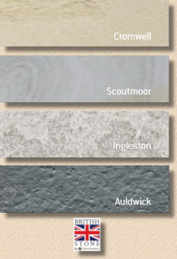
Auldwick is equally distinctive but dark and sombre which may well dissuade some from considering it for their project, which is a bit of a shame. It has a sensuous texture but in larger projects it can look too cold, too intimidating, so it needs little touches of a contrast paving to jolly it up. At 600mm gauge width, it would be very tempting to insert pencil lines of the Ingleston to perimeters or to break up bigger areas. This is a stone that laughs with contempt at mosses and sneers disdainfully at algae. Get the jointing right and it would be almost impossible for any vegetation to set up camp on a patio built using Auldwick stone.
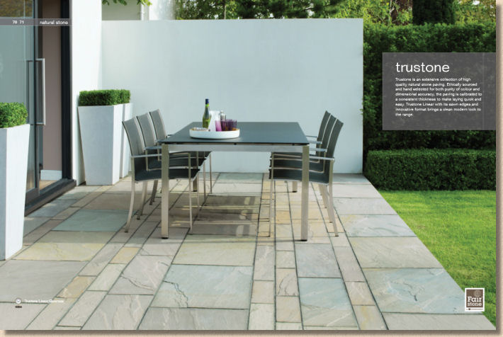
And from the heights of characterful native stone we plummet to the depth of "meh" imported materials. Avant-Garde does absolutely nothing for me; it's stone for people who don't like stone to be stony. The Vintage and Trustone ranges are, to be fair, as good as it gets for imported stone, but there's nothing to excite any longer. It's all achingly familiar but that's because it's so popular, and that popularity was earned by providing a sound, attractive paving at a reasonable price. Nothing has changed.
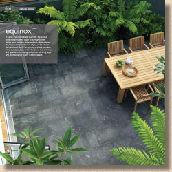
However, Equinox is new, and in yet another nod to current trends, it's a dark, funereal stone, described as a black quartzite, with grey and white veining and the definite quartz sparkle that we expect from such a stone. I've seen a small area of this laid and, bloody hell, it was depressing. It made me feel cold and downcast. It made me want to pull my coat tighter around my body. It automatically knocked 10 degrees off the thermometer.
I'll readily admit that much of this could have been the setting. I don't think it was the right choice for such an enclosed area, and come high summer, with a bit pot of blousy begonias in full bloom, it may well be the perfect sun-trap, but on that early April day, just as we were poking our heads up from the extended winter freeze, summer felt an awful long way away!
Four modular sizes, contemporary sharp-cut edges, on-message monochrome tones, it has much to recommend it to the designer types but it's not a family paving, which is a shame for quartzite is another of those stones which we vastly underuse in this country. It's hard, sparkly and virtually algae-proof, but this murky version isn't quartzite at its best.
Hey! Cheer up! Here's a new section dubbed Inside:Outside which, better late than never, latches on to the arty-farty Notting Hill trend for having the same materials as flooring in your home and as paving on the patio. Why did we never think of this when we only had grey 3x2's in the 1970s? Oh, we did, when Brian Hart flagged his mam's living room and she bollo …err…scolded him for getting mortar all over her skirting board which she'd just had painted.
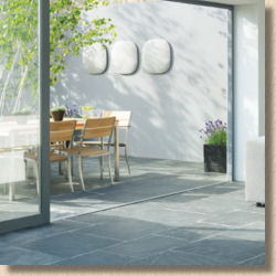
This pretentious desire for 'continuity' or 'through flow' is only of interest to those looking to be one up on the neighbours. The 'Garden Room' and all that Sunday supplement tosh is practically impractical for most families. In here is the house: out there is the garden. Inside, Travertine flooring is fine, but outside, the best place for travertine is a skip.
We're onto the driveway stuff now, and despite my expectations, this remains a sector into which Stonemarket haven't pushed quite as hard as I expected when they acquired Paver Systems and absorbed it into the business a few years back. It did seem, back then, that driveways was the obvious route to expansion for the business, and while they have given us a taste of the better-than-average, such as the Unity Paviors (which desperately need an invigorating colour option), there remains a sense that they are simply ticking boxes, offering a basic example of all the key formats.
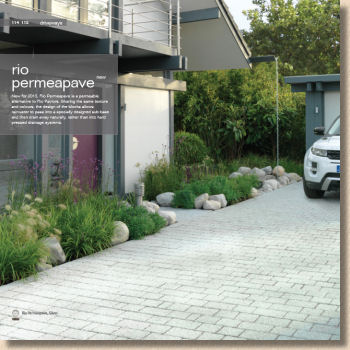
Maybe that's unfair, because they have, for this year, launched a permeable version of a Rio Pavior, the shot-textured granitic block which bears an uncanny resemblance to Marshalls' Argent. But will it sell?
I do wish we could find some way of cutting the price of permeable paving. It's a crucial strategy for managing urban surface water, but it's pricey because of the additional excavation and use of Type 3 aggregates. Personally, I think government, either local or central, should offer some sort of financial incentive in the way they do with loft insulation because there are major benefits to wider society from the use of permeable paving, but such a plan would have to be backed by manufacturers setting a reasonable price for the blocks. As one supplier said to me when I enquired about the retail price for Rio Permeable, if you have to ask, you can't afford it.
And that's about it. I'm conscious of the need not to drone on about the sheer quality of the photographs in the Stonemarket brochure. It is a block paver joint width away from being a coffee table book. It is an object lesson in how to display and photograph hard-landscaping, but more than that, the whole brochure has the right tone and feel. The text is ample without being intrusive; the layout is rich without being cluttered; the tech info is adequate without being mechanistic or baffling.
The only thing to criticise in a negative manner is the token two pages of installation guidance, but then, as I'm sure I've said before, are Stonemarket customers the type of people who undertake DIY? I've absolutely no problem with a brochure being just that: an exposition of products and styling suggestions, rather than a comprehensive 'How To…'. In fact, there are a few brochures that really ought to follow this example and stick to selling paving and leave the installation advice to those who know which end of a maul to hold.
If you've not already got a copy of this essential compendium of tasteful residential paving, what's up with you? It's been available for months and if you ain't seen this, you ain't seen owt. At the very least, download the PDF now and if you are 'trade', get a hard copy to show your customers - you know it makes sense!
