New website for Charcon
Back in the last century, when webbe-sytes were new-fangled technology that probably wouldn't catch on, many companies threw a few quid at some spotty troglodyte who claimed to be a "Web Designer" and then stared in amazement as their corporate logo twizzled around and a grainy thumbnail of their factory appeared after a twenty minute wait. It took a good few years before the more media-savvy companies realised that this here interweb thingummyjig might actually be useful, and that led us into the fin-de-siecle silliness that saw anything with even the most tenuous of links to the web being valued in billions. As we entered the new millennium, a more sensible rationale emerged, several noughts were erased from the ridiculous valuations attributed to web-based companies, and it became apparent that any company with even a hint of self-regard needed to have a proper web presence.
Fast forward to 2007 and after years of limping along with an indescribably useless and ineffective website that bore all the hallmarks of having been designed at 4:55pm on a Friday afternoon by young Jason while skiving-off and having a crafty fag on the bog, Charcon have finally treated themselves to something approximating a proper site, complete with relevant text and half-decent graphics.

For years, I've stuck to simple brochure and trade show reviews, avoiding website reviews in case my worthless opinions were interpreted as sour grapes or peevish. One website criticising another might not be the done thing. However, over the last few months, two of the bigger manufacturers that supply the paving market in Britain and Ireland have asked me why it is that I don't offer website reviews, and when I repeated the above reasoning, they seemed unimpressed and suggested that, as I'm not actually direct competitor, and because I don't have a commercial imperative (fancy talk which means I don't sell owt), I would probably be the only mug daft enough and fully justified in producing a review.
And then the PR team at Charcon send me an official announcement that their all-new website is now up and running and would I care to take a look. I would; and I did, and here's what I thought!
There are two ways of approaching this review, and it's a dichotomy that occurs with all the brochure reviews I conduct each year: do I review the brochure/site in its own right or do I review it in contrast to other brochures/sites? Normally, I like to hedge my bets and throw in a bit of both, but then comes the realisation that this would be impossible with Charcon, as there simply isn't a comparable website (or company) out there. Charcon don't serve the residential driveway/patio market, so that's all the Stonemarkets, Bretts, Tobermores and the like out of the running. Marshalls would be the nearest equivalent, but they don't serve the specialist markets such as rail and sewage works (Oops! Waste Water Treatment, as it's now known) and they combine their residential and specification products within the one site.
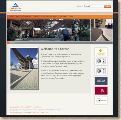
So, I'll stick to commenting on the site, which is mostly simple, straightforward, logical and extremely fast, much faster than almost any other manufacturer's site. The intro page starts off by dividing the site into two main sections: hard-landscaping and specialist products. This leads into a brief 'Welcome' page with a couple of animated images that change every few seconds to suggest dynamism. Navigation is not immediately apparent, but a quick scan around the screen finds the understated orange-hued navigation ribbon towards the top of the screen. If this had been delineated with graphic tabs, it might have been more apparent, but then it may have detracted from the clean, modern, minimalist image that is being presented.
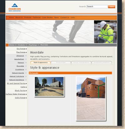
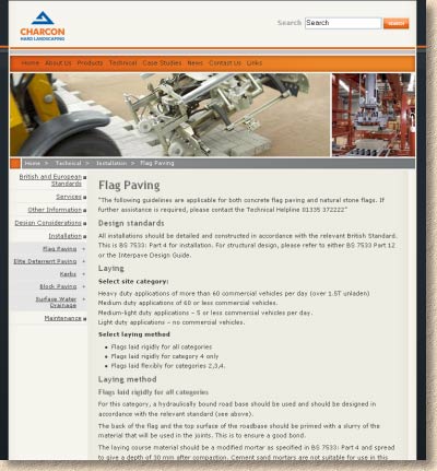
Following the links provided by the navigation ribbon leads to similar short, clean pages with a sub-menu on the left-hand side providing further links to sub-categories. Following the 'Products' link from the ribbon leads to a page where products are sub-divided into seven groups, such as flags, kerbs, blocks, suds, etc. These, in turn, lead to sub-pages where the product group is opened out and each individual product given a link, which leads to a dedicated product page that includes a much more obvious tag navigation system, with links to four classes of information: Style and Appearance, Product date, Design Considerations, and Installation Guidelines.
This is a wonderfully simple, intuitive and functional navigation system. Once within the relevant area, the user is never more than three clicks away from the required information, which is as it should be, and it's difficult to lose ones place within the site as a whole, because it is such a logical hierarchy, with 'escape links' back to the start always available via the main navigation ribbon.
The product information, which has to be the main attraction for a site such as this, is concise but covers most of what you're likely to want to know. The photographs are relatively clear but can't be enlarged. They are the usual fare of specification catalogue shots, so while being well composed and professionally executed, they aren't over-exciting. There are swatches for colours and textures, but again, these aren't expandable.
Some of the Design Considerations are extremely worthwhile and valid, but some are confusing or incomplete: there are references to “images below” that aren't below at all, and there are a lot of referrals to the Technical Services Team. Similarly with the Installation Guides, which are often far too generic and vague, and, in some cases plain bloody wrong! (notably with the advice on SuDS installation). A few illustrations would have been useful because the text is exceedingly sparse.
Throughout the site, the simple, clean look is maintained, aided by the use of a modern sans-serif font. The dark greys and oranges of the colour scheme are what I believe is called retro-chic, which means it's an updated version of the 1970s. The page template is formulaic and calls to mind the sort of template provided by those “Build-Your-Site-In-Under-10-Minutes” sites. However, the concise text and limited graphics result in very fast loading (unlike my site!) and the overall impression is of a site that is actually a useful tool and valuable addition to the printed manual the Charcon Team produced last year.
A couple of points of constructive criticism they may want to take onboard (or tell me to shove where the sun don't shine): Firstly, using ASP code to write the site means it will be difficult to get it highly ranked with the more popular search engines, which prefer good old html. ASP is great for dynamic sites, but it can adversely affect site ranking with the likes of Google. Secondly, the page titles, which are critical to good search engine placement, are vague – having a page entitled “products” doesn't tell the searchbots what type of products, from what company, in which sector, in which country. Finally, a little 16x16 pixel favicon image doesn't half improve the look of that title bar and is a great boon to anyone bookmarking the site.
In summary, the phrase that springs to the very front of my mind is “About Bloody Time”. The lack of a functional and useful site from Charcon was a major hole in their marketing and technical strategy. The site they've produced is excellent, from a product portfolio viewpoint, less so for installation guidance, but then, most users are more likely to be searching for info on product size, colour and pack quantities rather than on depth of laying course. Considered as a whole, the site is that much sought after balance of relevant information delivered at lightning speed. The only downside I can see is that I will now probably spend less time with my well-thumbed copy of the Charcon Product Bible and more time on the website, and that, I think, is just how it should be at this stage of the internet's development.
Considering those potential users, the site is well-pitched: there's enough for architects, designers and specifiers without the site ever descending into the sort of techno-gabble that would deter a contractor or even a self-builder. The site is not targeted at homeowners, and so it doesn't make any attempt to pander towards them by means of airy-fairy flowery phraseology or aspirational photo-shoots with fluorescent-toothed models. It's a solid, no-nonsense online guide to Charcon products that provides answers for the day-to-day questions most likely to be asked by those in the specification market.
Fraser Higgins, the ever-smiling Commercial Marketing Controller for Charcon says: “Our website is an essential resource for anyone involved in hard landscaping projects. The new site allows visitors to access more detailed information including technical summaries and design, installation and maintenance advice for our entire range of products. They can also select the most suitable product for an application, and look at the products in real life applications in our newly extended gallery.”
Why not nip over there now , have a butcher's and let me know what you think?
