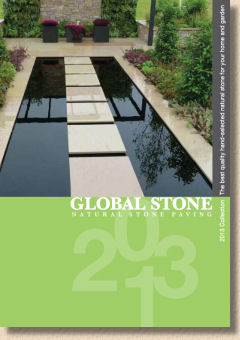
Global Stone 2013
For all sorts of reasons, it's taking longer than ever to get through all of the new brochures this season, but when I do get a break from extricating meself from failed relationships, moving house and office and garage, and trying to upgrade a website built in the 1990s into something suitable for the Twenty-Tens (or whatever we are calling this current decade) it repeatedly strikes me just how much each and every one of these publications has significantly upped its game this year.
Global Stone is the latest to come into focus and it's another example of a brochure which has been sitting on my desk for several weeks, occasionally receiving a cursory two-minute flick-through, and patiently awaiting its moment of glory. Well, that moment has come, and it's satisfying to reveal right at the outset that the 2013 edition not only maintains the tradition of quality from Global Stone, it also keeps its place in the pecking order of what is put out there by their competitors.
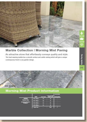
As with last year's offering , we have an A4, full colour format, but with a strong flash of very fresh green on the folded-to-be-too-narrow front cover, with the year 2013 presented in a jumbled, arty format. Last year, I talked about the re-organisation that had been undertaken to great benefit, and now that reorganisation has been somewhat reorganised so that products are largely grouped by type of material, so there is the Sandstone Collection, The Limestone Collection, The Marble Collection (which comprises just the one option: is one item a 'collection'? You'd be underwhelmed if I invited you to come and look at my car collection and told you, " There it is. Parked on the drive. No; that other car belongs to them next door! ")
I like the fresh green theme which is consistent with the re-vamped website , and I like the way the contents page is organised. I like the idea of simple icons to denote suitability, but I can't for the life of me remember which of the various 'horticultural' icons means what, so I have to keep referring to the key tucked inside the front cover.
When it comes to the actual contents, this continues the theme of last year, being heavily dominated by imagery, with reasonably generous swatches and just enough words. However, there is a slight feeling of claustrophobia which I don't recall from 2012; a sense that they've tried to squeeze as much of a photie onto the page as is practically possible.
There's a fine line between having too much and having too little on a page. Some brochures completely fill a page with one showpiece pic. Margin, gutters top and bottom, the whole shebang is given over to a single image, and it works by battering the visual sense with a huge dollop of 'wow'. Then others place an image within an empty field of nothing, which, when done well, creates a feeling of space and restfulness. For some reason, the page organisation in this year's Global Stone brochure falls between the two. There are good images crammed into a quarter page and lesser images given half a page or more, and all with minimal space between, which for me engenders a cramped, crushed and crowded feeling.
Annoyingly, many of the images are considerably better than previous years, and the products are so well chosen that you can sense the inherent quality but on some pages, it feels that this undeniable quality is battling to shine through, that it's not being given the room it deserves to make its case and present itself as worthy of deeper consideration.
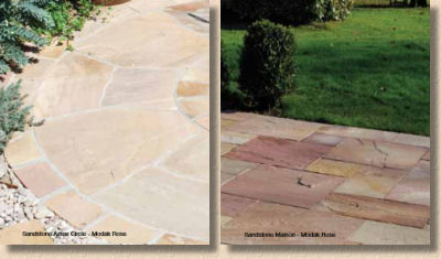
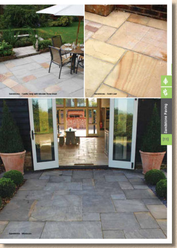
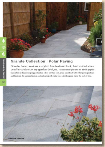
In the blurb at the back, reference is made to the fact that the paving is photographed dry (and unsealed/enhanced) and while this is laudable, on some of the images, particularly the sandstones, the colours are not always fully discernible. As a completely amateur togfer who spends far too much time togferring paving, I know this is down to the light we get in mid-summer Britain. It tends to bleach the true colour of the stone, and so you're faced with the problem of whether to digitally process the images or to show-it-as-it-is. I know some brochures feature nothing but 'enhanced' images and I feel this is bordering on unfair in some cases, but when a stone with good natural colour, such as the Modak Rose Sandstone feature circle (p15) looks wan, while the very same stone in the Maison Collection on p24 looks vibrant, maybe it's time for a re-think.
And images are the essence of this brochure. Some of this year's publications have been a little too free with the waffle and trumpet-blowing, the seemingly irresistible urge to let some copy writer fully vent their creative airs to wax lyrically about lifestyle and inspiration and various other intangibles. Some, albeit a few, get the balance about right, but Global Stone seem to have decided to let the photos do all of the talking.
This would normally be regarded as a good thing, but it relies on having seriously good images which genuinely are worth that fabled 1,000 words. There aren't enough images of that quality in this brochure. Front cover aside, there are a number of showcase projects that have been hinted at, teased, tantalised throughout the 76 pages. There are a number of too-closely cropped images showing what must be, when seen in full, visually stunning jobs. Maybe there's some bellend just out of sight wearing a loud and inappropriate shirt in a residential area, or maybe there's a contractors' van parked with the intention of getting name and phone number into shot, but it struck me time and again that these are images that need more space; they need to be bigger, they need to be more expansive, they need to be afforded the grandeur they so obviously deserve.
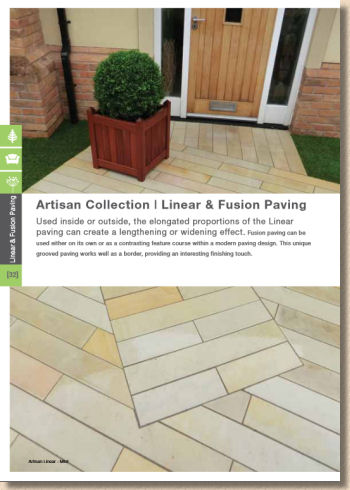
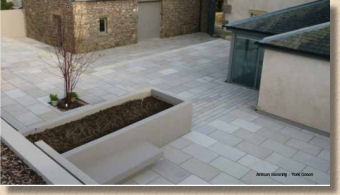
Occasionally, we get to see it, as with the striking use of linear/long aspect/plank paving on p32. OK, it's Mint, which is a real shame, and there's a bloody awful white text-filled strap across the middle of the image, but putting all that to one side, this is a lovely piece of work, echoing the board construction of the stylish front door. Turn the page, and an equally notable job, in a better quality stone (the York Green), with a wider range of unit sizes, is crammed into half a page and it feels that we are only getting half the story. I'd love to see more of that image. It certainly deserves as much space as the front door shot, but it looks and feels cramped.
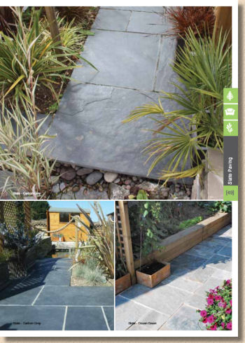
Too many of the other images are close-ups, tightly cropped shots showing a square metre or so. Now, these are invaluable as swatches, as guides to colour variation and jointing suggestions, but to get a real feel for a flagstone or sett, you need to see a bigger area. It needs scale, it needs context and it needs contrast. It reminds me of the wallpaper sample books my parents would pore over at the local housewares shop after announcing they were going to 'do up' the front room, the one no-one was ever allowed into unless the parish priest was visiting, and therefore the one room that least needed re-decorating. Yes, you get to see a bit of the paper and the colour and the pattern, but trying to mentally transfer that to a whole room, with furniture and lighting and angles....well, that was a real leap of imagination.
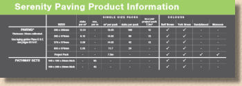
Considering the technical information, it does exactly what you'd want. The sizing and packaging information is clearly presented in a simple table format on the page where the products are shown. I find this to be much more useful than having to refer to a page somewhere near the back, folding over the corner for future reference, and then constantly switching back and forth to get the full picture.
The laying guides are exceptionally generous, and I suspect this is to enable them to be readily photocopied by the many builders' merchants that source their paving through Global Stone and then passed on to customers in the belief that an A4 page showing 15m² in a square resolves all your layout queries. Very shrewd, and an idea that may well see itself being replicated in other brochures in the years ahead!
Have I been too harsh on Global Stone? After making them wait so long for my opinion of suspect value and disparate, wandering thoughts, have I expected too much or viewed it all through overly-tired eyes? I do hope not, for that is not, and never will be, my intention with any of these reviews.
This is a brochure of images. It is essentially a collection of product photos and makes no pretence to be anything more than that. It is not selling you a lifestyle, nor trying to be a chatty, browse a-bit-at-a-time magazine. It's a glued-together assemblage of photies of paving and hard-landscaping. It shows them as they genuinely are, with no tricks, staging or gimmicks. It is, quite possibly, too honest.
However, if you are going to rely solely on imagery, then you need the very best quality imagery and not enough of the images herein fall into that category. None are awful, but too many are just OK and not enough are stunners.
Time and again, potentially great photies are ruined with a white strapline of unnecessary text
Having said all that, though, for the homeowner or contractor looking for a good range of natural stone to compare and contrast, the selection from Global Stone is as good as you will find.
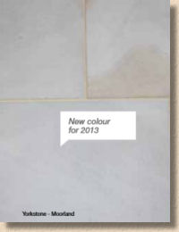
Over the years, they've consistently tweaked and expanded and chopped the range to offer what the GS team consider to be the best all-round offering at that point in time. So, we now have ceramics which look very intriguing, as well as clay pavers. They've also persisted in offering a native stone, the unmatchable yorkstone, and for 2013 there's a new colour option, 'Moorland' which offers subtly cooler hues but the same classy diamond sawn styling.
Overall, this brochure represents honest, value-for-money paving, with all the most popular options and enough of the 'something special' to suit most tastes. In fact, if you want something straightforward, you want good quality stone, that is ethically sourced and backed-up by British-based expertise, then Global Stone ticks every box, and for that reason alone, it's worth looking at what they can offer.

Download your own copy now - click here
