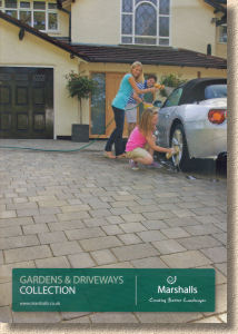
Marshalls' 2012 Brochure
Next up for examination in the ongoing series of brochure reviews comes this pretty little effort from some outfit by the name of Marshalls . A quick flick-through suggests they might just have a future in this business.
More seriously, the Marshalls' 2012-13 edition (a similar dating tactic has been used on junior cousin Stonemarket's current brochure ) follows the format that has served them well for the past decade: A4-ish sizing, generous 160+ pages (164, actually, this year), distinctive dark green branding on the cover, and much that is familiar inside.

In fact, so many of the Marshalls' products have acquired the status of near National Treasures that they need no introduction or re-visit. Names that are legendary in the paving game, such as Saxon, Tegula, Perfecta, and DriveLine are, reassuringly, still there as confirmation that the best products are usually the simple, straightforward, versatile ones. Over the years, we've seen a huge number of less simple, less straightforward, less versatile products arrive in a blaze of glory and expectation only to slink away with barely a whimper once they've failed to excite the general public. I won't name names, but we all know products from all manufacturers which should never have seen the light of day.
Which bring us to the annual obsession with new products. When the economy was booming, confidence was high and so the manufacturers bombarded us with all sorts of new items each year, but now there's much more caution and we see less genuine innovation but quite a bit more 'variation', by which I mean expansion of existing ranges via the addition of new sizes or colours. It's nowhere near as radical, and carries a smaller financial risk, but allows manufacturers to maintain an impression of freshness and vitality.
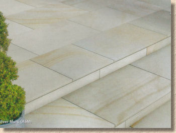
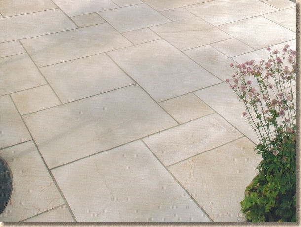
And new products is one of the topics that is raised by the 2012-13 Marshalls brochure. There are some, but they are, arguably, more variation than innovation. If we look at the section now referred to as Garden Paving, there are five products highlighted as new, but they fall within just two product lines, and involve either new size formats ( Fairstone King Size Sawn ), new colours ( Fairstone Caramel Cream Multi ), new packaging ( Fairstone and Coach House ) or new features such as steps and circles ( Coach House ) which are new in the sense that they were not previously available in that product line, but are not actually a new idea.
Now, some of these new products are very welcome. The king size options in Fairstone Sawn are probably overdue. 750mm by 750/1000/1250mm options (or their 140mm module equivalent) have been available from a multitude of suppliers for years, so it is logical for them to be made available in the premium brand. They massively increase the design options for this type of paving, and hark back to the glory days of 'ballbreakers', the huge yorkstone flags that we hauled and heaved when I were a lad. They need using wisely: it's all too easy to slot them into a larger patio willy-nilly, when the most impressive use is as feature stones. They are big buggers, so make sure they stand out from their lesser siblings, and make a bold statement. Don't allow them to become lost in a morass of mixed sizes.
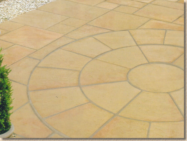
The Coach House Steps and Circles are just further logical extensions of a proven range. They could have been (and probably were!) predicted when Coach House was launched as the successor to Chancery back in 2009. They bring versatility, which, for me at least, is the single most important non-aesthetic feature of a paving product. Versatility expands creativity and enables individuality, and we all want our paving to be individual, don't we?
Meanwhile, over in the Driveways section, only two new products: an additional large size for the unimpeachable DriveSett (Tegula) range, and a genuinely new block paver with the confusing name of Elise .
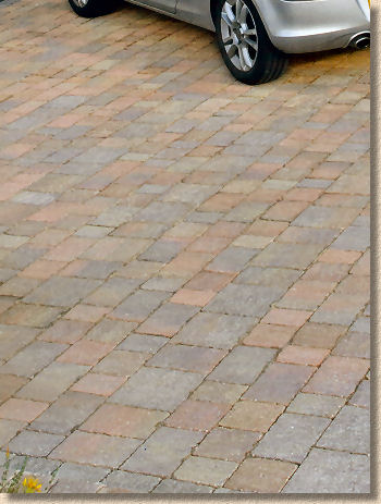
The extra big DriveSett offering, at 240x240mm, adds the aforementioned versatility by making gauged courses fully possible and by increasing the number of potential laying patterns as well as ramping-up the randomness for random layouts. So, variation rather than innovation, but extremely welcome nonetheless.
The Elise is, as previously stated, genuinely new, but how new? It's only one letter away from the Elite, which is seems to have replaced, but offers only one jumbo size, 300x150mm, and two colour options. Confusingly, the blurb claims the paving will be quicker to lay because the blocks are 50% bigger than standard (200x100mm) units.
Two points: Firstly, why does that make it quicker to lay? There may be fewer placements per square metre, but each placement is heavier, and therefore more tiring (thanks to the British insistence on hand-laying everything) and the generally accepted wisdom is that, to a large extent, it's the weight of paving laid per shift, not the area, which determines overall productivity.
Secondly, since when is a 300x150mm block (total area = 45,000 mm²) 50% larger than a 200x100mm block (total area = 20,000 mm²? It's more than twice as big, 125% larger if you prefer your figures that way.
The blurb fails to mention individual block weight, but does reveal that a pack of 204 blocks tips the scales at 1,056 kg, which equates to 5.2kg – oooh me wrists! For comparison, a Driveline 50 weighs just 2.3 kg, and even a Drivesett 240x160 only manages 4.4kg.
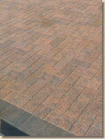
I don't like these textured blocks. They are an industrial-strength magnet for algae, lichens and other assorted crap. The granitic textured blocks, such as the rightly-revered Argent , get away with it by having an upper face of exceptionally hard aggregate, but when it's a general concrete mix, the algae start making reservations as the blocks are lifted off the delivery wagon.
I never liked Elite , and before that I despised (and believe me, that is NOT too strong a word) the bloody awful Magma/Lava stuff which besmirches a driveway in a prominent position within this village, and usually sports a more verdant sward than that of the local bowling green.
I can't take to this Elise . I don't like the texture, I don't like the jumbo proportions, I don't like the lack of compatible sizes. The colour isn't bad, but it isn't enough to save this from the fate that surely awaits it.
If the market buys into the strange texture and bulky format (stranger things have happened – look at Russell Grant!), it would be simple to produce alternative, more user-friendly sizes in subsequent years, but to launch a product that has both a new(ish) texture and a new(ish) size is unnecessary double handicapping.
So, that's the new stuff covered, and the only other topic I want to address is the overall layout of the brochure. Two things struck me about this edition: for some reason, Driveways, which once upon a time took pride of place at the front of a catalogue, have been shoved to the back while the fripperies (as I unkindly refer to them), the walling, the deco aggs, the sodding water features, have been promoted to mid-brochure respectability. Why? Don't make no sense as my 8 year old nephew says.
And what's with the individual table of contents? Garden Paving has a list of its allocated products, as does Accessories, and so too with Walling and Driveways, but there's no overall table of contents. And no: the summary table on page 3 which lists the individual sections, does not count.
I'm wanting to show a customer the new Elise rubbish, but how do I find it? I could flick through the whole brochure until it leaps out from a page to assault my eyes, or I could first look up the main index (page 3) to find out where the Driveways index is located (page 104 according to the main index, but page 107 in real life) and so turn there and look up Elise (page 136 if you must). Wouldn't it be simpler to provide a double page spread of ALL products with accurate page references, preferably somewhere near the beginning of the brochure (I'd opt for pages 2 and 3, if I had any say in the matter).
Enough. I don't want to deter anyone from obtaining a copy. When I step back and tune out the minor gripes, this is a fantastically well produced brochure. It's supremely professional in both layout and presentation. The waffle at the beginning annoys me but is invaluable for the actual intended audience (who tend not to be opinionated know-alls like me) and performs that function better than any other publication. And of all the brochures, catalogues, collections, and portfolios published each year, Marshalls is the one everyone simply MUST have. When it comes to paving design and choice it's as essential as a spade is to construction.
But where heartfelt praise is genuinely deserved is in the choice of images. The vast majority of the fancy photies used throughout the brochure are REAL jobs, laid by REAL contractors for REAL customers under REAL conditions. Staged and studio shots will always be necessary but I can think of no finer testament to a range of products than to show them in their native environment and let them speak for themselves.
Marshalls' 2012-13 Brochure. If you don't have a copy, you're not serious about paving.
