Bradstone & Stoneflair 2010
Once upon a time, there was a major international company that owned an exceptionally good poker hand of landscaping brands. There was an obvious ace, in the shape of a premium domestic paving label, with a King that had a solid reputation in the commercial sector, supported by a Queen that offered an unrivalled range of aggregates and a Jack that provided value for money without compromising quality. Then, about 18 months ago, for reasons which defy explanation, the powers-that-be decided to re-arrange their cards, turn over their hand and declare this impossible-to-beat Royal Flush as a lowly Ace High, consequently ceding the game to their rivals before going to hide in the toilets on their own.
From what used to be the most communicative of manufacturers comes a pair of brochures that prompt dozens of questions beginning: why? The fact that the brochures had to be requested indicates just how far into their corporate shell the various Aggregate Industries (AI) brands have retreated. A couple of years ago, I'd have been patiently and precisely guided through each brochure by a PR-accompanied AI marketeer who would proudly explain the thinking behind the brochures, how they saw the coming season, where they thought the excitement lay, and their unassailable support for all sorts of environmental and social causes. This year, I have to ask for copies from the one remaining face I know at the company, and then wait two weeks for the new marketing crowd to put them in the post with an impersonal cover letter suggesting how I can create a beautiful and inspirational garden. The plot has very definitely been lost.


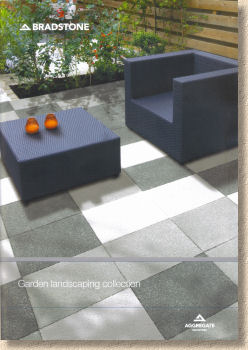
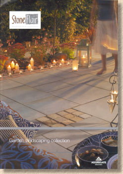
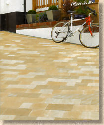
The first thing that strikes about the pair of brochures branded 'Bradstone' and 'Stoneflair' is just how similar they are. The business masterplan used to be about creating distinct brands with very definite markets, but now there is nothing to choose between them. Both brochures comprise a semi-gloss A4 format with a full-cover image overstamped with the Aggregate Industries logo; both are entitled "Garden landscape collection", and both have the named brand shrunk to an afterthought before being tucked away in the top left corner. The Stoneflair issue runs to 40 pages while the Bradstone offering has been given a less-than-generous 56 pages, but neither weigh up to the recent challenges from the other major suppliers, some of whom offer twice as many pages and in a noticeably plusher package.
Starting with the Bradstone brochure, it seems that, like many other manufacturers, there's been a conscious decision to limit innovation in the current economic climate and so there's only one new product which is basically an extension of the Panache range to include ground and textured options in light, medium and dark shades. However, there's no sizing information given on the page. Instead, we're referred to page 52 where careful perusal of the tabular information charted over two columns reveals that New Panache comes a 450x450mm squares while original Panache is a 400x400mm format. Wait a minute! Doesn't that mean that the two are basically incompatible? Why?
New Panache looks like an option that should have been given a standalone name. Rightly or wrongly, giving a product the same name as an existing product suggests compatibility. While it may be an attractive option (I haven't seen it in the flesh, but you could probably have guessed that much) it's nothing radically new, as ground and textured paving have been with us for years. I really do like the simple monochrome palette, which is bang on trend, but the confusion over the name defies logic.
Panache, both original and new, are corralled into the section dubbed "Contemporary Paving", followed somewhat predictably by "Traditional Paving", which is essentially the imported stone products and the wet cast products by which Bradstone established its reputation, and then "Block Paving", which is strangely split into what I assume to be Bradstone brands, such as Woburn, and then Charcon brands, such as Parliament and Andover. Why?
Three short sub-sections for Walling, Edgings and Decorative Aggregates wrap up the interesting part of the brochure and the final pages are given over to the usual caveats, laying patterns, and a busy size chart spread over three pages. No laying guide; no maintenance and aftercare advice; no plugs for recommended contractors.
Overall, this is a strange brochure. There's a bit too much flowery text and many of the photos are too small. On the subject of photography, I don't ever recall seeing so many images compromised by shadows. In some instances, a touch of shade can add depth and character to a photgraph, but in half-a-dozen or more photos here, the shadows spoil the appearance of the paving.
It is high quality, well-staged photographs that sell paving, so cramming a main photo, subsidiary photos, blurb text, swatches, image explanations, BRE and Carbon labels and links to the size charts, all onto a single A4 page per product doesn't really do justice for the paving. Sure, it's understandable for low-value products such as the utilitarian Peak Paving or block paving kerbs, but for new products? For prestige lines such as the polished natural stone? Why?
Let's look at the Stoneflair catalogue. Oh look! The same logos for BRE, ethical credentials and surface protection. In fact, the whole catalogue is incredibly similar to what has gone before. There are some small differences but it does have the look of homework copied on the bus.
Product names are printed in all capitals, but photos are small (again) and a third or a half of most pages is given over to white space with blurb text. This brochure has three product sub-sections, namely natural stone, reconstituted stone (pronounced " kon kreet ") and block paving.
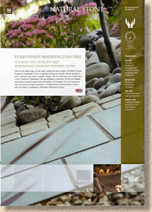
The most notable product is the native stone, Waddington Fell, a "yorkstone" which hails from Lancashire and a truly gorgeous thing it is. So why has it been portrayed using a photo which barely shows the stone itself and is afflicted with a strange blue cast? There's great excitement about what they've called "The World's first responsibly sourced natural stone". There's a sort-of explanation given: responsibly sourced means that it's like….err…. sourced responsibly, and ….errr… ethically and ….err….with minimum quarrying. All laudable credentials, admittedly, but how is that different to what almost every other supplier of note is claiming? I'd much prefer to see a decent photo or three, a selection of swatches to depict the colour variation within the stone, and some sensible size information. Referring me to another back-of-the-book size chart where I have to scroll through a column-and-a-half of other products and then squint to find that "PS Waddington Fell" comes in two patio packs (10.2m² and 5.5m²) is not particularly helpful.
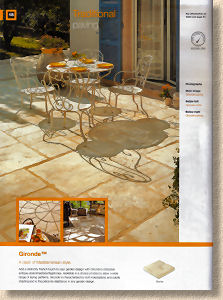
Leafing through the Purestone products it's hard to spot what's significantly different from what Bradstone offers. An antiqued Indian sandstone, black and yellow Kadappha limestone, granite,
The same can be said for the concrete reconstituted stone. There are slight differences, and the names are different but there's a still an enormous sense of déjà vu. The prize for best comedy line, though, has to go to the strapline used for the wet-cast wannabe weathered sleepers. "Stonewood – Stunning Realism" . Damn, I nearly slopped hot tea all over my keyboard when I read that! I know my eyes aren't what they were, but they're not * that * bad!
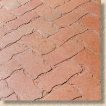
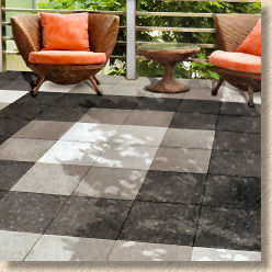
Block Paving. Rumbled Infilta. Not only is it the same product, it's the same chuffing photie as that used in the Bradstone brochure, only cropped further to the right! Stonemaster (which I still love) has at least been given an original photie, and Monksbridge genuinely is unique to Stoneflair. Roche Abbey with its ludicrous claims about evoking "all things pastoral with its hint of natural clay" is foul. It's what my younger daughter would call "minging". We've had some shockers in the block paving sector in recent years, but this is right up there. I'd actually prefer pattern imprinted concrete to this abomination!
The brochure closes with the inevitable laying guides, size charts, caveats and whoa! Two paragraphs of maintenance advice cunningly disguised as a plug for the underperforming "Pave Shield" water-based sealant. Wow!
Have I been harsh? I didn't intend to be, but reading through these comments now, there's little of a positive note. After careful consideration, I've determined this is due to a combination of two factors. Firstly, I've been spoiled in recent weeks by plush publications from those that AI would consider to be their main competitors. Marshalls, Brett, Stonemarket, Global have all produced credible and worthwhile catalogues that are wonderful sales aids. This pair from Bradstone and Stoneflair, while not bad, are not quite in the same league. They actually manage to make the brand seem cheaper than it really is.
Secondly, and the abiding thought I'll carry with me over the rest of this season, is the volte-face regarding brand identity. For many years, the brief was to give Bradstone, Charcon, Stoneflair, and Border Aggregates their own identity, their own target markets, their own feel and style and look. What's striking now is the exact opposite. It's all about how similar they are.
Can two separate brands be justified? I'm sure there are logistical and marketing reasons why the two must remain, but as an interested bystander, it seems like a lot of unnecessary duplication with no obvious benefit to me, the end user. Why?
For contractors, I can see one or both of these brochures being kept under the seat in the van, rather than on the dashboard. They contain some good information and there *will* be clients looking for some of these products, but when you're looking to impress a potential customer, the photography and styling of the competing catalogues will probably have you reaching for them first.
Brochures will be available from Bradstone and Stoneflair stockists throughout the country. Alternatively, you can download PDF versions from the AI website or order copies online via the following links.


