Brett 2010 Brochure
Last year's brochure from Brett caused a bit of a stir with its magazine-like styling and customer-friendly format, so it should come as no surprise to see that the follow-up for 2010 doesn't stray too far from the overall look and feel.
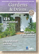
Once again, the cover very deliberately evokes a family-themed up-market magazine, with 100 full-colour pages in an easy A4 format. Entitled "Gardens & Drives" , the Brett logo is reduced to almost an afterthought tucked away in the lower right corner. The cover shot of a character-dripping timber front door on a period property looks very welcoming and maybe I'm reading too much into it, but a doorway on the cover? Come on in?
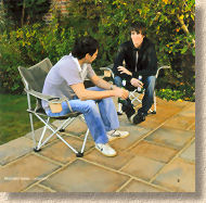
The first pair of pages include the index, which is useful, and a couple of 'Welcome' paragraphs, but look at the photies – not a bloke to be seen, just yummy mummies and photogenic kids. It's that old adage about the woman of the house making most of the purchasing decisions. It's page 5 before we get a whiff of testosterone, and even then, they look like a couple of student layabouts who have brought home their laundry from Uni for Mummy to wash while they neck their owld fellah's beers on the new patio!
The first section of the brochure considers Gardens, which means patio flagstones in concrete and natural stone, along with decorative aggregates and walling blocks. The section, like the brochure as a whole, is dotted with useful tips, such as the recommendation that regular sweeping and a wash-down with soapy water will keep the new paving looking great, fit in with the magazine feel. The images dominate while the text plays a subsidiary role, which amounts to little more than naming the product and listing the sizes or formats available.
The first of the new products puts in an appearance on page 23. Fossil Mint in a “tumbled” flagstone format. I know, it's not really new, but it's new to Brett in this style. I have to admit to being somewhat surprised that they've manage to distress Fossil Mint without it turning back into sand. Of all the Indian imports, including the gaudy colours that give many of us a headache, Fossil Mint is the pits. So light-coloured that it blinds you in summer and too soft to withstand even the feeblest of algal spores. Still, the marketing people tell me that the general public love it, so what do I know? There's no accounting for taste!
Another new colour in the un-battered sandstone flag range has been dubbed "Mountain Mist" which is shown only as a swatch and not as a main photie, so it's hard to tell that it's essentially the Kandala Grey, my favourite of all the Indian sandstones.
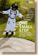
You've got to love the young astronaut on page 27. What a great photie! I bet they had a job getting that outfit back off him when the photo-shoot was over. I love the connection to 'outer space', as in “the garden”. Very clever and great way to market hard-landscaping to mums and families.
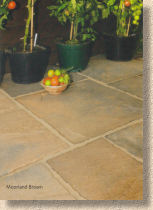
Concrete flags have not been overlooked. The top-end range, Canterbury , has been awarded a new colour, the " Moorland Brown " which is predominantly buff-brown with shadows of charcoal run through it. I've not seen it in the flesh but in the photies it looks very earthy and warm, so I think it will do well with those creating a more traditional garden.
Oh dear! It was all going so well and then they go and spoil it all by doing something stupid like…laying a flag on a ring and dab bed. No no no no no! These patio flags need to be laid on a FULL BED of mortar. Minus 25 points!
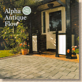
Anyway, on to the Driveways section where everything is pretty much as it was with the addition of some very good new photies and a change to the Alpha Antique Flow, the permeable version of the much-loved tumbled block.
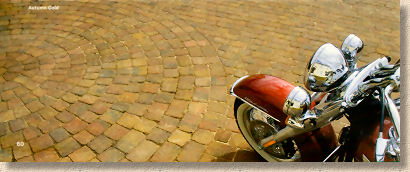
Speaking of those new photies, last year's brochure featured a truly beautiful specimen of British motorcycle engineering at its best with a BSA Gold Flash in pristine condition.
This has now been supplanted by a brash and loud motor-sickle from across the pond, one that is the epitome of style over substance, promising much but delivering little, other than hefty maintenance bills. We've some gorgeous modern British bikes – there's one parked on my drive right now, just waiting for me to finish this piece – so if there has to be a bike in the photie, can we please have a Triumph or a Norton?
Alpha Antique Flow is essentially the permeable version of Alpha Antique, and it was really needed, as the existing permeable versions of Omega and Classico left a huge hole in the range: why wasn't there a permeable tumbled block? That has now been rectified, albeit in just three of the colour options – Brindle, Charcoal and Autumn Gold.
I think it's fair to say that the uptake of permeable block paving for front gardens hasn't met the expectations of the manufacturers, but much of that is down to two key factors: uncertainty from the contractors and hefty prices for the installed paving. However, it has to change. It's been noticeable that several manufacturers have scaled-back their trumpet-blowing about CBPPs and adopted a much more realistic approach. In a decade or so, permeable paving will be the norm, but we are still some way from there, so there's no need to swamp the market with a bewildering array of styles, shapes and colours. A more cautious, step-by-step approach will pay off as more and more homeowners come to realise that they have to accept some responsibility for our environment, and the new-builds use CBPP or other suds-compliant paving as standard.
The brochure closes with a sensible and unfussy technical section, offering advice on sizes and pattern choice. As with other recent brochures, there's a noticeable lack of DIY guidance other than the absolute basics, and this is married to the promotion of recommended or approved installers. It's relatively subtle in this brochure, but it's there, nonetheless.
Overall, the photos are the best ever seen in a Brett catalogue, and the text is balanced to work exceptionally well, by not dominating or boring, but by conveying just enough essential information to tweak further interest. The magazine flavour still works and the browsability of the brochure as a whole is probably better than last year's debut issue. It's clearly targeted at homeowners, particularly those of the female persuasion, but it's a great sales tool for contractors thanks to the sheer number of large, good quality, well-staged photies.
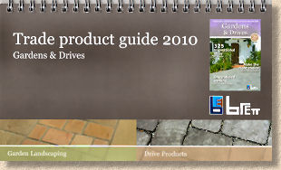
When it comes to the working-out, the contractor has access to the invaluable spiral-bound "Trade Product Guide" which provides all the essential technical stuff, sizes, pack quantities and just about everything else we need to know without the big photies. It makes finding info so much quicker and, probably more importantly, it allows the customer-targeted job-winning catalogue to remain in pristine condition, free from those inevitable tea stains and saucy drips from bacon butties incurred during intensive pricing-up sessions.
Special editions of the customer brochure have been produced for favoured stockists, featuring their brand and logo on the cover, which will help Brett curry favour with their main distribution channel, the medium sized and independent Builders' Merchants such as UGS. It's all part of the masterplan designed to improve Brett's standing with contractors, customers and suppliers. So far, I reckon it's working!
You can pick up a copy of the Brett 2010 Catalogue at any of their stockists, or you can order one online from the Brett Brochure Request Page
