Natural Paving 2014 Brochure
By the time Spring actually arrives, I've usually overdosed on brochures and there's a real danger of becoming unfairly jaded. There's a looming stack of publications which, for various reasons, won't be given the dubious honour of a published review, and a slightly smaller stack that, having been subjected to a cursory flick-through, are unlikely ever to disturb my line of sight again, but the smallest pile of all are those 'annuals' which are essential review candidates, either because of the stature of the company behind them, or, more pleasingly, because of the quality therein.
So: into which category does the Natural Paving 2014 edition fall?
Well, it's immediately different. A landscape format, oddly-sized 242x168mm (9½" x 6½"), yet surprisingly heavy for its 122 pages. That must be down to the lovely glossy paper. I recognise that photie on the cover, too. Tatton Show last summer – I have an almost identical shot!
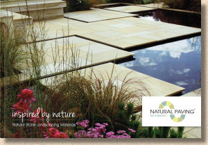
It's all well and good adopting a non-standard format to make a brochure stand out from the crowd, but it also brings limitations. A smaller page size means smaller images and less space to make your point, so what you put in there had better be better than average. At least the landscape format, as should be expected, lends itself to landscape images, but has it been exploited to its full potential?
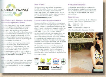
The opening page carries a note from the MD mentioning a comparatively small roster of new products, and the 'contents' listing is broken down into simple, logical components…flags, blocks, walling, etc., so it shouldn't be too hard to find things, and the first thing that is found is the 'Introduction'.
Oooh, there's a lot of text there – will anyone actually read all of that? I know it may seem important to establish ones credentials, but by putting so much information in one lump, there's a real risk of boring the reader. There's nothing wrong in making the case for stone paving against concrete, or emphasising the ethical foundation of the business, or even explaining the supply chain, but in one almighty dollop? It seems to me that such messages are more effective when dispersed throughout the brochure, as natural breaks between sections. When you have to wade through 14 pages before you get to an actual paving product, the attention may have started to wander.
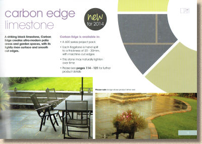
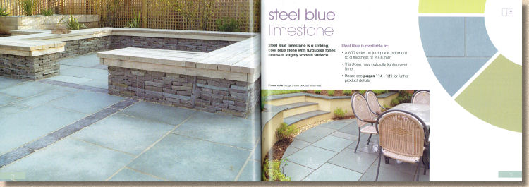
And that first paving product is…ta-daaah….black limestone, sexed up by being dubbed as 'Carbon Edge' . Oh dear! It may well be new to Natural Paving for 2014 (and I'm fairly sure they've had it previously, although possibly in a different format without sawn edges), but it's achingly familiar to the market. More worryingly, there's a sense in that market that Black Limestone has had its day, that the wave has just about crested, and nowadays there are more queries about how to counter the inevitable fading it suffers than to identify sources.
The text does mention that it "may naturally lighten over time", which is putting the best possible shine on it. A more brutal opinion might be that it WILL fade and it will do so relatively quickly. The two small illustrative images show it dark, but one of those is in the wet and in the other, the paving looks as though it has been sealed.
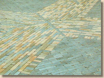
As the fade problem with black limestone becomes more and more widely known, the stone which is providing the solution, in the form of dark, sombre hues which are light-fast, is the Black Slate , as featured on page 18. In my opinion, this is a much better stone, although trickier to lay well. It benefits enormously by being given a full page image, taking advantage of that landscape page format and looking far more appealing than the postage-stamp images of the new Carbon Edge limestone.
And this theme persists. Each product is given a full page 'money shot' with subsidiary images/swatches and basic information and the page opposite. In general, it does work: there's no sense of it feeling cramped or crushed or even short-changed, but some of the big piccies really don't do justice to the paving.
It's that eternal problem of just how to get really good images of paving which tends to be quite reflective when viewed through a lens. If you photograph it when damp, the colour comes through but it's not really being fair on the customer, but 'dry' photies are often not fair on the stone. I've found that early morning or late evening shots in high summer give best results, or wait for an overcast day. It's very tempting to take photies in bright sunlight but it rarely produces a worthwhile image.
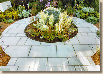
That low-sun trick has been used well for the photie used to show off the lovely Pumice Sandstone on page 28, with subdued tones and long shadows, but the texture is only really apparent on the close-up 'studio' shot. I really don't like those fiddly little bits of cuts on the outer and inner edges of the circle – that's bad practice for all the talk of 'Assured Installers' – but the stone itself looks rich and enticing and ultra-contemporary, so it has to be marked as 'job done'.
Page after page, what is really striking is the inability of too many images to convey the real character of the stone. I know most, if not all, of these products and they are, almost without exception, lovely pavings, well-chosen for colour, texture and quality, but the further I delve into the brochure, the more pizdov I become that this isn't apparent for all of them. The Ibis Sandstone is a rich, sultry, dusky blend of corals, rose and pastel pinks in real life, but on page 34 it looks wishy-washy and is embarrassed by the strong red stone of the walling. Ivory Sandstone on page 38 might as well be concrete and again, the shadows emphasise the colouring of the stone risers (bloody awful mortar bed on show, though) and retaining sleepers but the stone is in full sun and just bleached out!
I don't know what has happened with the Midnight Blue limestone on page 44, but that colour is definitely not blue, at any time of the day or night! Yet I know that it is, in real life, and the smaller images (with unsightly variable grouting) on the opposite page show it much more accurately. Someone has been playing with colour correction and made things worse!
There are good images in here, but not enough and it's annoying because it's letting down some wonderful stone and it seems to be especially affecting the top-of-the-range PremiaStone collection. The more realistically priced Cragstone collection and even the bog-standard ClassicStone collection have much better images. Maybe the natural riven character of these collections shows up better than the smoother, subtler textures of PremiaStone, but there's more to it than that. I think the PremiaStone images are more ambitious, trying to show off wow-factor jobs, whereas the lower orders tend to be smaller close-ups, less of the glossy magazine and more for the everyman. They look so much better for it, too!
On to the Natural Paving Stone Block Pavers , a shamefully underused format for imported stone. Admittedly, it's not as cheap as concrete blocks, but there is so much more character, and when you consider that the cost of the blocks themselves is often taken to be only 20% or so of the total cost of pavement construction, spending a few bob extra on natural stone doesn't seem wildly extravagant.
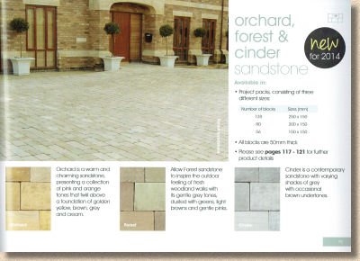
Three new colours for the tried and tested Natural Paving block range: Orchard, Forest and Cinder. I haven't yet seen these in the flesh, so I'm limited to the undersized swatches and text description, which doesn't really tell us very much. The arrisses seem to have been hardly disturbed, which suggests minimal tumbling. This might be a deliberate attempt to maintain straight, crisp lines for the so-called contemporary style, but my own taste is for something more naturalistic. We can have crisp lines with concrete; stone really shows its character when it's been distressed, either by machine or by time and weather.
Again, the quality of some of the full-page images worries me. The quartzite blocks on page 86: that photie looks fuzzy, as though it's been taken on a low-res mobile phone and then blown up to fit the page. It's not doing this lovely stone any favours. And on the following page, the Midnight Blue limestone (I do seem to be picking on this stone for some reason!) looks far better in the small area of shadow than it does in the bleached out main area. Why not get the photies taken on a bright, but not sunny day?
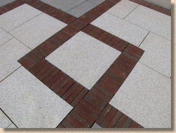
The link-up between Natural Paving and Vande Moortel clay pavers is a near perfect match. Natural materials, natural colours, natural textures, these materials complement each other so well it's hard to believe there was genuine concern from NP management about the synergy of the two back when the idea was first mooted. Of course, the clay pavers can be used on their own, but it always seems to me that when clay pavers and good quality natural stone are combined, it enhances both materials. There's something truly delicious about panels of flagstone edged with bands of clay pavers, bouncing off each other, highlighting their differences whilst accentuating their natural origins.
It's a real pity that manufacture of British clay pavers dies a little more each year – only this week I heard the appalling news that Blockleys are dropping their gorgeous Castleyard brick – but the Vande Moortel bricks do provide something a little more distinctive, a little more characterful than the generic dross coming from many of the German and Dutch kilns. Natural Paving have steadily increased their offering, from just three basic colours a couple of years ago, to a generous eight today, including the charming 'Melange' multicolour blend which is ideal for larger areas.
Onto walling and accessories and it's all pretty much as we would expect. The Drystone walling is, effectively, thicker-than-normal pieces of flagstone but it does look highly effective when laid as intended. I'm less taken with any of these walling stones when laid with mortar joints. It somehow doesn't look right, but I'm not sure exactly why…something to do with scale, I suspect.
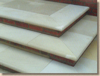
Bull-nosed steps are now expected of any serious stone supplier, but the range here is limited to two types of stone (Cornsilk and Pumice) and no corner units. The imagery shows a beautifully mitred corner on a wraparound step, but how many landscapers actually have the skills to turn out such high quality work? More chance with a paving specialist, admittedly, but even so, it would be so much easier to provide corner units ready cut, and think of the price they could command!
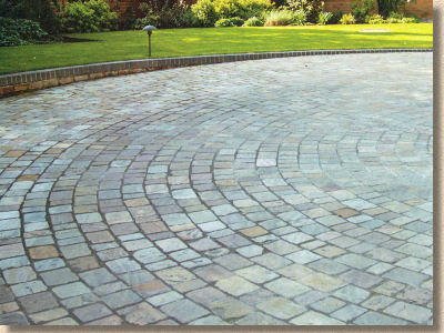
And along with the mandatory bull-nosed steps, it seems it's becoming obligatory to misname setts as 'cobbles'. Dressed stone paving blocks are not and never have been 'cobbles'. The next brochure to commit this basic error will be publicly ridiculed beyond contempt. When a company is attempting to present itself as a professional, serious stone supplier, the least it can do is use the right sodding terminology!
So: I'm not going to tell anyone how attractive these 'setts' look. There! That'll learn 'em!
On to the technical information, which is fine (I know the author really well and he generally gets things just about right), but the product detail tables are a tad confusing, primarily because they are trying to convey a lot of information in limited space. Matrices such as these are all well and good for merchants, but experience shows that some contractors and many customers find them difficult to follow. The simple 3 or 4 column table for each product on that product's page, as favoured by most other suppliers in their brochures, is neater, simpler and more visually appealing.
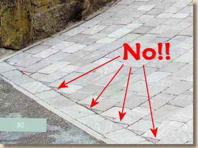
The Project Pack layouts – of how much value are these? How many people lay a single project pack in a rectangle of specific dimensions? I know there are some, but I also know that the overwhelming majority of customers have different sized rectangles requiring multiple packs, and many have non-rectangular areas. Even so, if you are going to provide sample layouts, for eff's sake don't show crossed joints. It's so pigging amateurish!
Brochure Layout and Page Style
The page structure is as good as possible given the landscape format and page size. The full page photie is the right idea (if not always the right photie), and the opposite page carries just enough information. The descriptive text is generally sound without ever descending into unnecessary excess, and the use of bullet points keeps it concise. The headline font is attractive and complements the contemporary styling which seems to be the intention. The swatches could do with being bigger, but we are back at the size limitation problem. And it would be better to have the size/pack information on the page rather than have to consult the complicated matrix at the back.
There's also no sense of a break between flags and blocks, or blocks and walling, or walling and accessories. There is supposed to be a colour theme identifying each section, as shown on the contents page and on the rear cover, but it's not apparent in the body of the brochure. This is where all that 'Mission Statement' text at the beginning could have been employed to greater effect. Use the valuable information about sustainability and ethics to create a natural break between, say, flags and blocks. It helps create distinct and discrete sections within the brochure but it also helps bring more attention to the topic by not losing it amongst a sea of worthy wordiness.
Summary and availability
I have to be brutally honest; if there is any value in these reviews at all, it lies in their honesty, even when that honesty may upset or even offend people and companies I respect enormously. Overall, I don't think the brochure does full justice to the products or to the standards to which Natural Paving as a company aspires. Too many photies are barely average or even poor; too many images show basic installation errors or, sad to say, examples of bad practice; and many of the layouts are just plain wrong.
And this is so bloody annoying. Natural Paving is one of the very best suppliers in the land. When asked, I have no hesitation in recommending their stone and their service. They are a fine example to everyone in the paving supply industry. So how has all this slipped through?
If you want to run an 'Approved Installer' scheme, you have to, simply *MUST* espouse the very highest standards. You CANNOT show shoddy cuts, variable jointing colour and finish, crossed joints, inconsistent levels and incorrect layouts: it sends a message to these allegedly 'approved' contractors that such work is acceptable, when it's not, or at least, it's not as far as I'm concerned. More worryingly, it sends a message to the customers that this is just about as good as you can expect. That, I'm afraid, is not good enough.
All this may seem harsh, but it is intended as constructive criticism to a company I hugely admire. It in no way detracts from the excellent paving materials supplied, nor the exceptional level of sales and after-sales service provided by one of the most knowledgeable teams in the industry. Don't let my narky comments deter you in the slightest from using Natural Paving on your project or recommending the company to your clients. My beef is with the brochure, not the paving. Once they get these niggles ironed out of their brochure (2015 perhaps?), then the competition better look out!
Natural Paving Brochureline: 0845 072 1150

