Stonemarket 2008
One of the now traditional treats of the Christmas break is the appearance of the new Stonemarket brochure. Of all the dozens of catalogues, brochures and other publicity material that lands on the doormat at Borlochs Hall each year, none are more eagerly anticipated than Stonemarket, not just for the stunning quality of the photographs, but for the innovation and willingness to take a risk with something a little out of the ordinary. Over recent years, this annual publication has managed to consistently improve on previous editions, and with each passing issue, one wonders how they can possibly top what they've already done.
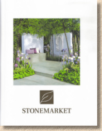
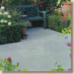
For 2008, the style of the brochure has edged even closer to “coffee-table” status. Its non-standard size (230x280mm, as last year) and clean white cover featuring a stylish garden of simple pastel colours with a bold but unfussy newly mono-chromed logo could lead the unfamiliar to mistake its identity, to assume that it is a chic design magazine or upmarket auction catalogue. Nothing on the front cover alerts the uninitiated that it is actually a hard-landscaping brochure.
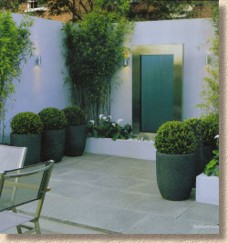
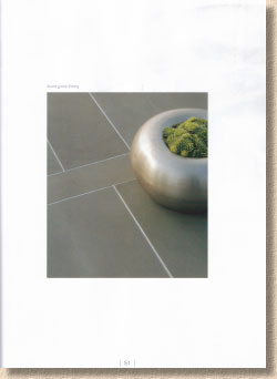
The styling is consistent throughout much of its 124 pages. Crisp white pages of semi-glossy paper with many images centrally positioned and framed by the virgin sheets on which they recline, coquettishly waiting to be ogled and manhandled by some mucky-pawed contractor.
Which raises a question: is it possible for a hard-landscaping brochure to become too swanky, too swish for those of a practical persuasion? If it is, then this 2008 brochure is vertiginously close to that point. It looks and feels as though it should have a dust-jacket, or be laminated to avoid the inevitable stains from splashes of industrial-strength tea and the drips from over-sauced bacon butties.
In reality, you have to ask at whom the brochure is targeted. Most of the major manufacturers aim quite precisely for somewhere in the centre, while others apply the scattergun technique, hoping to hit as many potential targets as possible. Is this latest Stonemarket oeuvre aimed at those of us in rigger boots, or is the intended audience more likely to be wearing Manolo Blahnik or Dubarry? For the first time with such a publication, I really feel it is definitely the latter. This is a marketing tool aimed fairly and squarely at the aspirational clientele with token acknowledgement to the plebs.
Not that this is a bad thing: at this stage in the evolution of a mature hard-landscaping market, the best contractors know that the technical info they need is available in other formats or from other sources, and that the brochure is now a sales accessory best used to help them show clients what's available, what's fashionable, and what's possible. Similarly for homeowners and designers undertaking their own research: this brochure offers a taster rather than a comprehensive guide.
So: what's in it that will be of interest to the type of person that uses this website? By now, it should be apparent that those looking for ideas and inspiration will not be disappointed because this is the most comprehensive collection of quality hard-landscaping materials for the residential market that is currently available in Britain. For the contractor, the focus is more on what's new and what's changed.
For 2008, the bulk of new or expanded product ranges are to be found in the natural paving section, which we'll come to shortly. Although the index page proclaims five new lines in the concrete products section … Ooops! It seems that Stonemarket too have succumbed to the verbal diarrhoea that's been passed on to our industry by scrofulous marketing bods and they now refer to good old concrete as “Handmade Reconstituted Stone” – well sod that! I'll fly the flag for veracity and refer to “concrete” as I type away on my handmade reconstituted oil keyboard that rests upon my handmade reconstituted natural timber desk – anyway; there are supposed to be five new products here, of which one is a new size option (450x450 in the Rio™ ), one is a new “Project Pack” of the now well-established Concept™ paving, a third is an extra ring to the Yorkstone Radius kit and the fourth is an expanded selection of sizes for the Yorkstone Walling .
The only genuine "new" product is actually the Rio™ Smooth , which is a ground/polished version of the mid-grey 'Storm' Rio™ paving, a paving that is uncannily similar to the wonderful Argent from parent company, Marshalls. Although the publicity photo shows a 450x600mm format flag, the tech info box declares there to be but one size, a 600x600mm square flag, which rather limits its potential. I saw this at Glee 2007 and it's a winner – nuff said!
 Avant-Garde with lots of white space
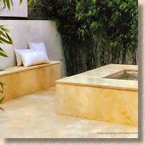
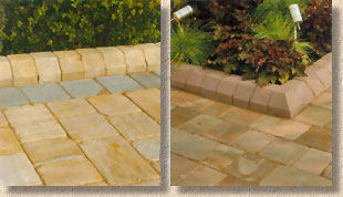
The bulk of the new products appear in the lavish “Natural Stone” section and it's revealing that a company which built its name by manufacturing top-end concrete patio flagstones has splashed out on a fold-out four-page spread of their new natural stone brand leader, Avant-Garde , a smooth-sawn sandstone available in Ebony (mid grey, really), Silver (light Grey) and Caramel, which is evocative of the richly banded Highmoor stone from deepest, darkest Yorkshire. Again, this was at Glee and is guaranteed to win favour with designers and those looking for a naturalistic look without having to plump for the usual Cottage Garden riven textures. It needs a colour impregnator and/or a really good quality sealant to show it at its best, and I worry about how it will fare in the British climate: it would be a shame for such lovely stone to be subsumed beneath the usual sea of moss and algae. The tech info box suggests only two (rather strange) sizes will be available 'out-of-the-box' (855 x 570 and 855 x 142), while there will be a 12.2m² 4-size project pack comprising 10 each of the 570 x 855/570/425/285mm sizes.
Trustone , the better-than-average riven stone range, has a new colour. "Sable" is the name given to the dark browny-black stone that's been around other suppliers for a few years now. Although acknowledged as new on the product page (p64) its status is understated on the index page compared to the other newbies. Is this because it's hard to claim this stone is new when it's been widely used by the trade for at least 5 years?
Vintage Stone is a bit of a mystery because it, too, is declared to be new when it's been around in this brushed/worn format for a number of years. I suppose “new” is the fact that, as from this Easter, all Vintage Stone (and TruStone) will be calibrated to provide installers with a uniform thickness of product, thereby enabling the easier 'screeded bed' method of laying. Hopefully, this will result in fewer installations featuring the despised and discredited spot or dab bedding so popular amongst the incompetent and the feebleminded. There is a new colour, the chilly-looking blue-grey “Frost” limestone that is a superb neutral colour for those projects where the paving needs to be functional but subtle. There are also 4-size setts available (140 x 285/210/140/105mm) although I'm unclear as to whether these will be calibrated along with the flagstones. I'm sure one of the Stonemarketeers will let me know in due course.
Zephyr attracted a lot of attention when it was unveiled at Glee. It's a dark marble (metamorphosed limestone, so don't put acid anywhere near it!) with white veining that Stonemarket are rather fancifully comparing to lightning forks. I'm not convinced that this will be as successful as some of the other new products. It's sombre and has a very indoorsy styling that will probably limit its usage. It's certainly better than bloody Travertine, but I suspect it will appeal more to designers than to customers.
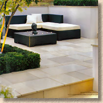
Radiance is at the opposite end of the palette: it's a glaringly-light buff-gold sandstone that will show every single mark, stain, scuff or spot. It's the sort of stone used for style-driven photographs and for gardens that are frequented once a year. It's pristine and bright: it'll dazzle the eyes out of your head in summer! Horizon suffers a similar fate: a pristine smooth sawn sandstone best suited to modern and/or minimalist design. All clean lines, serene surfaces and sharply defined edges with a pale, almost wan, palette of very light grey (Mist) or buff (New Dune). It's a designer's type of paving, rather than summat that will be used at the back of a Barratt home, but then a large part of Stonemarket's success comes from their ability to supply the right type of paving for any given residential project, whether it's a chic city apartment rooftop or a bog-standard back yard.
Travertine is still on the menu, I notice. “Used as a paving in Italy, Greece and Turkey since ancient times”, says the blurb: only because they've buggerall else! It may look wonderful when you're on yer jollies around the Med but it is wrong with a capital W for the British/Irish climate.
The TruSlate has one new colour option, the garish “Copper” which is far too metallic for my philistine taste. I don't mind a hint of metal in a paving material, but every time I've seen this product, I've been worried about the risk of electrocution. It's better suited to use as a detail than as a main paving, but I can bet some zany young design student comes up with a metallic garden where this would be ideal.
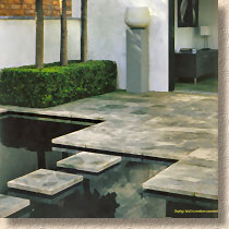
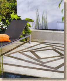
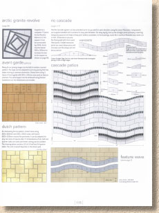
I grandly declared the Arctic Granite Revolve feature to be the Best New Product at Glee 2007, and I still think it's the best new stone paving feature I've seen in the past year. Yes: it won't work everywhere, and its neutral colours are flat and withdrawn, but it looks like a custom-made feature that has been specially commissioned rather than built from a kit, and it exudes more class than anything else in the Stonemarket brochure. However, it's very easy to over-egg the pudding and the Arctic Granite range has, for me, been somewhat devalued by introducing colour. I don't want to see tones of pinks, buffs or greens, because they distract from the stark, simple, straightforward palette of the original range. Stick them in a corner and sell them under a different name: keep the Arctic Granite pure, with monochrome arctic tones.
Marketstone is Stonemarket's contribution to what might be considered the budget end of the flagstone trade, but their budget product is still superior to many so-called 'top grade' products from other suppliers. This is your everyday Desert, Autumn Brown, or Grey Indian sandstone, albeit from verified ethical sources, and augmented by the new “Pink” colour which does nowt for me. I have to give credit where it's due, though, so congratulations to Stonemarket for being one of the first to point out in no uncertain terms that the light coloured “Sand” (Mint) is bedevilled by algal invasion and the Grey develops worrisome liver spots when left out in string sunlight. I wish the other suppliers would be as honest with their customers so that I wouldn't have to spend as much time explaining that it is a well-known feature of this type of stone.
Since the acquisition of Paver Systems, Stonemarket have been able to offer a genuinely original range of block paving. However, the first new offering in this section is a direct response to the success enjoyed by Natural Paving with their natural stone pavers. Stonemarket refer to their version as " Elemental ", but the idea is the same: a 3-size mix in one crate or just the largest size (240x160x40) on its own, available in 5 colours.
I'm slightly worried about the lack of thickness: 40mm pavers are notorious for cracking when compacted, resulting in additional replacement work for the contractor. The tumbling process usually eliminates the weakest blocks, but there are always some that get through and I'll be listening to feedback from contractors on this.
The kerb units, in the style (and name!) or the Marshalls KS kerb, are a delicious offering but, from the prices I've been quoted, I'm not sure how widely they'll be used. It'd be a crime to plonk in a concrete kerb rather than spend the few quid extra, but I know how difficult it will be to sell this kerb to customers at the current price.
The three-size tumbled concrete Trident paviors features one new colour blend, which has been christened “ Forest ” (I saw this colour blend at Glee and I'm sure that's the name I suggested: if it is, I'll be expecting at least one free pint!). Strangely, the new colour is shown on the page only as a swatch, with no larger format photo to allow readers to gain a more thorough appreciation of its hues. The same colour blend is also available in the standard 200x100x50/60/80 format Pavedrive paviors, which now boasts seven colour options: four single and three multi.
The Rivenstone paviors, launched last year, have been sent to the great crusher in the sky. I recall writing last year that I preferred these to the Pennon , and I'm slightly surprised to see the Pennon being retained and Rivenstone dropped, which shows just how much I know about the tastes of the British public!
And that's about it: there's some new stuff in amongst the decorative aggregates, but I'll leave those to be discovered for yourselves. The tech/design info is exemplary, as it has been for the last few years, but is in danger of becoming cluttered. There's a lot of information crammed into those few pages, and when the generous amount of white space afforded to some of the photographs is considered, it begs the question as to why a little more room wasn't designated to the design illustrations and text. The laying advice is sparse but accurate. Committing just two pages to construction advice and then crowbarring-in the H&S, the legal gubbins, the disclaimers, the acknowledgements and the Ethical Trading statement must have been a challenge for the page layout designer. I doubt anyone could construct a patio, driveway or wall using only the few words offered here, but there are better sources for this type of information nowadays. However, I do wonder whether the Stonemarket helpline is inundated with requests for clarification from well-meaning but befuddled DIYers relying on the scant advice provided on these two pages.
As expected, Stonemarket have produced yet another stunningly beautiful brochure. It's more artistic than ever, but given the choice between having the framing white space or not, I'd rather see a bigger photograph. There's a sense that some of the photos have now reached the end of their shelf-life and it's surprising to find some of the new products are portrayed only by a small swatch, when they should, surely, be given pride of place.
Regarding the liberal use of the term “new”; while acknowledging that the index page states that the “new” icon placed against product names indicates “new product within that section”, I'd much rather see icons along the lines of “new colour” or “new size”, and reserve the “new” for products that are truly new, and not just expanded. Like the “reconstituted stone” nonsense, it is misleading and attempts to give a less-than-accurate impression to the casual reader which is more appropriate to the pound store bargain shops. Stonemarket, as a company, ought to be above that sort of thing.
Despite these minor niggles, the Stonemarket brochure is likely to retain its deserved role as the one against which all others are judged. Every decent designer should have this on their work desk throughout the year. The more upmarket patio contractor will find it to be an invaluable sales aid, while the value-for-money contractors can use it as an aspirational guide to what's possible if only the client would stretch their budget just a little bit further.
