Global Stone 2017
In the mad, crazy world of paving brochures, some brands change their output almost every year, creating a new look, new orientation, new focus, new design and marketing agency. Then some brands work on the principle of “If it ain’t broke, don’t fix it” and keep a winning style going for several years. Global Stone = would definitely be in that latter category.
Back long before the world had gone totally doolally, Global took a long, hard look at their brochure and decided they needed to up their game, make the brochure an expression of the values they put into their products, and so, in 2014 they magicked-up a new format for the brochure and, bar a few minor nips, tuck and tweaks here and there, it’s been more-or-less the same ever since.
In fact, the 2017 edition is almost identical to last year’s brochure: attractive full page cover shot with purple strap across the top; friendly intro from MD Julian Wood; purple hued index page; a single page about designers (albeit from a different designer to 2016); and wallop! Straight into the goodies!
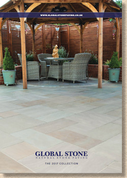
The running order has been jiggled about a bit, so, this time, it’s the old favourite Old Rectory that takes pride of place. At a time when so many others are leading with ultra-chic, machined-to-buggery-and-back, mega-sized stone flags or with slick, square shiny porcelain, Global have bravely led with a comfortable ‘antiqued’ riven stone range that has been a comfortable choice for Middle England for a decade or more. The snazzy new stuff follows straight after, but it’s a bold acknowledgement of their key market that Old Rectory has been given the nod over the zeitgeist of the honed Artisan Collection .
And that sense of sticking with the familiar carries on well into the brochure, for it is two-thirds of the way through the allotted 104 pages before we encounter anything new, or, at least, new to Global if not to the rest of the stone suppliers. Black (but not for long) limestone setts. 100 x 100 x 50mm, riven head, cropped sides, just like everyone else has had for yonks.
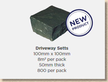
It shouldn’t be denied that, as a product, black limestone setts are a great complement to the other limestone pavings, and to so much more, but new they are not. And reliable they are not. In fact, the problem with fading black limestone is so well known, and the cause of so much anguish amongst customers who had foolishly assumed it would stay black, that many of those suppliers that previously had it on their books have quietly and without any ceremony, erased it from their repertoire.
It’s not that black limestone is a bad stone: it’s anything but. The problem is the fading, and, as long as you make it abundantly clear to the customer that what is black this week will not be black next week (unless you take preventative measure at additional cost), then there’s no harm done. But there’s no mention here that the single dark charcoal sett shown on the page will actually be steely grey by the end of summer, and that’s just asking for trouble.
Still: bonus points to Global for referring to them as 'setts' and not the misnomer 'cobbles'.
Gardenstone is the name for the Global “value” range. It’s good quality stone, in popular colour blends (note that word “blends”), nowt-too-fancy riven flagstones sold in multi-size project packs, and intended to satisfy the customer working on a tighter budget.
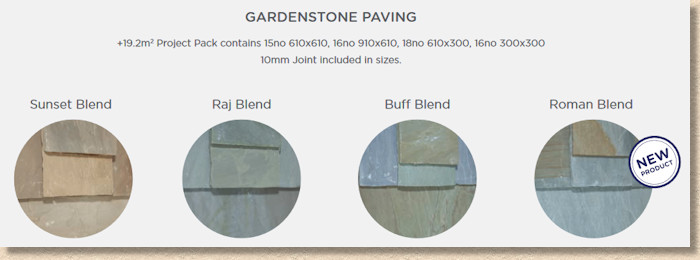
Roman is the new “blend”, and I can’t tell you a damned thing about the colours involved. The existing Sunset Blend is given a full page photie and, I’d hazard a guess, the light orangey-buff palette is interpreted as being reminiscent of the onset of dusk. Raj Blend , I know from experience, contains some of the greeny-brown tones associated with Raj Green stone, and, just a guess, but does the Buff Blend have predominantly buffy colouring? So, this Roman Blend : what colour is that? I haven’t got a clue, and I can’t tell from the 10 pence coin-sized swatch provided. Even the name doesn’t help, but, if I squint and gaze at it for long enough, I suspect there might be some grey in there. And possibly some orange. But that could just be my optic nerve playing up again. A photie would help, guys!
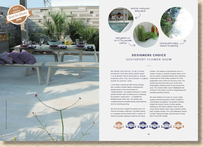
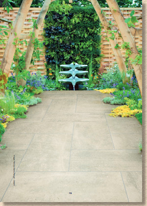
Nice to see Southport Flower Show getting a nod. I still think it’s the best value Flower Show in the country, largely because it hasn’t been soul-lessly exploited and over-marketed by the corporates and the self-anointed great-and-good of the horticultural world. It’s still a flower show for the people, by the people and Global deserve a big hand for showing their support. I was elsewhere at the time of last year’s Southport Show so I would have loved to have seen a bit more than one big, full-page image and three circular cut-outs. That looks like a great design, so give it a bit more exposure.
Ey up! Here’s the porcelain. I had expected it long before page 68, seeing how it’s flavour-of-the-month with almost everyone else. Global have proclaimed their panel of porcelain products to be Petrous , and, as we should have expected, there are some newbies in here for 2017.
Petrous Premium is new, but I can’t ascertain what’s premium about it, unless it’s the fact it comes in a mixed size project pack. Four new colours: Fallow (orangey-buff); Spindrift (pinky-buff); Dove Grey (grey); and Crema (milky). Don’t quote me on the colour descriptions. It’s not easy to tell from such tidgy swatches.
Premium Siena is also new, but isn’t a multi-size project pack, so that’s the mixed-size theory down the pan! The full page image suggests it’s a limestoney-marbley look in six colours ranging from dark grey, through browns to pale creams. There’s no descriptive text to explain what it is I’m looking at. The big picture is very attractive, very appealing, but the colour there doesn’t match the colour of the associated swatch. If I werev a customer, I’d want to know a bit more that it’s called “Desert” and it comes in a single size: 500x1000mm.
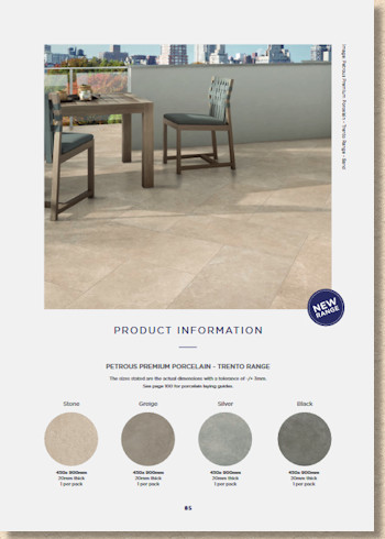
Trento , too, is new and now you know almost as much as me. When I tell you the four available colours are, I think, reddy-browns, and it comes in a single 450x900mm format, you will know exactly as much as me. If the one they’ve dubbed Silver is anything like silver, they need to sack the colour printers. And the Black? That’s dirty red if it’s anything at all.
Garnering images from the PDF brochure reveals the colours reproduced therein are, hopefully, more realistic than those in the hard-copy brochure. The black, for a start, is definitely more of a black than a red in the online version. Printer problems?
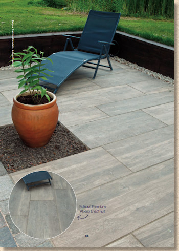
Albero , you will recall, is the 400x1200mm timber-styled porcelain, and this too has four new colours which I’m reluctant to describe because the chosen names bear almost resemblance to the actual colour Since when has Teak been a creamy-tan colour?
These plank-a-like porcelains are incredibly popular, and rightly so. Used in the right context, they are stunningly effective, but you’d never tell that from the images here. The swatches show Silvered and Chestnut to be distinctively different. The photographs accompanying the swatches suggests there’s not much to choose between them.
And that’s about it. Before you know it, we’re into the technical advice section, which is all well and good, and very sensibly tucked away.
The hand-drawn Laying Guides intrigue me. There’s not a crossed joint to be seen, yet too many of the photos used in the main body of the brochure are riddled with this glaring and amateurish error! Global have obviously gone to some trouble to avoid using crossed joints in their guide, so why are they shown in all their horror in what are intended as ‘money shot’ images?
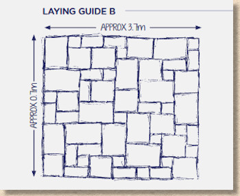
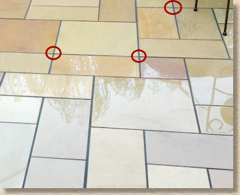
First wold problems, eh? On the scale of things currently not right with this world, crossed joints barely make it into the top ten, but for me, they’ll always be a key indicator of an installer who has not been properly trained and who fails to understand the niceties of pavement construction in general and random layouts in particular.
Reading back through the above, it sounds somewhat negative and overly critical, which was not my intention. I’m highly familiar with Global’s products and I have no hesitation in recommending them, but I don’t think this brochure has done them justice. They are much better than it might seem from a cursory perusal of the 106 pages.
The colours seem to be an issue, and I can’t help wondering whether this is a printing problem rather than any shortcoming of the actual products. Too many images look bleached or under-hued (if that is a word), but I’d hate to see paving wetted down to give it a temporary richer look, or have photies potato-shopped to boost the tones. The colours seem much more vibrant in the PDF. Could it really be as simple as getting a new set of ink cartridges for the printer?
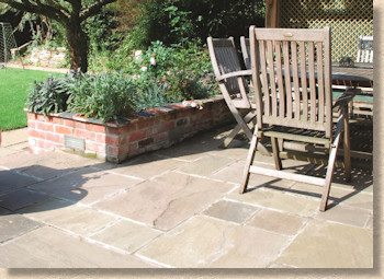
From an overall design perspective, I do like the format. Plenty of images, not too cramped, generous white-space to provide balance, and the content is well chosen, with interesting snippets from designers and users to break up the steady chug of product product product.
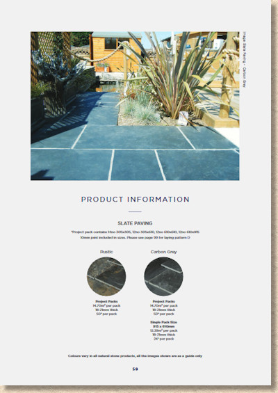
However, within each product category, I feel there needs to be some explanation of what it is we’re looking at. Just a sentence or two, nothing overly florid, nothing too ethereal and aspirational: a simple, effective, concise description and perhaps why it should appeal to use.
And the swatches! These are just ineffective little eyeballs of meaninglessness. They need to be, at the very least, 50% bigger, but how you work that into the page layout is for someone else to determine. Maybe circles aren’t the best use of page real estate.
Still, there is plenty to enjoy. There are some of the featured gardens that I would pay good money (up to a couple of quid, anyway) to see in real life simply on the strength of interest piqued by some of those images. Customers will find enough to assuage their desires; designers will find more than enough to encourage them to stretch themselves into new products and combinations; and contractors will find it an impressive aide when aiming to impress the casual customer.
No matter here you are in Britain, there’s a Global stockist covering your area, and to overlook them as also-rans to the BIG names would be a serious error and a glaring omission. For 2017, Global have maintained their strongly focussed tradition of continual product development and improvement and in the process they’ve given all of us something to tickle the salivary glands.
All we need now is a kind spring and customers a-plenty!
Click here to download brochure

