New website for Addagrip
Ey up! It's another website review. Have I chanced upon a previously undiscovered seam of news-worthy features or have the PR bods latched on to the fact that there's an opportunity to direct something of a spotlight onto their company and its products? Until the matter came up this summer, during a conversation with one of those rare PR bods capable of cogent conversation, I'd preferred to steer clear of website reviews, as there was a risk they'd be viewed as little more than one site criticising another, but said PR bod managed to convince me that any criticism I proffered would be viewed as constructive rather than jaundiced, due to the non-commercial and non-competitive nature of this site, which, she claimed, puts me in a unique position within the industry. Supposedly.
All of which is why these invitations to review various industry-related websites seem to be coming in thick and fast.
So: on to this week's victim.
Addagrip are a Sussex-based company that offers a wide range of what might be referred to as "surface treatments". Indeed: that is how they refer to themselves, and it's a convenient term to cover what is a rather eclectic range of products and techniques, most of which involve resins in one form or another, and can be used with both new and existing surfaces.

The best known of these is probably the Addastone resin-bonded product, along with the Addaset alternative, its resin-bound half-sibling. Less well-known, but probably not for long, are Addatex Stone Carpet, the high quality resin-bound surface for indoor and prestige applications, and Addaprint, the imprinted resin surfacing that has found favour on some of the more decorative streetworks and commercial projects. The company also offers a suite of surface protection/improvement resins, along with resin flooring for just about any application.
With such a relatively wide range of products, there's a risk that any website or even a product brochure, could befuddle the reader, perplex them with a profusion of pavement types, and leave them more confused as to the most suitable surface for any particular project. Consequently, a “home page” has to provide a tempting overview that immediately re-assures the knowledge-hungry surfer that they need look no further, and that they are only a click or two away from their goal. The opening page of the Addagrip site certainly introduces the range of products and provides those essential links to deeper information, but there's something naïve, rather than stylish about the presentation, and it lacks the sort of visual impact that is expected from a company of Addagrip's stature. It's all rather 1990s.
Now, the last thing I want to see on any website is an inane Flash intro, or pop-ups, epilepsy-inducing animated adverts or gimmicky cursor trickery, but I do like something that entices the eye and sets the scene for what should be a rewarding web experience. For me, the Addagrip intro page is a little too flat, two-dimensional and it doesn't really engage me. Which is a shame, because the subsequent content is very good, and deserves a much better curtain-raiser.
Each of the sub-pages dealing with the various product lines features the same chilly-looking blue box menu/navigation table at the top followed by a full-width photo-montage that, almost without exception, conveys a sense of that particular product and its potential. The pages then develop, with well-worded descriptive overviews of the products, possible applications, guidance on installation, colour and texture swatches where applicable, and links to further information or downloads.
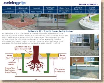
All of this is faultless. The text is interesting, relevant, clear and largely jargon-free, although the Tree Pit page does open with a real mouthful of undefined abbreviations before plunging into the sort of English that is normally found on the menus of East European pavement cafes. I mention this only because it seems such an anomalous page: every other page reads faultlessly (other than a couple of typos), which makes the pidgin English of this page stand out even more.
The images, too, are good quality, fast to download, and pertinent. Resin bound or bonded surfacing isn't always the most photogenic of subjects, so the accompanying photographs have to illustrate potential rather than specific applications, and they do just that, without ever looking like stock photos of playgrounds, car parks or office interiors.
The provision of company info (address, telephone, email, VAT number, etc.) at the foot of every page is an unnecessarily clunky touch. The provision of a valid email link, too, is indicative of naive design: the spambots will have that address in next to no time, and the Addagrip inbox will be inundated with drivel. There are dozens of fairly simple techniques that protect email addresses on web-pages – one of them really should have been used by the site developer. All that contact info stuff can be (and should be) bunged onto one page. The website ought to be a showcase for the products with discreet but convenient links to this sort of ancillary information.
Navigation through the site is effortless, which would normally be a huge plus mark for me, but that overbearing blue-box menu at the top of each page rather spoils the effect. While all of the main sub-pages can be accessed through the unmissable menu table, there is no site map that would provide a better overview of the site and allow visitors to jump directly to, say, the download for the Addastone build-up rather than be forced to navigate via the individual pages.
Overall, this is a good site that could be better with a little bit of a design makeover. The blue menu table is cold and too large; there's too little emphasis given to the product titles and too much to the company VAT number. It's a weird sense of scale when the company registration number has more prominence than the product name. The individual sub-pages have the sort of styling more commonly seen when info is printed onto letter-headed notepaper, with the logo uppermost and company details at the bottom, and it all looks a little plain and dowdy, which is slightly disappointing because the information made available is top quality and worthy of better presentation.
I suppose, if the site is viewed solely as a knowledge base, then it works perfectly well. Most of what you might ever want to know is in there, the information is laid out simply enough, and it's easy to find. It's a valuable resource for all things resinous, but I just wish it was all a bit more lively and engaging.
