Bradstone 2015 Brochure
'Tis the season to be….well, tucked up warm and cosy with a pint somewhere indoors, if truth be told, but it's also the season for new brochures from the nation's leading paving manufacturers, which means my Postie will be cursing me on a fairly regular basis over the next couple of months as s/he trudges the damp lanes of south Lancashire laden down with chunky catalogues and oversize packages of promotional materials.
There's been a trend which has developed over the last three or four years for the better organised manufacturers to give me a sneak preview of what they have lined-up sometime in late Autumn, so that my cynicism and sarcasm are fully stoked and ready to go for when the brochure hits the patios and driveways of the land in the deep midwinter. The trouble then is recalling just what I originally thought when faced with the galley pressings and coaster-sized samples back in November!
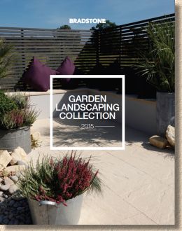
So, what can I call to mind regarding 2015's first vict ….contender, Bradstone ?
Well, according the incredibly friendly marketing team, it's a whole new look for Bradstone in 2015, with more focus on producing a brochure that has extra lashings of that upmarket coffee-table book styling which appeals to the clients, while maintaining Bradstone's reputation for clear and concise size and pack information, which is what's needed by the contractor.
It certainly looks attractive, running to 120 pages with a squarer-than-A4 format (217x280mm) and a clean, simple title over an appealing matt garden photo and printed onto a heavy card cover. The internal pages have a sort of soft satin finish, which seems to be more sympathetic to the photies than some of the very glossy papers used on other brochures.
Straight into the contents page, which splits the whole into six sections, which are fairly self-explanatory, except for the split between "contemporary" and "traditional" paving. OK: so we aficionados could probably guess what each term means, but will it be quite as clear to the casual browser? Handily, there's a link to the "Full Product Index" on the back cover which allows individual pavings and other products to be tracked down by name alone.
So, a gentle plug for the Bradstone Design Services, and a similar subtle nudge for the Bradstone Assured Installers. I feel they have got this about right. It's all too easy to devote page after page to the alleged benefits of using a manufacturer's pet contractors and designers, and that can sometimes come across as a overly hard sell. However, I do like it when showcase projects by pet contractors are featured, as it subliminally promotes the better-than-average installer, giving them the credit they truly deserve, but without being overly pushy. Sadly, there doesn't appear to be any of this in the Bradstone brochure.
Anyway, on to the first meaty section which is the "Contemporary" paving. This, as you may have surmised, is the high end stone, concrete and ceramic pavings, and seems to be almost everything that hasn't a riven appearance.
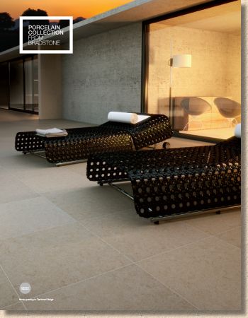
Obviously, the lead product for 2015, as it is with more or less every manufacturer/supplier of note, is the ceramic 'tile', which Bradstone have dubbed with the range name " Mode ". Interestingly, they have decided to run with the 'porcelain' description, but have included a bit of blurb about how this form of 'porcelain' in anything but fragile. Will this be enough to soothe the troubled brow of potential customers? Time, and options, will tell.
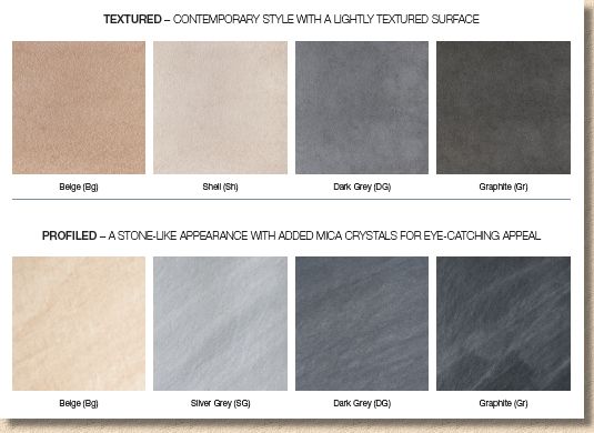
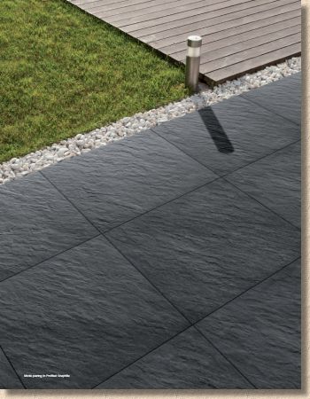
And when it comes to options, we're offered two finishes each with four colours. The 'Textured' is akin to gently shot textured, suggesting just enough grip to offset any worries about slipperiness, while 'Profiled' hints at a riven-ish sort of surface, albeit very, very subtle. Of the two, I much prefer the 'Profiled' style, especially in the darker colours, and I can see this having massive appeal to those clients looking for that 'indoor-outdoor' surface, where the same surface is used in the conservatory and the patio.
However, just one size, and it's a boring 600x600mm square. Not a lot you can do with that in terms of interesting design, is there? When you're paying top dollar for a paving, you'd want a bit more choice than stack or stretcher bond, wouldn't you? And what could be used as a contrast? It would be effective to team one of the paler greys with a darker one, but when there's just the one size to play with, the only option is to maintain the boring pattern, or to risk cutting.
Obviously, once the market for ceramics settles down, manufacturers such as Bradstone will put money into developing complementary sizes and contrast pieces, but for now, it's one size fits all, and that. I fear, will limit its appeal.
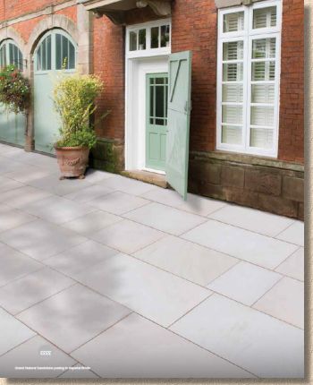
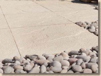
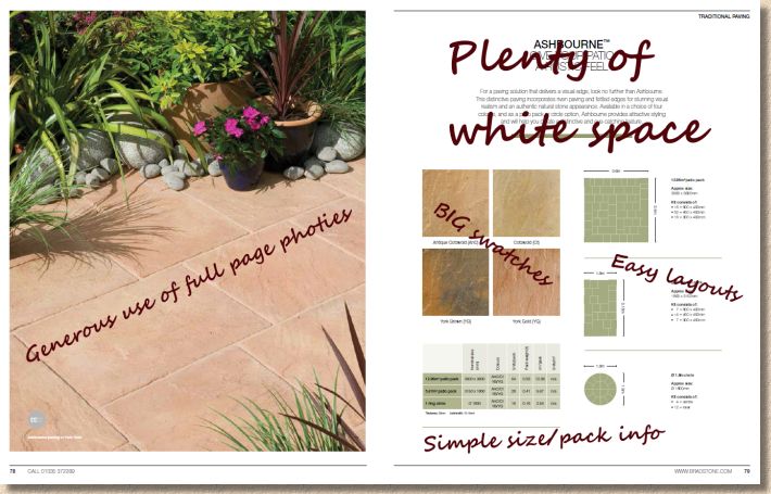
And as if to reinforce that point, the big seller in the high-end pavings over that last couple of years, namely the Smooth Natural Sandstone , comes in four popular sizes, while the grandly titled ' Grand Natural Sandstone ' comes in four whopper sizes (1250/1000/750/600mm) albeit all with a 750mm gauge width, and three compelling colour choices: Imperial White, as shown opposite, the veined Caramel, and the multi-hued Grey Ochre. These *will* sell, and not just because they are a more familiar product, but because that mix of available sizes enables far greater patterning or even random layouts , which helps create genuine individuality.
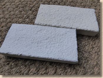
Liscia is another newcomer with the same one-size-fits-all problem as already discussed, although it's 450x450mm in this case, The paver in question is a fine quality cast concrete flag with a lightly stippled finish and comes in two colour options: ark Grey and Cream, both having vague tonal variations which does help pique one's interest, but that single size....well, it just leaves me bored. This is a flag with a genuinely appealling texture, one that's bound to stimulate interest, but what can be done with it?
Here's a flag with the quality and texture that I feel would attract a lot of interest, but if the only viable design option is the sort of boring, rigid, geometric layout as shown in the brochure, so highly reminiscent of the orthodoxy of the lamentable decorative paving design we endured in the1970s , then it's going to be a damned hard sell.
Caution is understandable with a new product, but there has to be a balance between investing too much in an unproven paving and hobbling it with mininal creative appeal.
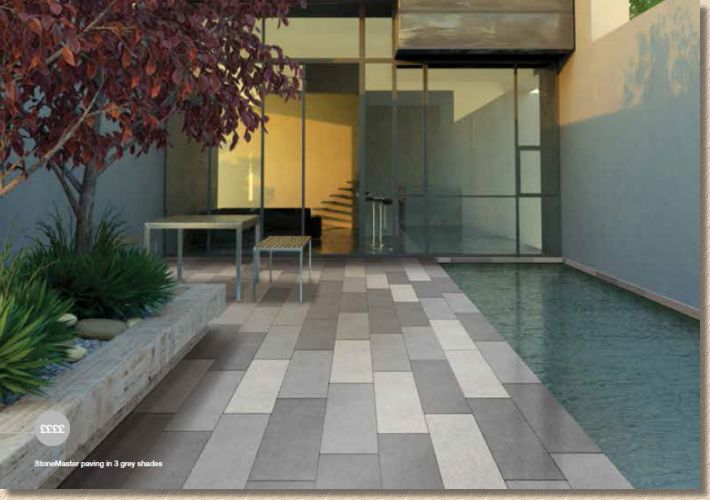
Pushing on, the vastly under-rated StoneMaster is now available in a 200x800mm plank option (we desperately need to come up with a better name than 'plank' paving. 'Long Aspect' paving is too weighty, and 'Linear' paving is too vague, but plank makes it sound cheap and nasty, which it almost never is!). Now, to my eye, this is ultra-contemporary: an intriguing, naturalistic surface texture, great colour options, and a real modern look to it. Maybe this will be the breakthrough that StoneMaster has long needed. I do hope so!
So, that's it for Contemporary: is there owt worth looking at in the so-called Traditional section? Well, there's not a lot that's new, other than a few photies we haven't seen before, but perhaps that's what we should expect from a 'Traditional' selection. If something too new comes along, can it actually be considered traditional? Doesn't it have to serve its time as 'contemporary' before it can mature sufficiently to become traditional?
The one new product is "Traditional Riven" which is a pressed and embossed concrete flag with the gentlest of riven surfaces which has then been shot-textured to give that extra-grippy styling. It's an interesting combination of manufacturing processes, and one that could well attract a good bit of interest, as it offers that oh-so-reassuring (albeit algae-friendly) texturing with an ersatz profiled surface and all with the dimensional accuracy (and regular thickness for screeded be installation) of a pressed concrete flag. Just two colours for now: buff and grey, which the brochure image portrays as a noticeable difference, but which I find to be barely discernible in natural daylight. The good news is that they're available in two sizes, but then the bad news is that each size is a sodding square – 450x450mm or 600x600mm - so, once again, design possibilities are somewhat limited.
One thing about the traditional selection is that there seems to be a flag for every degree of riven and every colour option imaginable, from the lumpy-bumpy, strongly coloured concrete of Ashbourne, to the delectably seductive and subtle soft surface of pale Honeymede Limestone, and everything between.
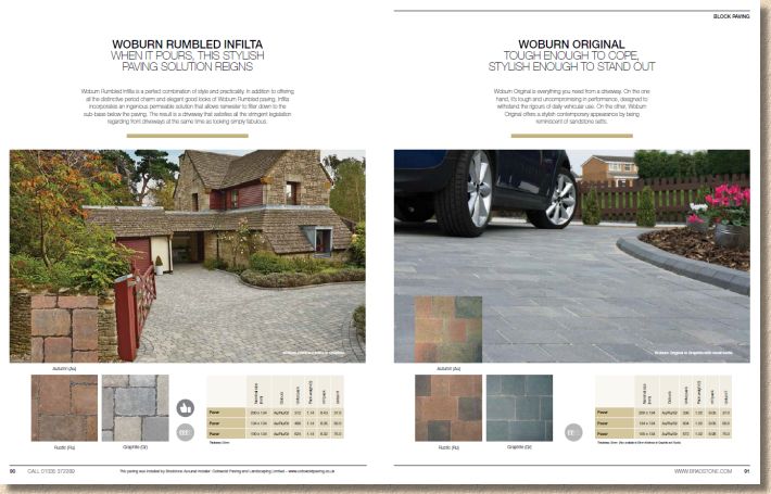
Similarly with block paving. Nothing new, but then the existing range is fully comprehensive, with everything you could expect from blocks without there being anything too exotic. This reflects the sense that the CBP market has matured and stabilised at a point where, as far as the British market is concerned, we have all the options we need, thank you very much, so you can keep your fancy continental ideas about textures and non-rectangular shapes, because we don't want them.
And more of the same with the "Landscape Features", the walling edgings and stepping stones, the decorative aggs, rockery stone and pretend sleepers. A robust selection with nothing new and nothing to get you over-excited.
While it may seem there is little new for 2015 - and marking such products as new might help customers and contractors alike realise that Bradstone as a brand is not just resting on its arse admiring the view – the big change is in the brochure itself. It's much more airy and user-friendly. The decision to use full page images for all of the key products, and to back them up with more generous support images is most welcome and a positive change from the now-banished thumbnails which achieved nothing.
Much more comfortable page layout
The new photies are perfectly executed, but maybe a little *too* perfectly in some cases, where shots look too obviously staged. Maybe that's where the opportunity to use high-quality pics from contractor jobs could come in?
Swatches are, by and large, as generous as is seemly, but by allowing them to float freely on an uncrowdedpage of crisp white, they carry more weight and authority. The text is concise and generally useful, printed in a clean, light sans-serif font which means it doesn't detract from the imagery, which, as we know, is what really sells a paving. The size and packaging information is similarly lean, and is kept with the product imagery rather than tucking it away in some unfathomable table at the back of the brochure.
In summary, while there may not be a feast of new products on which we can gorge, the 2015 Collection represents a significant step forward from Bradstone. This new clean and classy styling consolidates the brand's position as a marque of serious intent and quality. We don't need new products every year: a sprinkling of innovation to keep the brand fresh is more than sufficient, but we do need to see bigger and better ways of showing the products at their very best, along with images that promote alternative design thinking, and no one can deny we have that in this new brochure. If I can offer just a single item of constructive criticism, it would be to ease off the staginess of some of the imagery, and take advantage of that highly skilled band of pet contractors who perform little miracles with Bradstone products week in and week out.
Bradstone' Customer Helpline: 01335 372 289

