Brett 2016 Brochure
Brochures are a strange thing. Some are modest but achieve their aims (see previous review ); others are fancifully grand but sometimes fail to deliver all that they seem to promise; and then there are the ones that are exactly what you would expect, with no shocks or surprises, just a steady presentation in a reasonably logical and consistent manner.
This might seem to be a laudable aim, but such a strategy runs the risk of creating a brochure that is staid and almost instantly forgettable amongst the plethora of brochures that land on the counters of Builders' Merchants, Landscape Suppliers and DIY stores at this time of year. So: the challenge is to deliver a brochure with enough interest to maintain the reader's attention, to be useful to the contractor or supplier, but without making it all seem unobtainable or unrealistic.
With many of the more successful brochures from national brands, the key to success is to build on that which went before, promote the latest in-things as being must-have, give a hearty introduction to the newcomers to make them seem to be the best thing since Chocolate Hob-Nobs, but to discreetly drop the underperformers and disappointments, erasing them from history as though they never existed.
Brett's 2016 "Gardens and Drives" brochure has probably got it just about right. It's definitely a paving/hard-landscaping brochure, and not a coffee table book, and there is enough in there to keep you turning the pages, and it never fizzles out, managing to maintain enthusiasm throughout.
Over the last few years, this is a brochure that has matured, moving from the breezy and informal magazine style of 2009 to the more sedate, structured, wider-than-tall format of last yea r, a theme that's been retained for 2016. There are pros and cons to both approaches and it's for the individual to decide which suits them best. Personally, I loved the chatty, loose style of the magazine version, but I have to admit that the current more traditional style is probably easier to fathom.
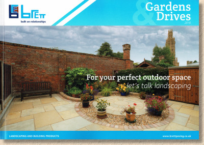
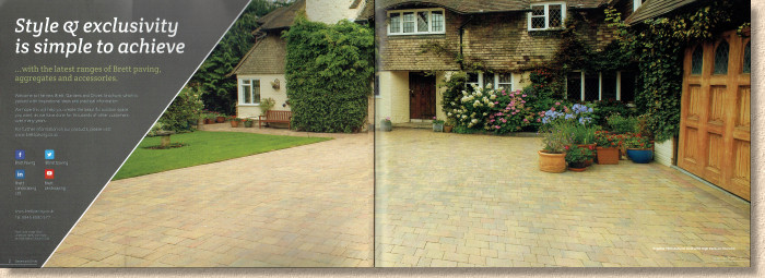
So, on with the motley, and what have we before us for 2016? The landscape orientation, as mentioned, is still with us, with a strong Brett logo and a cover image that smacks of traditional rather than contemporary. Opening up, the advantage of landscape orientation is used to the full by delighting the eyes with a double page spread of Regatta block paving outside what would be called a 'country cottage' but is actually larger than the local Co-op! It's a well-crafted photo, with the roses and agapanthus and cleverly arranged pots which never detract from the paving, but soften it ever so subtly. Very clever!
The new products, which are what really interests the habitual brochure browser such as myself, and also given deserved prominence on the first real double page spread. Good images with bold page numbers indicating where they are to be found, but looking more closely, it's apparent that each is just a variation on an existing theme, primarily new colour options, although the Elite Flamed Sandstone is, arguably, just about new, and is probably going to be the pick of the bunch.
A double-page Contents spread divides the products into logical groups: Natural Stone; Garden Paving (pronounced 'concrete'); Drives; Ancillaries; and finally, a section on product info, but before all this we have the inevitable introductory section.
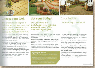
Of all the sections within a typical brochure, this is the one that gives me most trouble. I appreciate it's a necessity for the customer, a gentle introduction to what needs to be considered before choosing a product, but all-too-often, it wanders off into trumpet-blowing about what a wonderful business they are, and how the customer should be grateful to be dealing with such a socially-aware and beneficent company. Mercifully, there is none of that here, just rudimentary yet sensible advice with a four-page plug for the Approved Installers, along with very welcome recognition of the deserving award winners.
And then on with the actual products!
The template for each of the major products is the same throughout. A full page 'money shot' is backed-up with a second page of alternatives, colour/texture swatches and a simple text explanation of what is shown. Size and packing information has been hived off to the back of the brochure, and I'm not sure this is good thing, but it does free-up page real estate for larger-than-average swatches, so maybe it's a reasonable trade-off.
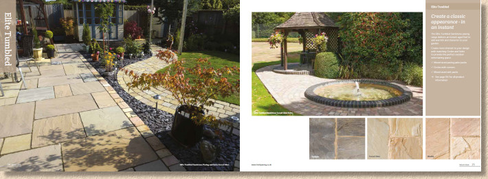
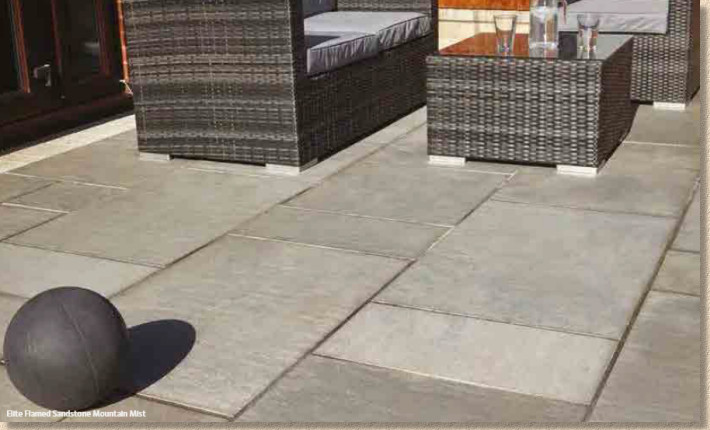
The first of the 'new' products appears on page 18, the delicious Elite Flame Textured Sandstone which is a very welcome addition to the Elite range of premium natural stone. Not all sandstone can be flamed, but when it can, and when it's done well, it opens a whole new dimension to a familiar product. Brett has gone with the Forest Glen for the money shot, but I think I'd choose the Mountain Mist. Those silvery grey tones just seem to highlight the texture more effectively and grey is so on trend for those looking for a contemporary styling.
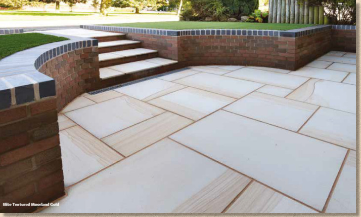
On to page 21 for the next newbie, an Elite Textured Sandstone labelled as Moorland Gold, a creamy-gold with brownish banding in places. Yes, we know this stone from elsewhere, but the texturing adds a new dimension. Like all the other products in the Elite range, it's a 600 series flag, in four sizes (900x600, 600x600, 600x300 and 300x300) and comes in 15.37m² project packs. It's certainly contemporary, all crisp edges and strong geometry, but this particular sandstone isn't one of my favourites. I haven't seen the Brett product yet, but experience with this stone from other suppliers tells me it takes a good bit of care to keep it looking at its best.
As you flick through the pages, the consistently high quality of the photographs has to be admired. However, using shots of Approved Installer jobs seems to have been dropped, or the credit for such work has been omitted for whatever reason, and there's a sense of it all being micro-managed, of it being very cleverly staged and set-up solely for the camera. There's nowt wrong with that, but if brochure shots are going to be staged, then let's eliminate the silly errors such as crossed joints and farty-small infill pieces. If a shot is intended to show the product at its best, then show the best workmanship, too.
Moving on the so-called "Garden" paving, the porcelain paving is touted as new, which is true in that it's new to the brochure, but it has been available through the Approved Installers for almost a year now. I've made loads of comments about porcelain/ceramic/vitrified paving over that time, and if nothing else, it has introduced a new vitality into the market. It's not had the impact that some of its more enthusiastic promoters predicted, which is primarily down to cost and contractor unfamiliarity, but it has to be welcomed as another option for customers.
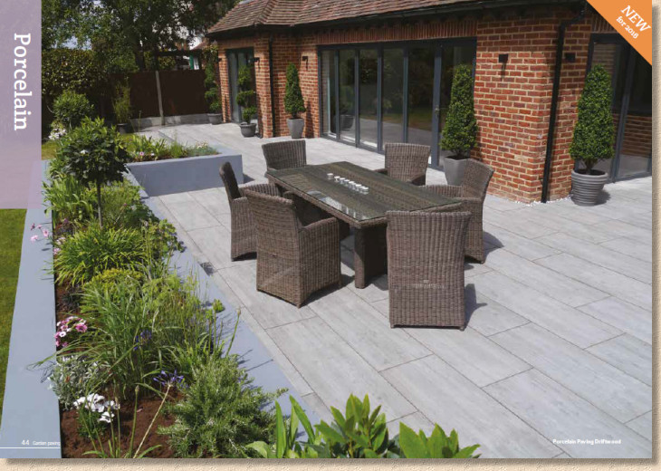
The Brett Porcelain offer hails from Italy, and, if you are going to do porcelain, then Italian manufacturing is widely recognised as the best. It's a sensible offer of five options, three stone-a-likes and two wood-a-likes, in lighter and darker shades, in two sizes for the stoney versions, 1200x400 and 600x600, but only the 1200x400 for the timber-y versions.
Contractor feedback suggests that it's the timber-effect that appeals most to customers, which makes sense, but more size options are needed to make this a permanent and versatile addition to the paving repertoire.
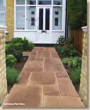
The next newbie is a Pale Ochre colour for the wet-cast riven-effect Canterbury flag range. It looks pinky-brown but I could be wrong. Only a small photie available, which doesn't really do justice, I suspect, as the flags look almost blotchy. I'll reserve judgement until I've seen it for real, but looking at the other colours in the range, a more-browny option would make sense.
And then we move on to Drives, which essentially means block paving although, with the right thickness flagstones and the correct sub-layers, there's no reason why some of the preceding stone or concrete flags couldn't be used if so desired.
There's been precious little innovation with concrete block paving (CBP) over recent years, but when I hark back to the ICCBP conference in Dresden last September, there was so much that was genuinely exciting and new and full of promise. I know Britain is traditionally conservative when it comes to its taste in paving (look how long it took for the nation to accept face mix blocks!), but it would be so good for the wider CBP industry to see some of these developments at least offered to the residential market.
However, what we do have is a new colour in the Regatta range of profiled CBPs, and it very neatly sits between the existing colour options of Silver Haze and Autumn Gold. Rustic Bronze features significantly warmer tones than those in Silver Haze, but not as strong as those of Autumn Gold. It's more subtle, more reserved and probably just what the range needs to expand its potential. The money shot on page 76 is taken from a low angle, one that would require you to be lying on the deck to actually experience, so judging the overall colour isn't easy, but it does look quite tasty.
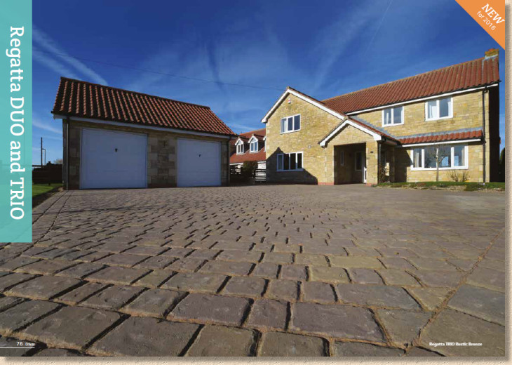
The other change to Regatta, which is being passed off as the sixth and final newbie, is the practically the same as the fifth above – the addition of a third colour option, the Rustic Bronze, to the Regatta Duo. I'm confused now: isn't adding a fresh colour to a range just one new idea, not two? Why does having each pack option available in the new colour make it two new products? It obviously makes sense to someone, but not to me.
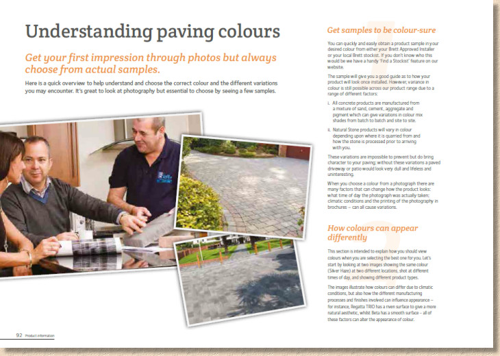
And so there we are. The last section is the hived-off size and pack info, along with a few basic laying patterns, and then the most elementary of installation guidance, but as commented last year, and many times before that, is it really fair to expect a brochure to provide detailed, step-by-step how-to's for the DIYer? What is worthy of a mention, though, is the thought-provoking article on the effect of colours on paving. This deserves to be read by everyone, particularly contractors, as I'm sure it will open quite a few eyes!
Obviously, anyone serious about paving is going to get their mitts on the Brett brochure. It is none of the absolutely must-haves, even for those of us in parts of the country where Brett products aren't always easy to obtain. The 2016 edition will not disappoint. It's a thoroughly professional presentation that will entice even the pickiest of customers and of which any competent contractor would be proud to use as part of their sales pitch. The photography has been elevated to a new level for this season, and if for that reason alone, the 2016 Brett Brochure is a genuine treasure trove of products and ideas.
Brett Paving: 0845 60 80 577
Click here to download brochure
