Brett Commercial Catalogue
There was a time, back in the days before the world had been bankrupted by the incompetent meddling of so-called financial wizards, when the unleashing of a new commercial products catalogue from any of the major national paving manufacturers was a significant boost to the economy. The catalogues of those days of yore had to be moved around by gas-guzzling HGVs before having their individual delivery supervised by specially trained sales reps who had been on 6-week intensive gym workouts in order to be able to operate the block and tackle needed to winch the new tome onto the glass-and-chrome storage shelves of the nation's landscape architects, hardscape designers and property developers.
These epic publications almost doubled in size with each iteration, and for some, it wasn't just a matter of them only being capable of restraint by the stainless steel hoops of a 4-ring binder, there was usually a PVC-clad protective shield to further emphasise their importance.
Things calmed down a bit as we entered the 21 st century and the behemoths of old were rationalised down to much more manageable spiral-bound efforts with lots of icons and logos along with references to almost every known acronym in the construction trade.
So when Brett Paving announce a new Commercial Landscaping Solutions volume, it's a bit of a shock to see a straightforward, glued and bound, A4-sized, all-paper, good-old proper catalogue. Retro or radical? Are they trying to evoke the glory days of 80s and early 90s or is it actually a more rational riposte to the economic realities of the hard landscaping industry in the second decade of the 21 st century?
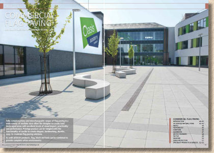
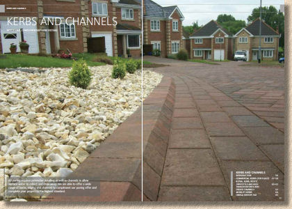
A brief flick through reveals the essential game plan: give a 'product-per-page' run-down of the Brett range, with the info most needed by decision-makers displayed simply and clearly, topped-off by at least one decent 'show off' photie supplemented by smaller, subsidiary images and swatches where necessary. The worst excesses of marketingese have, it seems, largely been avoided and the explanatory text is exactly that: explanatory.
Of course, a commercial products catalogue has a much different target audience than a residential brochure, so images that might seem bland or unexciting to some are actually well-chosen, neutral "any project" images that any half-decent designer would be able to transpose to their own particular project with ease.
It should be obvious that very few commercial projects are specified based on a single picture seen in a catalogue, but what the images have to do is give a fair representation of the product on a typical job. It would be easy to pick out showcase jobs with exceptional head-turning applications, but the commercial market is different. A lot of it is plain, boring and completely devoid of inspiration. Much of it is driven by budget rather than aesthetics, so while the big fancy job in that London with all the swirls and curlicues and bespoke pieces might look stunning, it counts for nought when someone is looking to re-pave the old market square in a northern industrial town. What that designer needs is a basic guide and a general indication.
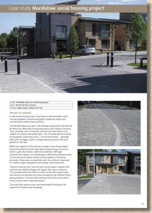
Having said all that, there are enough 'showcase' jobs sprinkled through the 104 pages of this catalogue to pique the interest, but I felt I wanted to know more.
This isn't just a fault (if that's the right word) for Brett alone: every manufacturer of paving and surfacing is doing the same thing of late. They get a showpiece job, print two or three photies, mention the designer and contractor, and a plug for the local council, of course, but never actually explain why the choices were made.
If presenting a project as a case study, then give us the information to study, detail the critical decisions that had to be addressed, explain the thinking behind the choices, relate how problems were resolved. Sorry, but in my book, two photies and "Cracking Job, Lads " thumbs-up press release does not constitute a case study. Think on!
Anyway, on with the catalogue. It's logically sub-divided into sections for CBPs, Permeable Pavers, Flags, Kerbs, Aggregates, Specials, and Site Services. There's an index, but no colour-coding of pages or provision of tabs as used to be the norm with commercial literature. And the fundamental inter-connectedness of all things is mentioned more than once, which is a good thing. I like designs which use different formats, mixing blocks with flags, permeable and non-permeable surfaces. Getting designers to understand that these can all be used together is sometimes something of a major hurdle.
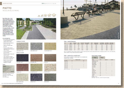
Some of the products may be familiar to those more at home with the residential works, but there are some genuinely exciting commercial-only products that never seem to get enough attention. The Piatto block pavers, for example. Lovely stuff, but hardly ever mentioned outside of a design studio.
I also like the way that permeable pavers have been treated much the same as any other material option rather than being touted as the saviour of the free world. As an industry, we have to move on from brow-beating designers about SUDS. They should know it by now. If they don't, they shouldn't be working in this trade, and they probably won't be for much longer.
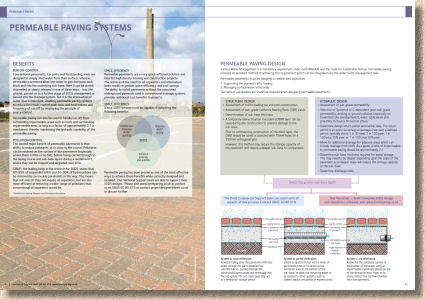
We've had years of brochures wasting over a half-dozen pages explaining why permeable paving is important as a principle but simultaneously neglecting to actually sell the bloody pavers! A double page spread on the basics of SUDS is ample, as that gives more space to show off what's available and get clients to understand that it's not all that scary, honest! It now has to be considered as everyday technology.
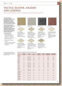
Elsewhere, there is a good blend of dry technical info, such as kerb size or tactile options, with compelling images and lucid explanatory text. The whole thing feels less like a commercial catalogue and more of a browse-friendly source of information. And that's what will determine whether it's a success or not. Will this be on the desk, within easy reach, or will it be tucked away on a shelf across the office just in case it's ever needed?
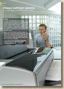
Brett Paving's motto for the last few years has been "Built on Relationships" and the final 10 pages or so pay much more than lip service to this. There's an emphasis in this closing section on how Brett Paving work with the clients, how they can tailor their offering, how early involvement leads to better finishes. This 'working together' model is increasingly important in a frighteningly competitive commercial market just now. Clients are no longer interested solely in style or supply or even price; they want to feel that their selected paving supplier is working with them and working for them, working as a team rather than as contentious supplier and buyer.
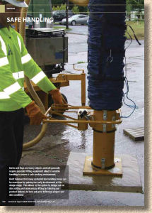
And there's a very welcome section on the safe handling of paving materials. This is a subject that has been growing in importance over the last couple of years or so, and one that will become much more so in the very near future. In fact, it's something that's been discussed today in The Brew Cabin discussion forum as we try to involve all the players (what the men-in-suits refer to as "stakeholders", FFS!) to have their say on how to make the paving game that bit safer.
So how will it fare? As an ink-and-paper publication, it has to battle against the increasing tendency for all of us to go online when looking up anything and everything, to rely on web-based catalogues and PDFs, and this trend is partly responsible for the decline of the hard-copy catalogue. But there is still enormous value in a hands-on brochure. We're still an acquisitive animal at heart, so we like things we can touch, and there's always a willingness, bordering on keenness, to browse magazine-like publications of interest, even if it's only at coffee time. This is something Brett seem to have learned from the phenomenally successful residential brochures they've put out over recent years.
By making the format less dry and technical, by moving away from the ring-binders and sub-section tabs, the modern catalogue has a much more user-friendly, chatty, informal feel to it. That open approachability makes it more likely to be kept close at hand, and that has to be the measure of success. It's not overly bulky; it's probably still just a few seconds quicker than finding the relevant info on the corporate website; ideas can be scribbled onto it at will; page corners can be folded over as aide-memoires; and the image quality is just so much better than any lossy PDF or jpeg.
It's not perfect. The case studies, as mentioned previously, really aren't given a fair crack of the whip, and there's precious little in the way of web links, but I suspect much of the reason for that lies in the shortcomings of the company website rather than any issue with the print catalogue. We all know that, in time, the web will completely replace these archaic paper-based documents, but for now, while we're still very much in the transition stage, this effort from Brett Paving is probably about as good as it's going to get.
Get your copy now before they disappear - at some point in the very near future, one of these hard-copy commercial publications will be the last of its kind.
Download from Brett Paving website
