Marshalls 2014 Brochure
There are some brochures which dazzle with their imagery. There are some that delight with their innovative layout and style. But when it comes to sheer completeness of range, is there really anyone who can challenge Marshalls?
This point was rammed home last week during a mob-handed personal walkthrough of the new products and the 2014 brochure. It's called 'Gap Analysis” apparently and seems to involve looking at your current offering to identify where there might be omissions or weaknesses in the range. The Marshalls team (and it really does come across as very much a 'team effort') have the knack of spotting gaps which the rest of us never even saw as miniscule crannies.
In a classic example of difficulty in seeing trees because of all the wood, it's only when you stand back and take stock that the sheer comprehensiveness of Marshall's patio and driveway offering hits you. Think of a paving or hard-landscaping product: anything, stone or concrete. It's a ridiculously safe bet that Marshalls have it in their range. The only exceptions I can think of are clay pavers and shaped blocks, but that's a problem with the home market, rather than an unidentified gap in Marshall's offering.
Anyway, on to what we can expect to see in 2014 and the New Products supplement alone is thicker than some manufacturers' brochure. Obviously, the one they'd like to see garner most interest, hence its role as cover star, is the re-named DriveSys , neé Cobbletech. The re-naming is for trademarking rights, apparently, but the system remains unchanged other than being augmented by the addition of a 'split stone' effect paver.
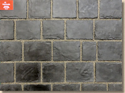
This new version offers a more contemporary style and was eminently predictable given the success of the 'original' flavour. The same colour options, Basalt and Grey-Green, are available, although Split Stone is manufactured in Britain, but there is still that homogeneity of tone which is, for me, too reminiscent of pattern imprinted concrete. Obviously (and rightly!), my taste counts for nought, because it sells well enough and the contractors seem to love the money it makes for them.
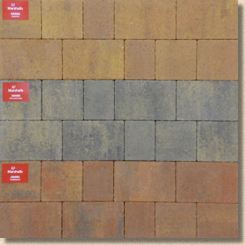
Sticking with block paving, the so-called new product, Savannah , is not new at all. It's been resurrected, brought back from an unexpected early interment back in 2002. It's a larger format, un-distressed block. Similar products for other manufacturers sell reasonably well, so just why Savannah lay buried for so many years is a bit of mystery, but its return is more than welcome, especially as it seems to coincide with the demise of one of my least favourite blocks, the Excel, which did anything but (excel, that is!)
Maybe the time has come for Savannah. Its clean, unblemished styling and new warmer colours (even the normally chilly Pennant Grey seems to have been thawed out by a boost of buff) are very now, although a stark monotone palette may have given it an even sharper contemporary feel. Like the Split Stone DriveSys, the more modern look, the absence of faux heritage styling, may see it do rather better than some might expect.
Finally in the block paving stuff, is a new version of Driveline 50 which, despite being very patiently explained to me over and over again, still made my brane ake. The improved Driveline 50 has a closer finish, sharper colours and a sprinkling of sparkly mica in the mix which makes the surface glint. The old Driveline 50 is still available, but has been re-named as Standard CBP50mm and is as good now as it was last year.
So, during what, hopefully, will be a very brief transitional period, the new Driveline 50 and the old Driveline 50 will co-exist as the original version packaged as Driveline 50 is used up, even though it should really be called 'Standard CBP 50mm'.
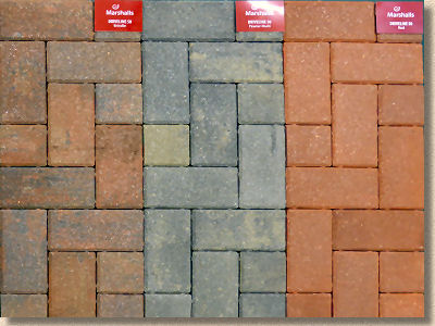
Worryingly, given there's a potential price difference of up to around a couple of quid per square metre between the two, there's opportunity here for some unscrupulous supplier or contractor to bang in the cheaper old stock still labelled as Driveline 50 at the price of the sparkly one. If you can't definitively identify by name which of the two is required, then the ground is laid for exploitation. If you're planning on using or specifying Driveline 50s this season, make sure your supplier knows exactly, with no ambiguity, which version you require.
Anyway, as for the blocks themselves, the colours are….errrm….colourful, there's no doubt, and the surface texture is somewhat tighter, closer (despite a stray naughty block making it into the display panel), and the sparkly bits are very sparkly. They also go the full depth of the block, and are not just a surface feature that will disappear shortly after the cheque has cleared.
But do we actually want sparkles? I'm completely indifferent. They neither augment nor detract. My background working with Pennine yorkstone tells me that the presence of sparkly mica usually indicates a stone with easier-to-cleave bedding planes, but in a CBP that's meaningless. Maybe the glittery facebook generation want sparkles on their paving? There's quite a lot about this generation's wants and tastes that completely passes me by!
Sticking with pressed concrete products, and an item that really deserves much wider usage, the Argent Palisades offer phenomenal potential for contemporary landscapes where concrete pavings are being used. You may have read my comments regarding an uncannily similar product from a closely aligned company late last year, and so you may be aware that I'm a massive fan of these vertical restraints. You see them everywhere in that Europe, but they've never really caught on over here.
Maybe it's the fact that the taller units can be tricky to install properly. The 300mm high elements are hardly any more difficult than a high block paving kerb; the medium, 600mm heights are more of a challenge; and the big 900mm beasts are a skill in themselves, but they offer so much in the way of visual impact, raising a hardscape into that third dimension and drawing the eye upwards with style and elegance. Getting 900mm of textured heavy concrete to sit perfectly upright, in true straight lines and sweet arcs is the mark of a master.
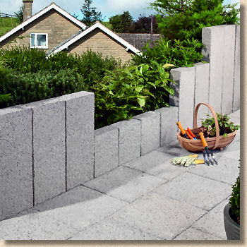
I know Marshalls have issued some written installation guidance, and as good as it may be, I think a novice will struggle to successfully plant the big 'uns relying on that alone. It's one of those skills that you need to practice over and over again, before attempting it on site where you need it to be perfect to get paid. It's one of those jobs that I'd love to demonstrate as there are so many tips and tricks to getting a good line in place. However, once you have the knack, you can quickly become incredibly creative and, possible of more importance, earn a good pay packet from it, too! Prices will depend on size, obviously, but the 900mm high units should work out at somewhere around 35 quid per linear metre to buy.
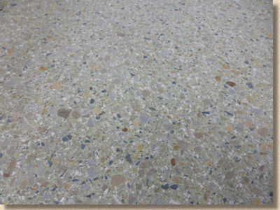
Elsewhere in the world of concrete paving, what is probably the most exciting new product is one that is easy to overlook. Wildwood is a sort-of exposed aggregate flagstone, where the specially selected coarse aggregate stands slightly proud of the surface to give a distinctive look and a very distinctive tactile experience in bare feet.
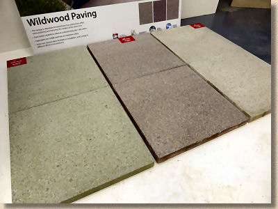
Concrete paving was being written off as the cheap stone imports devoured market share over recent years. Why would anyone choose concrete when you can have natural stone for less money? Too many manufacturers have stood on the sidelines grumbling about cheap imports, inhuman working conditions in various countries, government subsidies and the like, whereas Marshalls seem to have viewed the market from a slightly different angle and looked to do with concrete those things that can only be done with concrete. Instead of trying (and generally failing) to imitate natural stone, manufacturers should be looking to use concrete imaginatively, to do things that simply can't be done with natural stone, and Wildwood is a great example of that.
By using specialised brushes to abrade the surface, the fine aggregate matrix of the concrete is literally swept away leaving behind the gently rounded coarse aggregate, projecting ever so slightly from a sensitively coloured background. There will be some strong comment about those background colours: while a soft cream (Pine) and a russet brown (Oak) might not be too radical, the sage green colour dubbed 'Sycamore' is bound to provoke the Marmite reaction. You either love it or you hate it with no middle ground. And the limited range of sizes (450 x 300/450/600mm) doesn't make it easy to be creative, but maybe that will be expanded if the product appeals to the patio-buying public. And at the 25-35 quid per square metre sort of price, it's bound to attract some attention.
However, the key thing to take from this is the potential. This is concrete being concrete and being damned good at it. This is the next generation of concrete paving, a very welcome step on from the passé imitation stone and the tired ground or shot-textured formats. This is 21st century concrete paving developing before your very eyes. Exciting times!
Wrapping up the new concrete products, there are some concrete imitation stone effect edgings going under the name Hewnstone . Four unsurprising colours, just the one relatively short size (200x450x50mm) round tops with a faux chiselled effect. Regardless of what it says in the brochure, do not use these with natural stone paving. It would be embarrassing for all concerned.
Following Tony's golden rule about not mixing concrete copies with natural materials, the only permissible use for these would be as an accompaniment for concrete copy paving, such as Heritage or Coach House, where I'm sure they'd look fine, but even against a budget natural stone, their ersatz appearance would be exposed for all to see.
Those 'gaps' mentioned at the start of this piece, well this was one of them, apparently. Personally, I would not have been too worried if they'd just erected a bit of chestnut paling around this one.
So, speaking of natural stone, in an almost undetectable segue-stylee, we stumble along to this season's crop of newbies from the world's quarries as selected by the keen eye of the Marshallettes.
Fairstone Flamed debuted last year and its undeniable good looks with how-do-they-do-it-for-that-price costing more or less guaranteed its success, so it should come as no surprise to see another colour added to the range. The 'in thing' grey sandstone sold as Silver Birch now joins the toasty-warm Autumn Bronze Multi, so how can it possibly fail? Marshalls' own stone specialist, Chris Frankland, was very informative about the hand flaming process which is applied to selected flagstones, and the frankness was much appreciated. Most flamed stone chugs along, stop-start style, on a conveyor belt and is scorched-in-passing by a set of mounted burners which usually results in very distinctive 'bands' of deeper texture. It looks very fine but it runs the risk of coming across as just too mechanical on what is a natural product.
Hand flaming involves the cutting-edge technology of some poor sod wafting a turbo-charged crème brulee toaster over each flagstone individually, so you get arcs as the flame-wielding arm is moved from side to side, and areas of lighter and then denser flaking, emphasising the texture with an unmistakable naturalistic randomness. It looked great on the ABM; the Silver Birch, being a paler colour, shows it off even more so.
The only flaw in this product, if it really can be considered a flaw, is that it comes in just the single gauge width of 450mm. This means no real chance of random layouts, just coursed broken bond, but with that one course width, there's a risk of it becoming a bit boring. A 300mm and/or a 600mm width option would make it so much more versatile, and at around 60 quid/m², you really do expect some versatility.
Eclipse Granite is emblazoned as being new, but despite repeated examination, just what it is that's nbew is not immediately apparent. On about the tenth double-check, it emerges: It's now available in single size packs. #worrabloodyanticlimax, as they might say on that twittery thing!
Still a lovely stone, though.
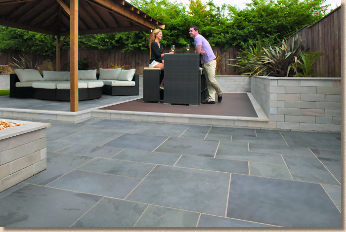
Casarta Slate is my favourite new product, without doubt. The same stone is appearing in the Stonemarket range under a different pseudonym (Nordus Schwartz and Gris) and I over-emoted about it back in November . It's gorgeous, with brooding tones and a silken surface featuring just enough texture to underline its natural origin. The two colour options (Slate Grey and Black) are bang on trend just now, and the large format of the 800x800mm pieces will make a real statement.
However, slate is notoriously brittle on sawn arrisses, so it will need to be treated with the utmost respect during installation.
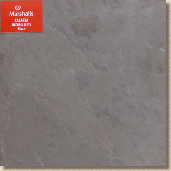
If I were fit enough to be laying this nowadays, I would, without hesitation, be using a vacuum lift to carefully move and place each piece onto its prepared bed. Hand-balling stone such as this is just asking for chips and spalling, and at around 55 quid/m² you can't afford too many accidents.
And I do think the lighter coloured mortar used for jointing is the right choice. How long it says lighter-coloured depends on how well the completed pavement is maintained, but I know some of the better contractors are already drooling to use this impressive Brazilian slate on projects this spring.
Which brings us to the natural stone edgings, another result from the meticulous Gap Analysis boffins up there at Marshalls Towers. The most surprising thing about the two products is that they weren't already available. It seems a no-brainer, but, up until the advent of Fairstone Sawn and Fairstone Riven Antique edgings, contractors were making their own from off-cuts of matching paving.
The Sawn version is a generous 845mm length, 150mm deep and 50mm wide with a pencil chamfer arriss. The smooth, perfect lines don't half remind me of the sort of edging used to retain unnaturally coloured gravel in graveyards, but that's not a bad thing. Quiet, understated elegance in four colours: Caramel Cream, Silver Multi, Golden sand Multi and Autumn Bronze Multi, so something to suit all the equivalent flagstones. Expect them to cost somewhere around 17 quid a piece from the usual suppliers.
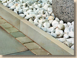
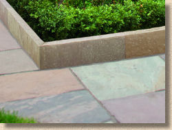
The Riven Antique option, also in four colours (Silver Limestone, Silver Birch, Autumn Bronze and Golden Sand) is simply a riven version of the above. Same sizes, same unmistakeable style, but a more rugged, naturalistic appearance to suit the riven-type of flagstones and setts, and a lower price, probably around 12 quid per unit.
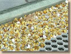
Going back to this concept of Gap Analysis, it would appear they noticed the growing use of cellular retention systems for containing loose gravel (some are used for growing turf) and spotted another gap. That's where Drivegrid comes in. A recycled plastic 35mm honeycomb cell with an integral base geotextile which is laid over a prepared bed and filled with the gravel of your choice.
There are dozens, nay hundreds of these systems on the market just now, and at around 14 quid/m², this is not one of the cheapest. There are also concerns regarding how secure is the system when installed, as there is no interlock between adjacent units nor anchor pegs to prevent lifting. It fills the gap, for sure, but I'm not convinced it was a gap that needed filling.
Finally in this look at the new products, a new colour for the polymeric Weatherpoint mortar: Black. The Basalt colour is offered by several manufacturers, but that is really a dark grey, whereas black, and I'm judging from photies here, is very definitely black. Jet black. If it's the same sort of formulation as the black from a couple of the other quality German manufacturers, it's based on a waste product from the steel industry and is supremely colour-fast.
Brochure layout
So, after all that on the new products, is there any room left to consider the new brochure? I suppose I'll have to make room!
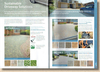
The 2014/2015 edition follows the familiar format which has been used since way, way back in 2003, just after Savannah was last spotted in the wild. If the same formula is used year after year, for what is now 11 editions, that suggests they feel they have got it more or less right. But while the dark green spine and full page photie cover may not have changed, the pages inside have continued to gradually evolve without ever losing their genetic heredity.
There's the inevitable trumpet-blowing of the first few pages, but it's not as excessive as it once was, and there is an important message in there about sustainability and a nice plug for the great and the good of the Approved Installer Awards. The thumbnail photies of winning projects may seem parsimonious at first glance, but several of the successful projects are featured elsewhere in the brochure, so we can't really complain. And with 172 pages in total, making it by far the largest brochure of the season, the use of 19 pages for a bit of self-promotion shouldn't be judged to harshly.
The rest of those pages are divided into Garden Paving with 87 pages, Driveways which runs to 53 pages, the ignominiously entitled 'Standard' which looks at budget Indian sandstone, utility paving and low-end block paving in a measly 4 pages. The last 6 pages are given over to closing waffle, ifs-and-buts, and acknowledgements. That is a lot of real estate to fill, but how many other manufacturers could realistically fill half of that?
The Garden Paving sub-division takes up most of the space, and unlike some other brochures, there's no attempt to stream products into particular themes, such as 'chic', 'contemporary' or 'cottage'. This runs the risk of confusing potential customers, but there's actually a sense of flow and logic to the way it has all been organised here. The section starts off with the ever-growing family of Fairstone products which drifts effortlessly into the granites and slates before sublimating to concrete products starting with the wannabe-stone effect brands (Coach House, Heritage, etc.) and then finally meandering into the unashamedly concrete lines such as Saxon and Perfecta.
It all seems to link together seamlessly. There're no sudden jerks from one material to another, no phase changes, nothing too abrupt. Without it being explicitly declared, there's a natural order to it all, a sense of relatedness between adjacent products but no need to adhere rigidly to the sequence.
The same holds true for what follows with Paths and Edgings, Decorative Aggregates and then Walling. A smooth transition from highest quality premium natural stone to everyday value and functional decorative concrete. You could almost guess where any particular product will be found within the sequence.
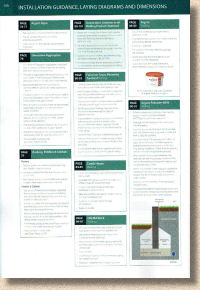
The dry technical information comes at the end of the section and is succinct, to put it mildly. There's not really enough information for a DIYer or occasional installer to undertake their own project, but all of the key points seem to be there. The technical drawings for features such as circles are tiny, but then, with everything now being available online in much greater detail, this is probably enough….just. The information for installing Palisades is practically impossible to follow and the cross-section is mis-labelled, but as stated above, Palisade installation is far trickier than you might expect and to explain it all in one-sixth of a page, even when using the smallest legible font, is probably expecting too much.
The Driveways section opens with an overly simplistic explanation of the drainage options for driveways. Given that the legislation covering this subject is a complete shambles, trying to reduce it to three options for householders is asking for trouble, but look at how much page space is given to each option. A full page for permeable paving; two thirds of a page for run-off to SUDS; and a skimpy one-third for conventional drainage. Which “solution” do you think they want you to buy?
Maintaining the Easy-Flow page ordering, permeable products (Priora, BioVerse) are given priority before moving on to natural stone, six pages of the re-titled DriveSys (lot of space for just two products!) and then a gradual slide down the price scale from Argent, through Tegula to Driveline in its various guises.
Throughout all of the 172 glossy, full colour, photie-rich pages, there's that sense of flow, of logical ordering and transition, of each product being in its right place within the scheme of things. The brochure is very much about showing product rather than explaining or weighing you down with technical information. It's essentially a slideshow in brochure format.
Page Styling:
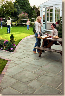
This slideshow styling works well. Each of the product pages gives over the top two-thirds to imagery, and they are, as you'd expect, beautiful projects beautifully photographed.
However, I really don't like the preponderance of Pretty Young Thing models in nearly every major image. Human beings should only ever be seen in paving photies when a sense of scale is needed. By page 30, I'm sick of looking at inanely grinning, gleaming toothed PYTs with their pseudo-perfect lifestyles. They distract the eye from what's really important; your subconscious starts to make judgements about whether you like the model rather than whether you like the paving.
And human models in any such publication invites hyper-criticism from the thought police. How many pretty women vs how many hunky men? How many gingers? How many dark faces, or disabled, or Inuits, LGBTs, dog-walkers….???
It's a hard landscape brochure. I want to see hard-landscaping not some debased form of a Freemans's Catalogue. It's all marketing bollocks, I know, but it's the sort of marketing bollocks that prompts cynics like me to wonder why they feel we need to be distracted. With a lesser brand, I'd be looking for what they *don't* want me to notice, but this is the strongest brand in the market, with some of the best products on that market. We don't need distracting: the products are good enough to speak for themselves.
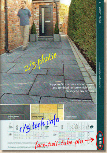
Enough: back to the page styling. We've moved on from the era of superfluous superlatives and, like several other brochures of late, there's been a general calming down to provide bullet points of reasonably useful information. Colour sizing and pack information are presented in table format, rendering them consistent and easy to understand. Swatch sizes are right at the lowest end of acceptable and, in general, do show a representative sample of colour/texture variation. The reason for the presence of logos from all of the usual social meejah sites on every other page is not clear – maybe having these 'badges' repeated ad nauseam makes a brand seem trendy and relevant. Smacks of desperation to me, especially when such badging is totally absent on the 'economy products' pages!
However, it has to be admitted that the overall page design is simple, clean and gets the message across. There's a good balance in the two-thirds/one-third split and the whole layout feels balanced – not cramped but not wasteful, either. It is, to put it simply, a very pleasant browse.
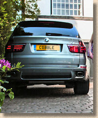
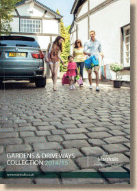
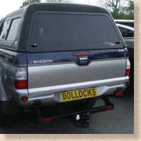
Having said all of that, the registration plate on that car on the front cover: that, on its own, is more than worthy of a whole round of the stinkiest Stilton imaginable. Cheesefest par excellence!
Summary and availability
Marshalls are, by some distance, the biggest name in British hard-landscaping, and so it's right to expect more from them than from other brands who can't match those resources, those budgets or even than enormous gap-free range of products, and I think it's fair to say that, for 2014/15, they've delivered what we have come to expect. It's a very professional brochure (too professional with all those sodding PYTs) which engenders confidence in the brand. The product range is practically faultless and virtually gap-free (any chance of seeing a return of clay products?). If it's not in here, it probably doesn't exist. The brochure itself is classy but not too pretentious or arty. It's a browsable brochure rather than a coffee-table collection of very nice photies. And it's actually useful. There are some great ideas on show in here, some stunning work by named-and-shamed contractors, and the feel of a brochure to which you will return over and again throughout the coming season.
Rather than having me tell you why you should get your own copy of Marshalls 2014/15 brochure, why don't you tell me why you shouldn't? Who, in their right mind, would NOT want to see what Marshalls have to offer? The penny pinchers: possibly. The cowboys: almost certainly. The Flat Earthers and the Yoghurt Knitters: maybe. But anyone with even the slightest interest in top quality paving and hard-landscaping will definitely have it on their desk.
Marshalls' Customer Helpline: 0845 820 5000

